Updated: July 8, 2026 · 6 min read
Etsy art print mockups convert best when they work as a listing image set: one hero room image, one close-up, one size reference, one product-clarity graphic, and one alternate room or frame view. The goal is not to make the art look bigger than it is. The goal is to help buyers understand the product before they read the description.
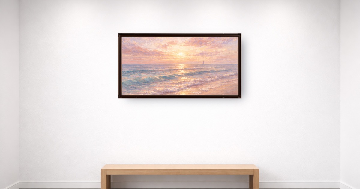
Table of Contents
- Why does the first Etsy listing image matter so much?
- What should an Etsy art print mockup include?
- What image set should Etsy sellers publish?
- How do you keep scale honest?
- How do you choose rooms, frames, and backgrounds?
- What mistakes make Etsy mockups lose trust?
- How do you build a repeatable mockup workflow?
- Key Takeaways
- FAQ
Why does the first Etsy listing image matter so much?
Etsy buyers see a search grid before they see your description. Your first image has to communicate product, style, room fit, and trust quickly. A flat file can show the artwork, but it rarely shows why someone should want it in their home.
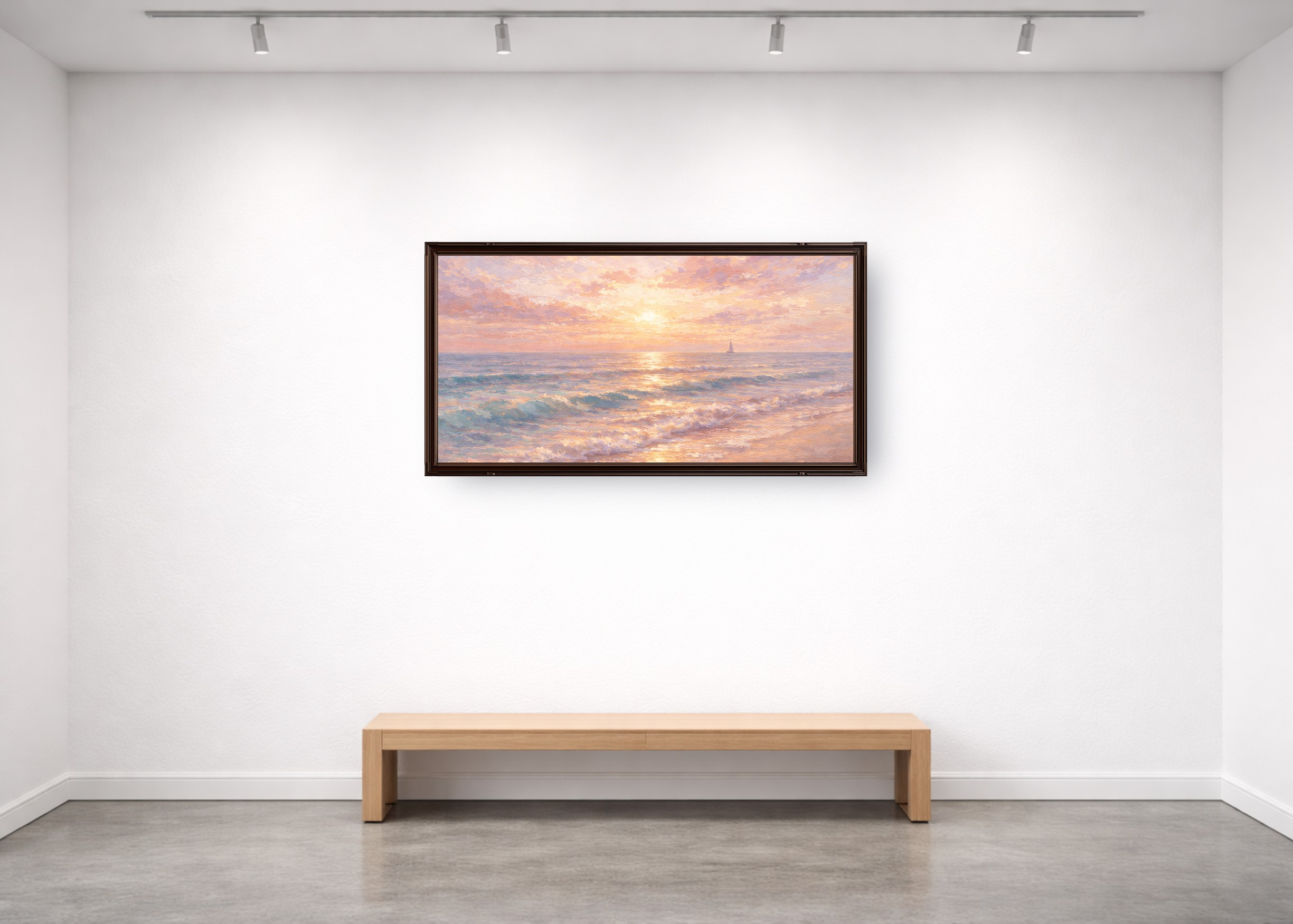
For art prints, the first image should usually be a wall mockup because it answers the fastest buyer question: "Would this look good in my room?" The room gives scale and mood. The frame gives finish. The artwork still has to remain the focus.
Two-second thumbnail test: if a buyer cannot understand the product at search-result size, the mockup is too busy, too cropped, or too vague.
Create the first image with a true-size wall art scene, then use the rest of the listing to answer practical details. For the broader shop plan, read How to Sell Art Prints on Etsy.
What should an Etsy art print mockup include?
A strong mockup is specific. It shows the actual print ratio, believable wall scale, frame style, room mood, and product expectation. It should not imply that the buyer receives a frame, mat, or physical product if they do not.
| Mockup element | Why it matters | Best practice |
|---|---|---|
| Real print size | Prevents surprise when the order arrives | Set width and height to the sold size |
| Room context | Helps buyers imagine the print at home | Match the room to the buyer and niche |
| Frame treatment | Signals finish and style | Show only what is included, or label display-only frames |
| Sharp export | Supports zooming and listing clarity | Use clean artwork files and export at listing-ready quality |
Use the WallMockup editor to set real dimensions, choose a room, and keep frames consistent across a collection.
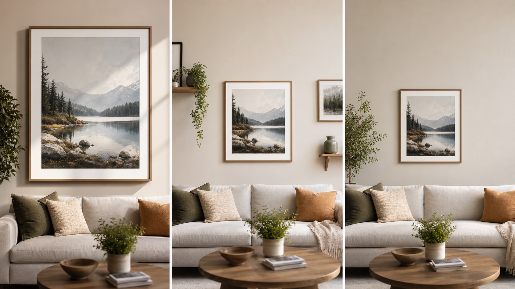
What image set should Etsy sellers publish?
The best Etsy image set answers buyer questions in order. Do not add random extra views just because Etsy allows multiple images. Every image should do a job.
| Order | Image type | Buyer question answered |
|---|---|---|
| 1 | Hero wall mockup | Will this fit my style and room? |
| 2 | Close-up detail | What does the artwork look like up close? |
| 3 | Size comparison | How big will it feel? |
| 4 | What is included | Do I receive a file, print, frame, or set? |
| 5 | Alternate room or frame | Can I picture it in another space? |
Etsy's Seller Handbook has a useful overview of product photography types. Translate that advice into wall-art-specific images: scale, frame, print detail, and buyer clarity.
How do you keep scale honest?
Scale is where Etsy art print mockups most often go wrong. Sellers enlarge small prints because the listing image looks better. Buyers then expect a bigger visual impact than the product provides.
Set the print to the size you sell. If you offer multiple sizes, show the hero image at the most representative size and include a separate size chart. If the frame is not included, say so in the image set and description.
Scale checklist:
- Show 8x10, 16x20, and 24x36 differently; do not make every size look huge.
- Use furniture or wall context to make dimensions easier to understand.
- Verify print resolution before offering large sizes.
- Keep frame and mat thickness proportionate to the print.
Use the wall art size calculator to estimate wall presence, then use the poster size guide for print sellers to confirm ratios, pixels, frame fit, and Etsy file groups.
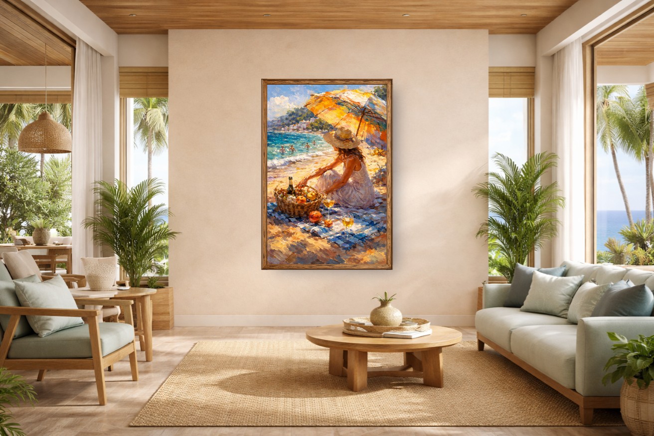
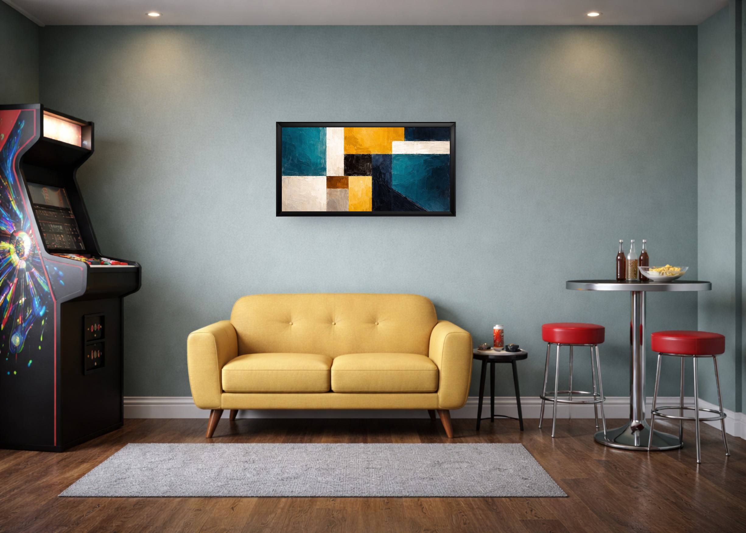
How do you choose rooms, frames, and backgrounds?
Choose a room that matches the buyer, not just the artwork colors. Nursery prints need a different context from moody photography. Minimal line art needs a different room from maximalist florals.
Limit your scene library for each collection. Two main room styles and one backup room usually give enough variety without making the shop grid feel scattered. Keep frame colors consistent unless frame color is a meaningful product option.
| Art niche | Room direction | Frame direction |
|---|---|---|
| Nursery prints | Soft bedroom, playroom, warm neutral wall | White, light wood, or no frame |
| Botanical prints | Calm bedroom, entryway, natural living room | Oak, white, black, or thin gold |
| Photography | Minimal living room, office, gallery wall | Black, walnut, or gallery-style white mat |
| Typography | Office, entryway, kitchen, small wall | Simple black, white, or wood |
For frame-specific planning, use the common frame sizes guide.
What mistakes make Etsy mockups lose trust?
The most damaging mockup mistakes are not visual taste mistakes. They are expectation mistakes. A buyer can forgive a simple room. They do not forgive a product that arrives smaller, blurrier, or less finished than the image implied.
Avoid these mistakes:
- Showing a framed product when the buyer receives an unframed print.
- Making a small print look like a large statement piece.
- Using a room scene busier than the art.
- Mixing random mockup styles across one collection.
- Exporting blurry listing images from low-resolution artwork.
- Hiding digital-download details until the bottom of the description.
Etsy's keyword guidance also warns against misleading presentation in titles, descriptions, and tags. Keep the visual promise and written promise aligned.
How do you build a repeatable mockup workflow?
Build the workflow once, then reuse it. Choose a default hero room, a secondary room, one frame color, one shadow style, and a size-reference format. That gives the shop a consistent look and makes each new listing faster.
Simple repeatable workflow:
- Upload the final artwork file.
- Set the real print size.
- Choose the default hero room.
- Apply the collection frame and shadow style.
- Export the hero image.
- Create a close-up, size guide, included-product note, and alternate room.
Use WallMockup for the hero and room images, then keep any text-heavy size or included-product graphics simple. If you need print-file checks before publishing, use the print resolution checker.
Key Takeaways
- Etsy art print mockups should be a listing image set, not one decorative photo.
- The first image should show room context, true scale, and the artwork clearly.
- Size charts and what-is-included images prevent buyer confusion.
- Consistent rooms and frames make the shop feel more trustworthy.
- Honest scale matters more than making every print look large.
FAQ
Do Etsy art prints need mockups?
Mockups are not required, but they are strongly useful for wall art because they show scale and room fit. They make listings easier to understand at search-result speed.
What should the first Etsy image be for an art print?
Use a realistic wall mockup when it makes the print easier to understand. It should show true scale, a fitting room, and a frame style that does not mislead buyers.
How many Etsy mockup images should I use?
Use five focused images for most art print listings: hero mockup, close-up, size comparison, what-is-included image, and alternate room or frame view.
Can I use mockups for digital downloads on Etsy?
Yes. Make clear that the buyer receives digital files, not a framed physical print. Use an included-files image so that detail is visible before purchase.
Should Etsy mockups show frames?
Only if the frame is included or clearly display-only. If you sell unframed prints, label the frame status in the listing images or description.
Create your Etsy hero mockup
Build the first image in the WallMockup editor. Use real dimensions, a quiet room, and a frame style that matches what the listing actually offers.