
Updated: July 8, 2026 · 9 min read
Plan a gallery wall on paper — or in a mockup — before you touch a hammer. Pick a layout pattern, set the total footprint against your furniture, decide spacing, and preview it in the actual room. The single most expensive gallery wall mistake is committing to nail holes before you've confirmed the arrangement actually works at real scale.
This guide walks through the layout patterns that work, the spacing math, and how to plan the whole thing before drilling — including how a real room mockup catches mistakes a floor layout can't.
Table of Contents
- Why plan a gallery wall before hanging it?
- What layout patterns work for gallery walls?
- How much space should be between frames?
- How big should the whole arrangement be?
- How do you plan the layout step by step?
- How does a room mockup prevent costly mistakes?
- Key Takeaways
- FAQ
Why plan a gallery wall before hanging it?
A gallery wall has more failure points than a single framed print: total size, spacing consistency, visual balance, and how the whole group relates to the furniture below it. Each frame you add multiplies the number of ways the layout can go wrong.
Planning first — on paper, on the floor, or in a digital mockup — moves the expensive mistakes (wrong total size, awkward spacing, a group that reads as random rather than intentional) to a stage where fixing them costs nothing. Fixing them after drilling costs wall repair and a redo.
What layout patterns work for gallery walls?
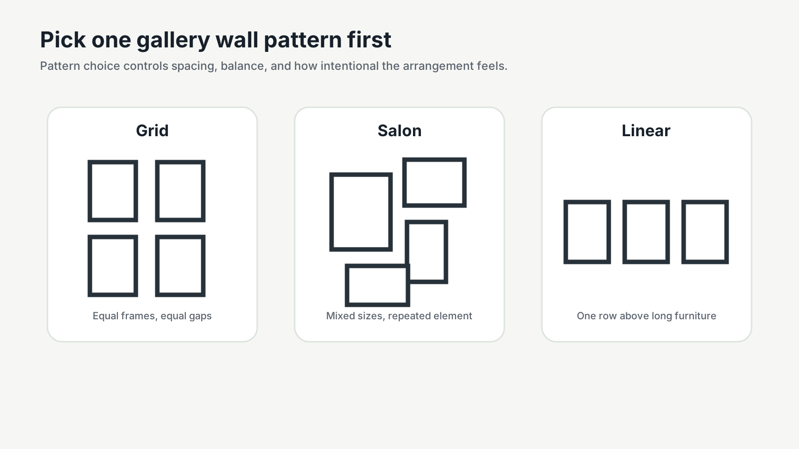
Most gallery walls fall into one of three patterns. Pick one before you start placing frames — mixing patterns without intention is what makes an arrangement look accidental.
Grid. Equal-sized frames arranged in even rows and columns with consistent spacing. This is the most forgiving pattern for beginners because the math is simple: pick a frame count, pick a gap width, and the layout follows directly. It also reads as calm and intentional even with busy or varied artwork inside each frame.
Salon (eclectic). Mixed frame sizes and orientations arranged to fill a defined rectangular or organic zone. This pattern has the most visual energy but is the hardest to plan well — it needs one anchor piece, a repeated element (frame color, mat style, or palette) to tie it together, and careful attention to keeping sightlines and negative space balanced.
Linear. A single row of frames, evenly spaced, usually above a long piece of furniture like a console, staircase run, or hallway. This pattern works best when the wall itself is a horizontal shape — wider than it is tall.
| Pattern | Best for | Planning difficulty | Where it works best |
|---|---|---|---|
| Grid | Beginners, matching frame sets | Low — math-driven | Living rooms, offices, symmetric walls |
| Salon | Mixed collections, eclectic decor | High — needs an anchor + repetition | Stairwells, large open walls |
| Linear | Long, narrow wall zones | Low — one axis to plan | Hallways, above consoles, staircases |
If you're arranging a set of same-sized or similarly-sized prints, the grid pattern is the fastest to plan accurately — and it's the pattern the gallery wall layout planner is built to calculate: give it your frame count, sizes, and wall width, and it returns a balanced grid arrangement centered at eye level automatically.
How much space should be between frames?
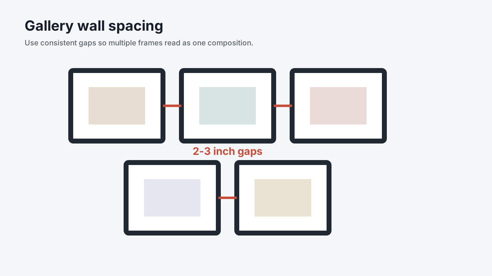
Consistency matters more than the exact number you choose. For most gallery walls, use 2 to 3 inches between frames — tight enough that the group reads as one composition, wide enough that each piece keeps its own presence.
| Frame group | Recommended gap | Best use |
|---|---|---|
| Small prints | 1.5 to 2.5 inches | Grid walls, shelves, small hallway groupings |
| Medium gallery wall | 2 to 3 inches | Most living rooms, bedrooms, and offices |
| Large frames | 3 to 4 inches | Oversized pieces, open walls, statement groups |
Uneven gaps are the fastest way to make an intentional layout look like an accident. Measure once, then use that same number for every gap in the arrangement — don't eyeball each one individually as you go.
How big should the whole arrangement be?
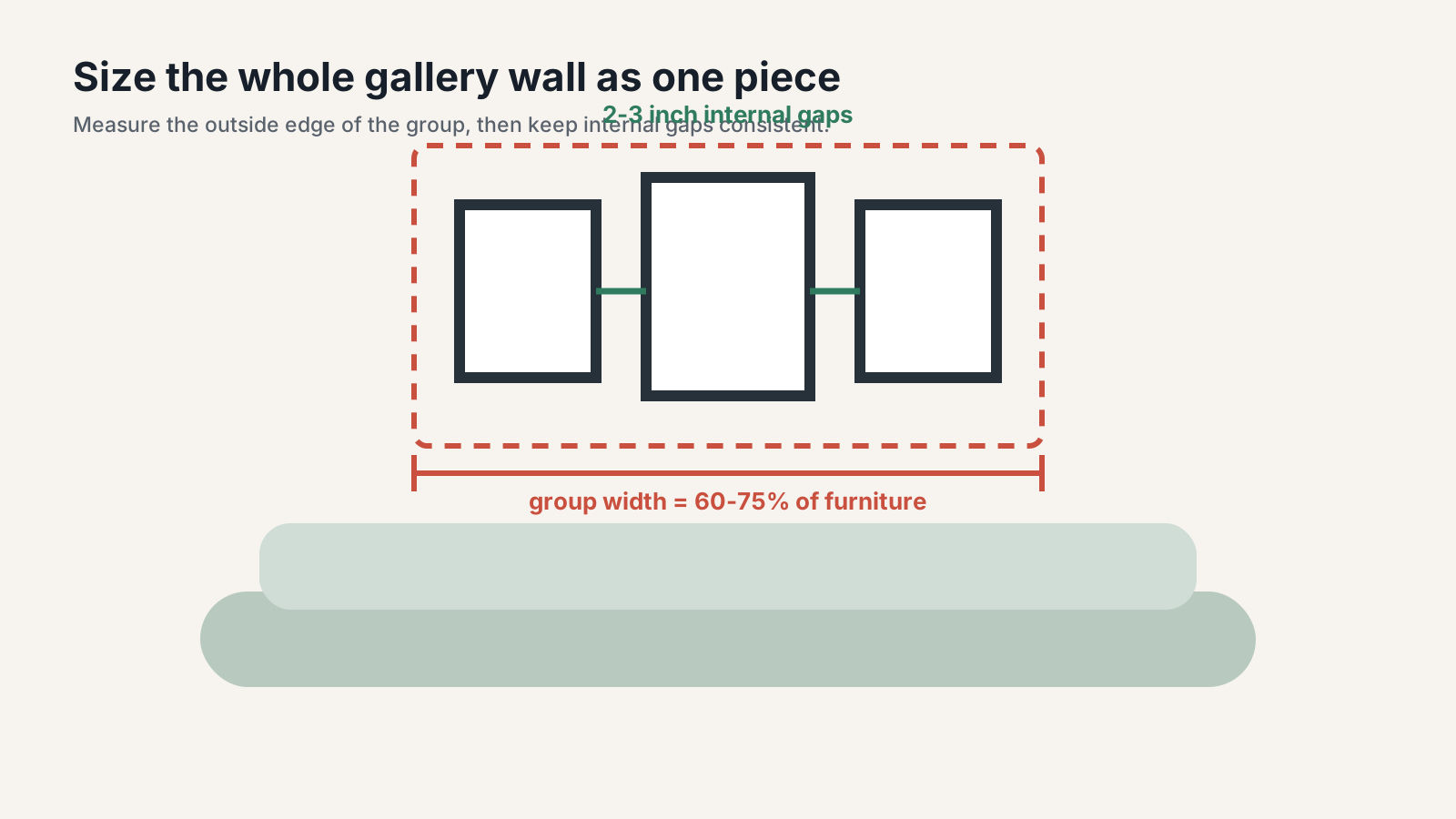
Treat the entire gallery wall as one artwork when sizing it against the room. The same rule that governs a single framed piece applies to a group: the total arrangement should span roughly 60% to 75% of the furniture width it sits above, or fill a proportional, comfortable zone on an open wall.
| Furniture width | 60% arrangement width | 75% arrangement width |
|---|---|---|
| 60 inches | 36 inches | 45 inches |
| 72 inches | 43 inches | 54 inches |
| 84 inches | 50 inches | 63 inches |
| 96 inches | 58 inches | 72 inches |
Center the whole group around the standard 57-inch eye-level rule — same as you would a single piece — treating the group's visual center, not any one frame's center, as the reference point. For the full mechanics of that rule, including the nail-height formula for wire-hung frames, see How to Hang Wall Art. Architectural Digest's guide to hanging a picture frame documents the same eye-level convention for single pieces, which extends directly to gallery groupings.
How do you plan the layout step by step?
- Measure the wall or furniture width you're working with.
- Choose the pattern — grid, salon, or linear — based on your frame collection and the shape of the wall.
- Decide the total footprint, using the 60% to 75% furniture-width rule as your target.
- Pick your gap width and hold it consistent across every pair of frames.
- Place the largest or most important piece first if you're doing a salon layout; for a grid, start from a corner and work outward.
- Tape paper templates to the wall — full-size cutouts of each frame, taped in position — before drilling anything. This is the single highest-leverage step: it turns an abstract plan into something you can stand back and actually look at.
- Center the group at 57 inches (or 6 to 10 inches above the furniture it sits over) and confirm the taped layout against that height.
- Export or record the installation coordinates. For a mixed collection, use Plan & Hang mode to number the frames, enter measured hardware offsets, and create a PDF or CSV plan before the first hole.
Better Homes & Gardens' guide to hanging pictures securely is a good reference for the hardware side of this once your layout is confirmed — weight-rated hooks and anchors matter more once you're committing to multiple holes instead of one.
How does a room mockup prevent costly mistakes?
Paper templates on the actual wall are the gold standard for confirming spacing and height. But they don't tell you how the arrangement will read against your furniture, wall color, and lighting before you've bought or framed the prints — and they don't help at all if you're planning the purchase, not just the hanging.
A room mockup fills that gap earlier in the process. Uploading your artwork into a realistic room scene, at true scale, lets you see the group against real furniture proportions before a single print is ordered or framed. That matters most when:
- You're deciding how many pieces to buy or print, not just how to arrange ones you already own.
- You want to test a grid versus a salon layout without committing to either.
- You're mixing frame colors or styles and want to confirm they read as intentional together.
- You're selling gallery-wall-ready print sets and need a listing image that shows the arrangement, not just one print in isolation.
Use the gallery wall mockups tool to preview a multi-frame arrangement in a real room at true scale before you buy frames, print anything, or pick up a hammer.
Key Takeaways
- Pick one layout pattern — grid, salon, or linear — before placing any frames; mixing patterns without intention looks accidental.
- Grid layouts are the easiest to plan and the pattern the gallery wall planner tool calculates directly.
- Keep spacing consistent, usually 2 to 3 inches between frames.
- Size the whole arrangement like a single piece: 60% to 75% of the furniture width it sits above.
- Center the group at the standard 57-inch eye-level height.
- Tape paper templates to the wall before drilling — it's the cheapest mistake-catcher available.
- Mock up the arrangement in a real room earlier in the process, before buying or framing prints, to test layout and frame choices without risk.
FAQ
What is the easiest gallery wall layout for beginners?
A grid layout with equal-sized frames and consistent spacing is the easiest to plan. The math is simple — pick a frame count, a gap width, and the arrangement follows directly, unlike a salon layout which needs more visual judgment.
How many frames should a gallery wall have?
There's no fixed number — it depends on the wall size and frame sizes. What matters more is that the total arrangement fits the 60% to 75% furniture-width guideline and uses consistent spacing throughout.
How high should a gallery wall be hung?
Center the entire arrangement around 57 inches from the floor, the same eye-level rule used for a single piece, or 6 to 10 inches above the furniture it hangs over. See How to Hang Wall Art for the full height formula.
Should all the frames in a gallery wall match?
No. A grid layout usually uses matching or similar frames for a clean look, while a salon layout intentionally mixes sizes and orientations — but it needs one repeated element, like frame color or mat style, to keep the mix from feeling random.
Can I plan a gallery wall without buying the frames first?
Yes — and it's the safer order of operations. Mock up the arrangement with your artwork in a real room at true scale using the gallery wall mockups tool before committing to frame purchases or printing.
Plan before you drill
Use the gallery wall layout planner to turn your frame count, wall width, and print sizes into a balanced starting arrangement. Continue in Plan & Hang to refine mixed frame sizes, exact gaps, obstacles, or a staircase and export a numbered installation plan, then switch to a realistic gallery wall mockup before buying frames or making a single hole.
For frame sizing details once your layout is set, see the complete guide to frame sizes for wall art. For the full picture of how gallery walls fit into a broader mockup strategy, see the complete guide to wall art mockups. If you're still deciding which tool to plan with, see Best Gallery Wall Layout Generators & Planners.