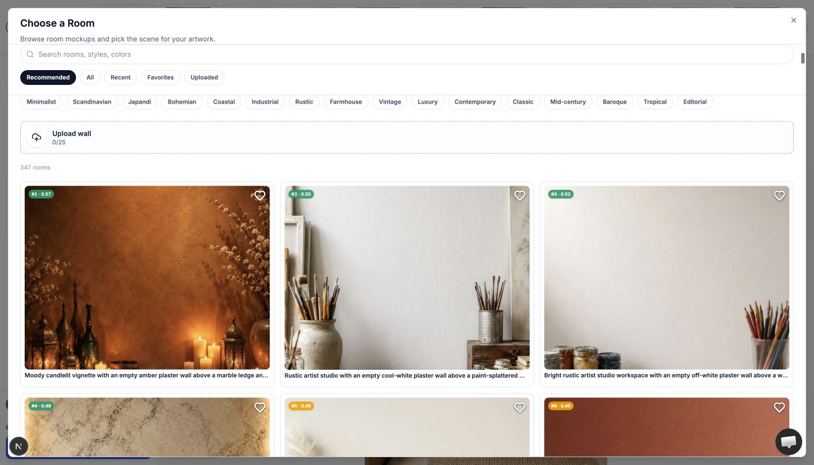
Choosing a room mockup can feel strangely harder than making the artwork. You open a library of beautiful interiors, try a bright living room, switch to a dark gallery, wonder whether the bedroom was better - and twenty minutes later the room has become the subject.
WallMockup’s Recommended view is designed to shorten that search. It looks at the artwork you have selected, removes rooms where the piece cannot sit comfortably, then ranks the remaining choices by proportion, shape, color harmony, and contrast.
Recommended gives you a shorter list of plausible rooms. You still make the final choice.
The short answer
Recommended Rooms follows one artist-friendly rule:
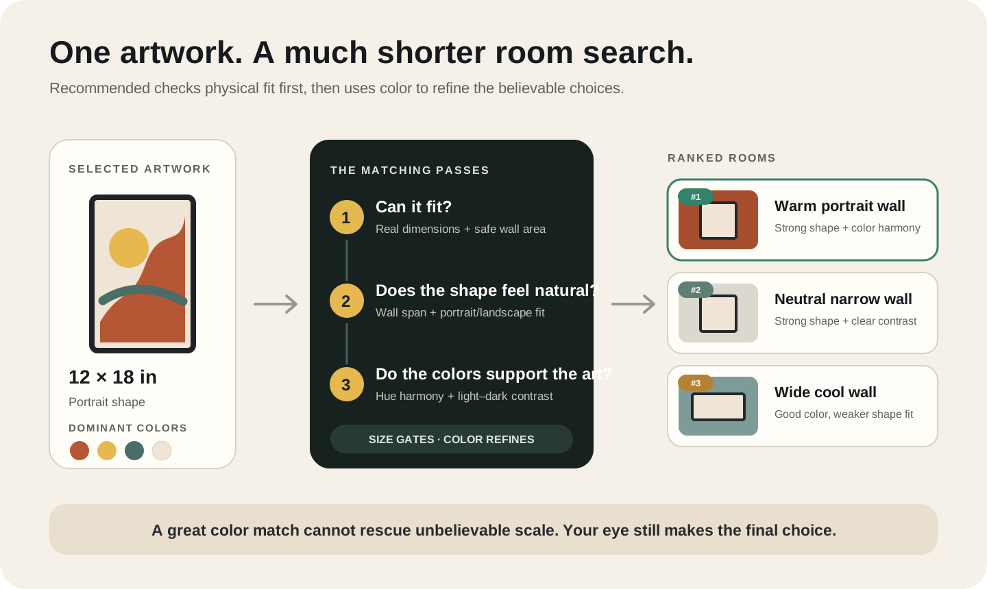
First make the artwork feel believable on the wall. Then make the artwork and room feel good together.
That order matters. A perfect color match cannot rescue a room where a small print looks like a postage stamp. Likewise, a correctly sized wall can still be a weak choice if the artwork disappears into it.
Table of Contents
- What does Recommended actually look at?
- How the recommendation algorithm works
- How color matching works
- What the recommendation score means
- Three practical examples
- How to use Recommended Rooms
- What happens when there is no strong match?
- What the algorithm does not know
- FAQ
What does Recommended actually look at?
The ranking uses four signals from the active artwork and each room:
- Real artwork size. A 12 × 18-inch print should not be treated like a 40 × 60-inch original.
- Artwork shape. Portrait work usually belongs in a taller display area; landscape work needs a wider one.
- Artwork colors. WallMockup reduces the image to a small palette of dominant colors instead of reacting to every individual pixel.
- The room’s wall colors. It considers the main wall surface and, more lightly, the colors around it.
The system does not use your identity, purchase history, export history, or another artist’s popularity to rank the rooms. It is a deterministic comparison between the selected artwork and the available walls: give it the same artwork dimensions and colors, and it produces the same order.
The feature is best understood as a recommendation algorithm. It measures visual compatibility without trying to interpret what the artwork means.
How the recommendation algorithm works
Step 1: WallMockup reads the selected artwork
After upload, the editor records the artwork’s proportions and extracts up to five dominant colors. Transparent pixels in a PNG are ignored, so an isolated illustration is judged by the visible art rather than its empty background.
The color reading happens in the browser and is saved with the artwork. WallMockup normally reuses that saved palette instead of analyzing the full-resolution artwork again each time you open Recommended.
If several artworks are in the editor, the ranking follows the currently selected artwork. Select another piece and the order can change immediately.
Step 2: It checks whether the artwork can fit comfortably
Every preset room has a measured wall and a safe display area - the usable part of the wall that avoids furniture, windows, doors, and other obstacles.
The first pass asks whether the artwork fits inside that area with a little breathing room. A room that requires the piece to touch the edge of a doorway is not treated as a comfortable match.
At this stage, the system is only checking whether the artwork fits. This prevents beautiful but impractical rooms from floating to the top.
Step 3: It judges proportion and shape
An artwork can fit and still look awkward. A 10-inch print may technically fit on a 15-foot wall, but it will probably feel lost.
For most rooms, the algorithm treats artwork that spans roughly 25% to 46% of the full wall width as a useful range, with about 33% as the starting ideal. Some rooms have a hand-tuned range because their architecture calls for a different proportion.
The match is continuous rather than pass/fail. A piece slightly outside the ideal range is gently lowered; a wildly undersized or oversized piece falls much farther.
Shape is scored in the same way. The artwork’s width-to-height ratio is compared with the room’s usable wall area. That is why a tall print tends to rise in a portrait-friendly entryway while a wide panorama tends to rise above a sofa or console.
Step 4: Color refines the plausible choices
Once size and shape make sense, the algorithm asks which rooms help the artwork read clearly. The final score works like this in plain language:
Final rank = size-and-shape fit × a color multiplier
Size is the gate. Color is the differentiator.
That design choice is deliberate. If color and size were simply added together, an amber artwork might rank a vast amber wall highly even when the print would look tiny. Multiplication makes a bad proportion difficult to hide.
How color matching works
Color matching involves more than finding a wall with the same hex code. Identical color is only one possible relationship, and often not the most interesting one.
WallMockup compares color in a perceptual color space, which is closer to how differences appear to the eye than raw red, green, and blue values. It looks for two things:
- Hue relationship: similar or analogous colors, complementary colors, and selected triadic relationships can all work.
- Light–dark separation: the artwork needs enough value contrast to remain visible on the wall.
Neutral walls are handled differently from saturated walls. A white, ivory, gray, or other low-color wall can support almost any hue, so contrast does more of the work. On a blue, green, rust, or pink wall, the hue relationship matters more.
The main wall surface carries most of the color decision. Smaller room accents - perhaps a chair, vase, or textile that echoes the artwork - can improve a match, but they cannot overpower a bad wall color.
This produces a useful creative result: a complementary wall can outrank a same-color wall when it separates the art more clearly.
What the recommendation score means
Every recommended room receives a rank badge such as #1 · 0.57. The first number is its position in the current list. The decimal is the combined fit score.
It is not a 57% chance that the room will sell the artwork. It is not a quality grade for your work, and scores from different artworks should not be compared as performance metrics.
The number is not on a 0–100 or percentage scale on purpose: size fit and color multiply together, so a strong match on both signals can still land well under 1.0. Read the decimal as a relative ranking signal, not as a completeness score.
Hover over a badge to see the useful parts behind it:
- Color match: how well the artwork palette and room colors relate.
- Size fit: the combined proportion and shape result.
- Size verdict: well proportioned, too small, too large, or the wrong shape.
- Wall span: how much of the wall width the art occupies compared with the room’s ideal.
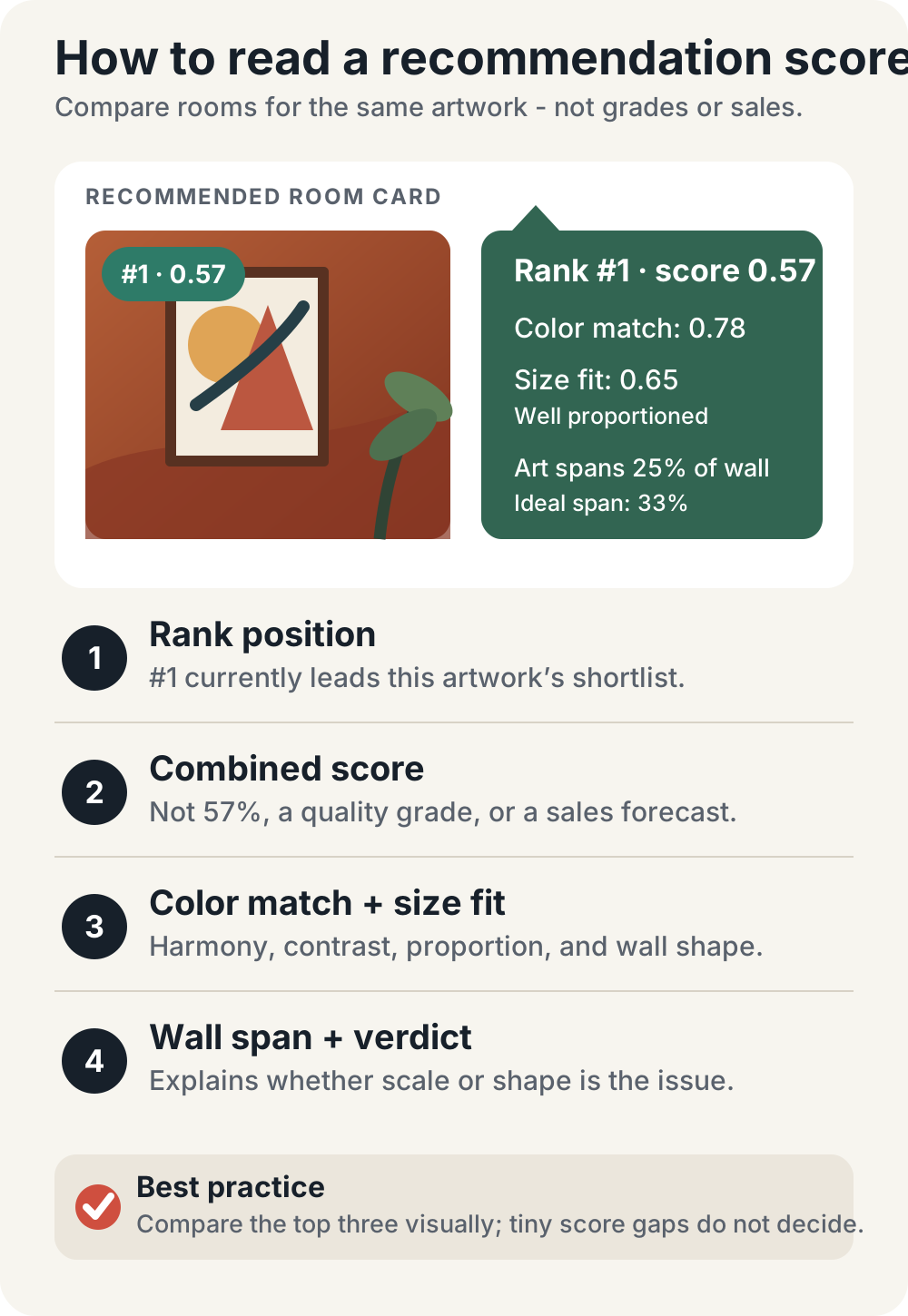
Treat small score differences calmly. A room at 0.57 is not artistically “better” than one at 0.55. The numbers are most useful for spotting a meaningful drop caused by poor scale, shape, or contrast.
Three practical examples
These examples are simplified, but they show the decisions the ranking is built to make.
| Artwork | What the algorithm notices |
|---|---|
| 12 × 18-inch warm portrait | Vertical shape, modest physical size, warm dominant colors |
| 8 × 10-inch pale botanical | Small size, gentle values, likely to disappear in a huge room |
| 24 × 16-inch cool seascape | Wide shape, larger width, blue-green palette |
Example 1: the portrait print
Imagine a 12 × 18-inch portrait with rust, cream, and dark brown. A large rust living-room wall might have the strongest color echo, but if the display area is very wide the portrait shape works against it. A smaller amber entryway can win because it preserves both the vertical composition and the warm palette.
Example 2: the small botanical
An 8 × 10-inch botanical may look lovely against an enormous ivory wall, yet the piece would occupy only a tiny fraction of that wall. Recommended lowers the large scene and surfaces smaller vignettes - perhaps above a chair, narrow table, or nightstand. If you really sell an 8 × 10 print, the mockup should not quietly turn it into a mural.
Example 3: the landscape photograph
A 24 × 16-inch blue coastal photograph has enough width for a sofa scene. A pale aqua wall may create an analogous palette, while a warm sand or muted terracotta wall may create stronger separation. Both can rank well if their proportions are similar.
Recommended is meant to create a shortlist. Your final choice can follow the collection’s mood, the buyer, or the storefront you are building.
How to use Recommended Rooms
1. Upload the finished artwork
Use the final crop and aspect ratio. The room ranking follows the visible file, so a white border, transparent background, or different crop can change the palette and shape it reads.
2. Enter the real print or artwork size
This is the most important input. If you type 24 × 36 inches for a print that is actually 12 × 18, the ranking will find rooms for the larger product you described.
If you are unsure what size the file supports, check it first with the print resolution checker.
3. Select the artwork you want to match
When the editor contains multiple pieces, click the one you are working on. Recommended always responds to the active artwork, including any dimension changes you make.
4. Choose Find Room → Recommended
The room browser will reorder the available scenes from strongest to weakest match. You can still select any room manually, regardless of its position.
5. Narrow by room type when it helps
If the buyer needs to imagine the work in a bedroom, office, kitchen, hallway, gallery, or living room, select that room type. Recommended keeps the room-type constraint and ranks the best matches inside it.
In Recommended mode, the algorithm takes over the size, orientation, wall-color, and style decisions so those filters do not narrow the ranking. Switch back to All when you want complete manual filtering.
6. Compare the top three, not only number one
Open the first few rooms and ask:
- Does the artwork remain the focal point?
- Is the scale honest for the product I sell?
- Does the room fit the collector I want to reach?
- Does it work with the other listing images in my shop?
The top-ranked room is the best mathematical fit. The best marketing image may be number two or number five because it better expresses your collection.
What happens when there is no strong match?
The catalog may not contain an ideal room for every artwork size. Very small pieces, extremely wide panoramas, unusually tall originals, or oversized work can create weak results.
WallMockup handles this in stages:
- It first looks for rooms where the artwork fits with comfortable breathing space.
- If none exist, it relaxes that margin and checks physical fit.
- If nothing fits at all, it still orders the closest options instead of returning an empty screen.
When the best combined score is weak, the editor says “Showing the best available matches.” If the dimensions do not fit any wall, it says so directly.
Use that message as a prompt to verify the artwork size, try a custom wall, or choose manually.
Custom uploaded walls can also join the ranking after the editor reads their colors. Because a custom image does not have the same hand-authored safe display area as a WallMockup preset, always check doors, furniture, lighting, and available wall space with your own eye.
What the algorithm does not know
Recommended is intentionally narrow. It does not know:
- what the artwork means;
- whether it belongs to a formal collection or a playful series;
- which buyer or interior designer you want to reach;
- whether the frame shown is included in the sale;
- whether a room matches the rest of your Etsy or Shopify storefront.
It also does not reward rooms simply because other artists used them more often. For aggregate product trends, see the separate analysis of the most-exported wall art mockup rooms.
Recommended can quickly identify rooms that fit the dimensions and palette. The final presentation decision stays with you.
Key takeaways
- Set the real artwork size and select the correct artwork before opening Recommended.
- Size and shape establish the plausible choices; color and contrast refine their order.
- Treat the score as guidance and compare the top few rooms with your own artistic and commercial judgment.
FAQ
Is WallMockup Recommended an AI algorithm?
No. It is a deterministic scoring system that compares the selected artwork’s dimensions, shape, and dominant colors with measured room walls and their color profiles. It does not generate a room or learn your taste.
Why did a neutral room rank above a room that matches my colors?
The neutral room may give the artwork stronger light–dark separation, a better shape match, or more believable scale. Exact hue similarity is only one kind of harmony.
Why do my recommended rooms change when I select another artwork?
Recommendations use the active artwork. Different dimensions, aspect ratios, and color palettes produce a different order.
Does a higher recommendation score mean the mockup will sell better?
No. The score measures visual fit inside the editor. It does not predict clicks, purchases, collector taste, or marketplace performance.
Can I use room filters with Recommended?
You can narrow the ranking by room type. Recommended handles size, orientation, wall color, and style itself; switch to All when you want to control every filter manually.
Can custom uploaded walls be recommended?
Yes. Once the editor can read the uploaded wall’s color profile, it can appear in the ranking. Check the result manually because custom walls do not have the same authored safe-area metadata as preset rooms.
Try it with one finished artwork
Open the WallMockup editor, upload one finished piece, enter the real size, and choose Find Room → Recommended. Compare the top three rooms before deciding.
For help choosing among that shortlist, continue with How to Choose a Wall Mockup for Your Art. For the rest of the listing workflow, see How to Create Wall Art Mockups Without Photoshop or the Complete Guide to Wall Art Mockups.