The best wall mockup makes your artwork easy to understand at its real size, keeps the art as the focal point, and gives the right buyer a believable place to imagine it. That may be a different room from the one you would choose for your own home.
In short: enter the artwork's real dimensions before opening the room library, match the display area's shape to the artwork's orientation, and pick the wall color for contrast rather than decoration. Everything else in this guide supports those three decisions.
The 60-second check below puts those decisions in a practical order.
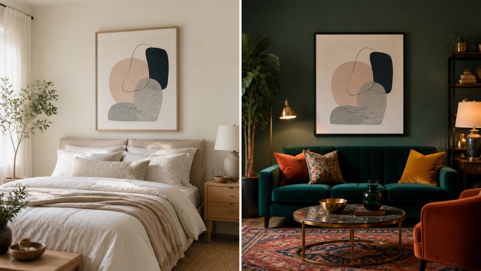
Table of Contents
- The 60-second wall mockup check
- Start with the product you actually sell
- Match the wall shape to the artwork
- Choose a room that makes the size believable
- Choose wall color by contrast, not decoration
- Match the room to the buyer
- Check furniture, styling, and empty space
- Match the frame, lighting, and shadow
- Choose differently for Etsy, Shopify, portfolios, and social media
- Six worked examples
- The three-room test
- Let WallMockup shortlist rooms for you
- Mistakes that make the wrong room look right
- Final checklist
- FAQ
The 60-second wall mockup check
Before you spend time choosing frames or shadows, ask five questions:
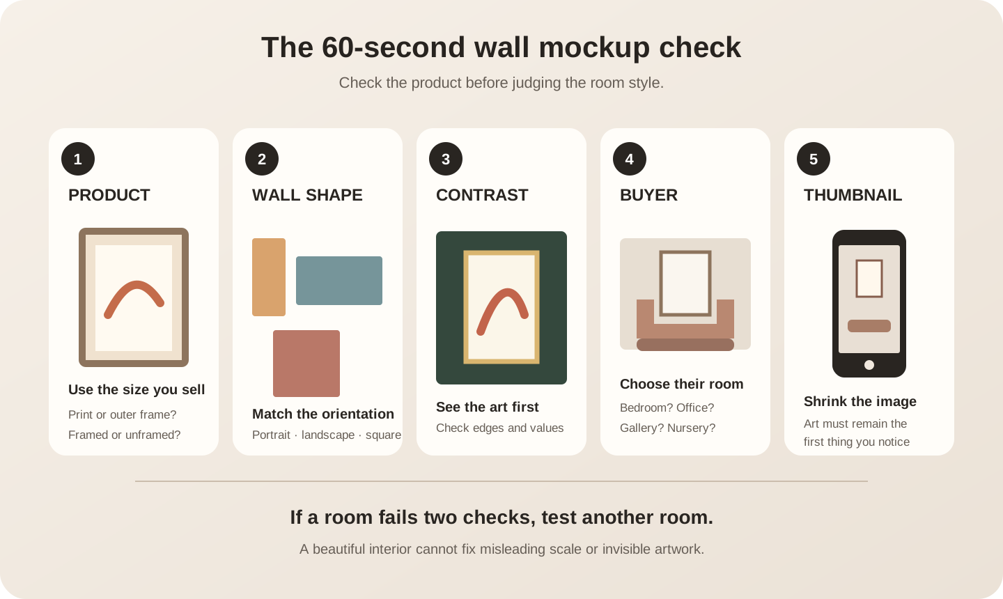
1. Is this the real product size?
Enter the dimensions of the print, canvas, or original you actually offer. If the listing is for an 8 × 10-inch print, judge rooms with the artwork set to 8 × 10 - not 24 × 30 because it fills the scene more dramatically.
2. Does the wall area share the artwork’s shape?
A portrait piece needs a display area with useful height. A landscape needs width. A square piece needs a centered area that does not force it into a narrow vertical gap or a panoramic composition.
3. Can you see the artwork immediately?
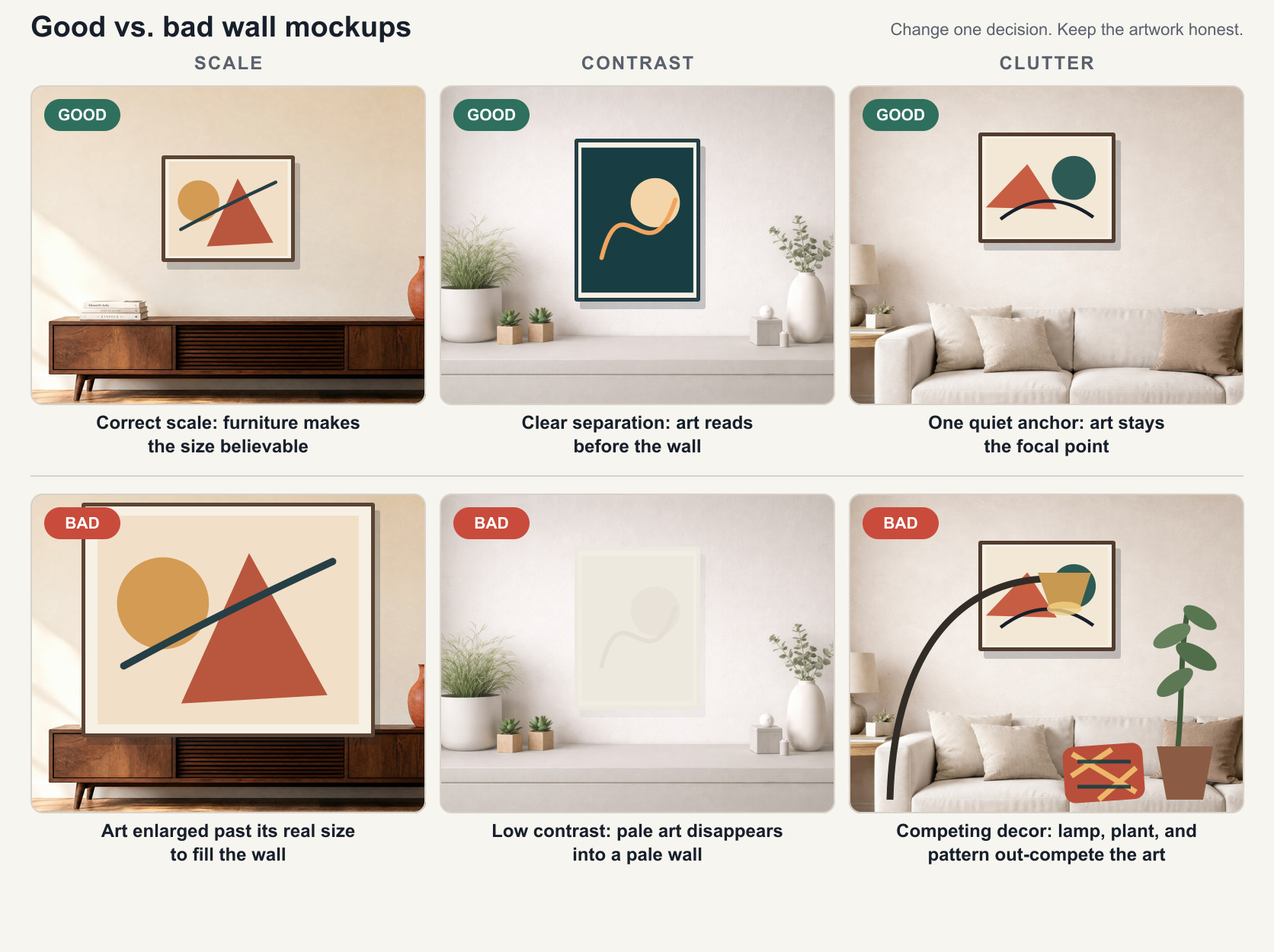
Look at the light and dark values as well as the hues. Pale line art can disappear on ivory. Dark photography can close up on charcoal. The artwork should separate from the wall before the viewer studies it.
4. Would the likely buyer recognize the room?
A nursery print should not need a luxury hotel corridor to make sense. A large formal abstract may feel under-positioned in a casual craft corner. The room should make the product promise more believable.
5. Does it still work as a small thumbnail?
Shrink the mockup to roughly phone-listing size. If you see the sofa, lamp, or wall texture before the artwork, choose a closer scene or a simpler wall.
If a room fails two of these questions, stop adjusting it and test another.
Start with the product you actually sell
Artists often choose the room first because the room library is visible and exciting. Reverse the process. Write down the product facts before opening the room browser:
- finished artwork width and height;
- whether those dimensions describe the print, outer frame, or canvas;
- portrait, landscape, or square format;
- framed, unframed, or display-frame-only;
- the main listing size if several sizes are offered;
- the buyer and sales channel for the image.
These facts prevent a beautiful mockup from quietly changing the product.
Print size is not frame size
A 16 × 20-inch print in a wide frame with a mat occupies more wall space than the paper alone. If you sell the frame, show the finished framed footprint. If you sell an unframed print, use a frame only as display context and state clearly that it is not included.
For detailed sizing, use the frame size guide. If you are unsure whether the uploaded file supports the advertised print size, check it with the print resolution checker before building the mockup.
Pick one main size for the hero image
When a listing offers five sizes, do not choose an unspecified “average-looking” scale. Decide which size the first image represents and label it in the listing. Supporting images can show the other sizes.
This keeps the hero mockup honest and makes comparison easier.
Match the wall shape to the artwork
Orientation is the fastest way to remove bad options.
Portrait artwork
Look for tall entryways, narrow walls beside doors, bedroom side walls, spaces between windows, or vertical gallery niches. The furniture should anchor the piece without forcing it to stretch sideways.
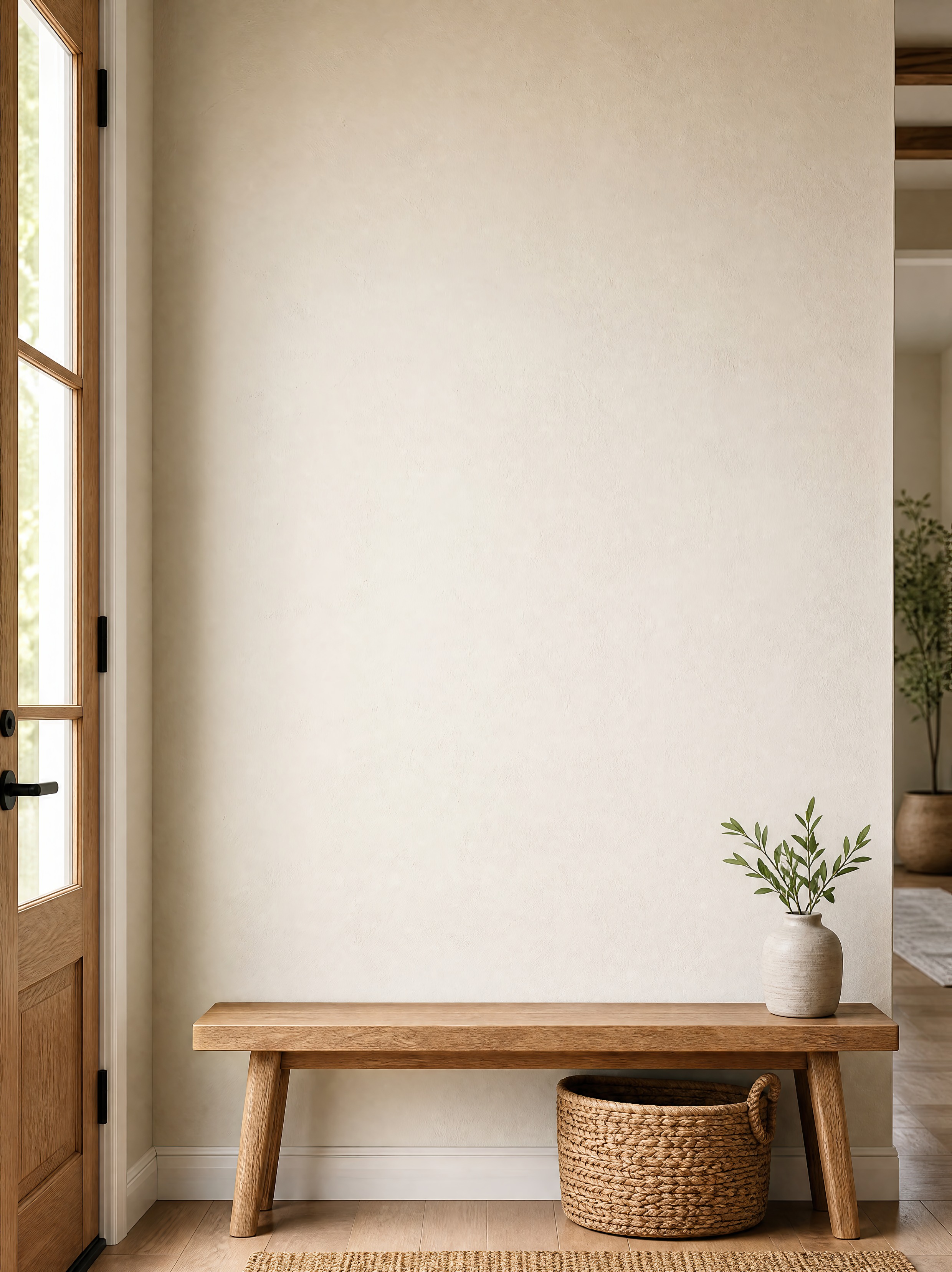
Good for: figurative paintings, vertical botanicals, fashion illustration, portrait photography, tall typography, and 2:3 or 3:4 prints.
Reject when: the room has plenty of height but the usable wall is extremely wide. A portrait can still look stranded in the middle of a landscape composition.
Landscape artwork
Look for broad walls above sofas, credenzas, beds, desks, or long benches. Check that lamps, shelving, and tall plants do not narrow the usable area more than the room first suggests.
Good for: landscapes, panoramas, horizontal abstracts, maps, cinematic photography, and wide typographic work.
Reject when: the only way to make the art visible is to enlarge it beyond the size you sell.
Square artwork
Square work is flexible, but it still needs a visual center. Console walls, centered chairs, fireplace walls, and symmetrical gallery settings usually support it better than narrow side walls.
Good for: graphic prints, album-inspired art, geometric abstracts, single florals, and square photography.
Reject when: the furniture creates a strong horizontal line that makes the square look too small, or the architecture creates a tall slot that makes it feel squat.
Sets and gallery walls
Judge the outside footprint of the full arrangement and include the gaps between frames. A three-piece set may have landscape proportions even when every individual print is portrait.
Use the gallery wall layout planner when the spacing and combined footprint matter.
Choose a room that makes the size believable
The room should tell the truth about scale before the buyer reads a number.
Furniture gives the eye a reference: a chair, desk, console, sofa, bed, or door. The closer that reference is to the artwork, the easier the size is to understand.
The comparison below shows the same console wall carrying a small, a medium, and a large print in turn - the print changes size, but the furniture stays fixed as the reader's scale reference across all three tiers described next.
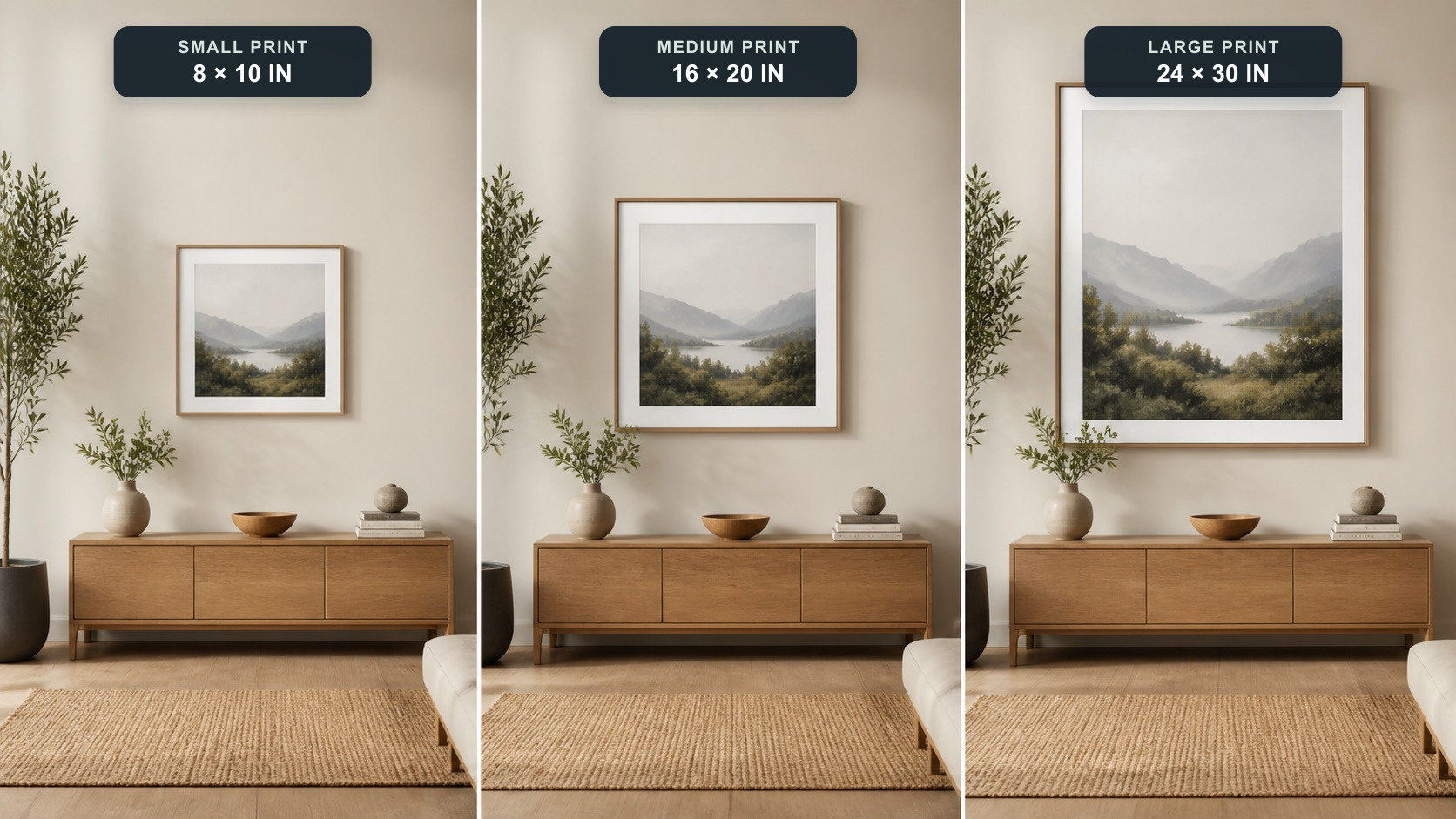
Small prints: 5 × 7, 8 × 10, and similar sizes
Choose close-cropped walls above a desk, chair, bedside table, shelf, or small console. A large empty living-room wall will make the product look weak or tempt you to misrepresent its size.
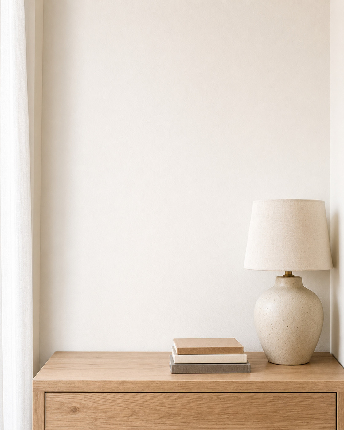
Small art does not need to look unimportant. It needs a scene where smallness feels intentional.
Medium prints: 11 × 14, 12 × 18, and 16 × 20
These sizes work in many entryways, offices, bedrooms, and console scenes. Choose a room where the art reads clearly beside the furniture.
Medium sizes are the easiest to overstate because they can be enlarged into almost any room. Keep the dimensions visible while comparing scenes.
Large prints: 18 × 24, 20 × 30, and 24 × 36
Living rooms, broad bedroom walls, larger offices, and gallery settings become believable. A large piece can carry more visual weight, but it still needs breathing room around the frame.
Leave breathing room around the artwork. That space helps it feel attached to the wall and makes the mockup more credible.
Oversized originals and statement work
Use rooms with architecture and furniture large enough to support the scale: galleries, hotel-style corridors, large living rooms, stair landings, or art-fair walls.

Check doors, ceilings, consoles, and light fixtures. Oversized art can technically fit while still feeling implausibly close to surrounding objects.
Choose wall color by contrast, not decoration
The wall color has one main job: help the artwork read.
Start with a neutral baseline
White, ivory, beige, greige, and light gray are useful first tests because they reveal the artwork without forcing a strong color story. They are especially helpful when:
- your collection contains many palettes;
- the art already has strong color;
- you want a consistent storefront grid;
- the frame and paper tone need to stay clear;
- you do not yet know the buyer’s interior style.
A neutral wall can still be the wrong choice. Pale artwork may disappear on it, and warm paper can look unexpectedly yellow against cool white.
Use a colored wall for a reason
A colored wall should do one of three things:
- Echo a color already in the work.
- Contrast with the dominant palette so the piece separates.
- Position the work for a particular mood or buyer.
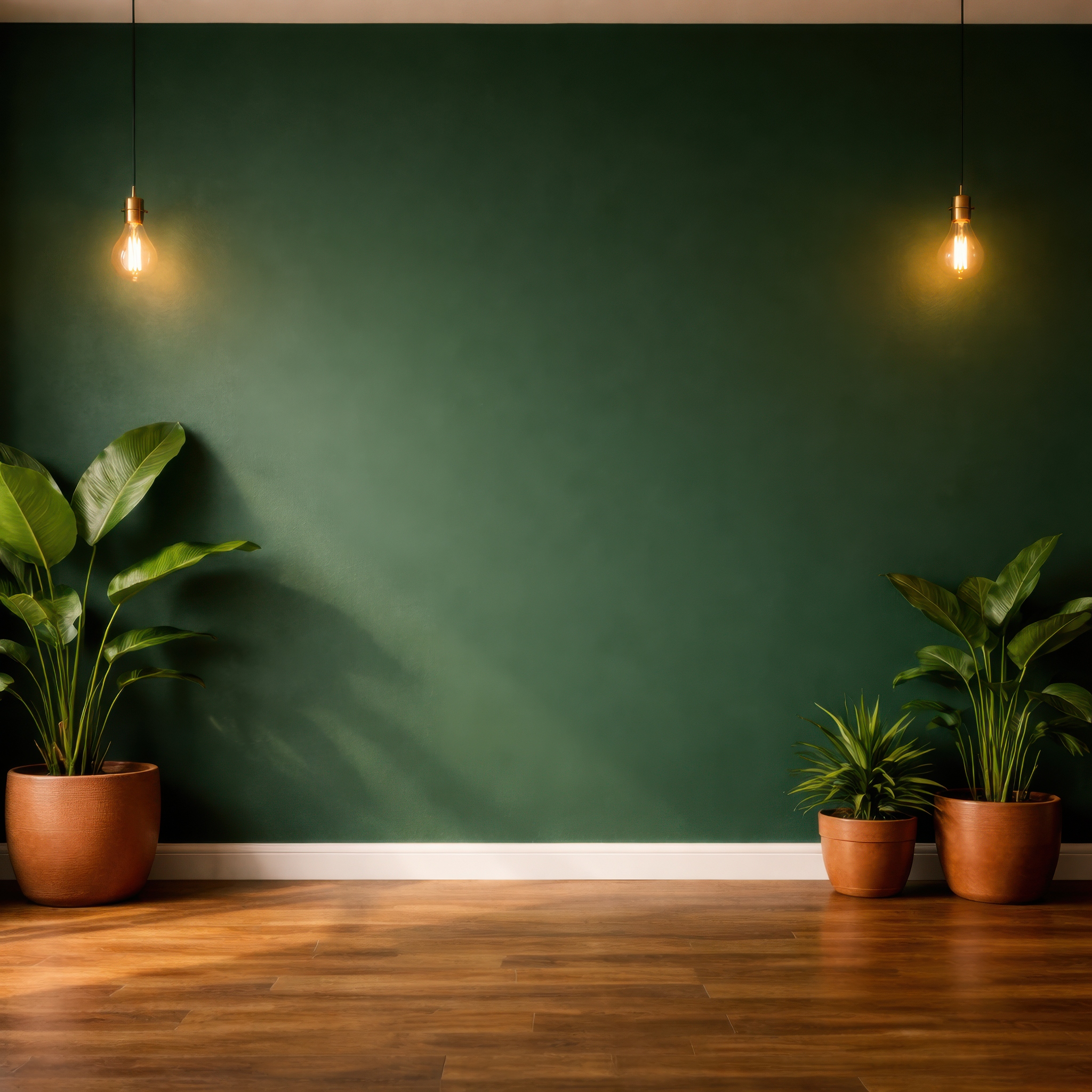
A dark green wall can make pale botanical art or warm graphic work feel vivid. The same wall may swallow a low-contrast forest photograph. The subject sounds compatible in both cases; the values decide whether it works.
I initially preferred the dark green room, but at Etsy thumbnail size the leaves disappeared. The plain ivory room was less dramatic and much clearer.
Check the edge of the artwork
Look where the print, canvas, mat, or frame meets the wall:
- A white border on a white wall may lose its outline.
- A black frame on charcoal needs a visible shadow or value shift.
- A beige mat against a warm beige wall can look muddy.
- A pale unframed print may need a darker wall to show its paper edge.
- A highly saturated wall can cast a visual color bias over delicate artwork.
If the boundary disappears, change the wall, frame, mat, or crop. Do not rely on a heavy artificial shadow to rescue it.
Similar color versus complementary color
An analogous room - blue art on a blue-gray wall - can feel calm and cohesive. A complementary room - blue art against muted terracotta - can feel more energetic and make the artwork jump forward.
Neither approach is universally better. Test both, then decide whether the listing needs calm belonging or immediate contrast.
Match the room to the buyer
Room type is a positioning choice. Ask where the buyer would realistically imagine the work and how that setting supports the product.
| Room | Often useful for | Watch for |
|---|---|---|
| Living room | Abstracts, photography, landscapes, statement prints, broad collections | Sofas can make small work look undersized; busy cushions can compete with color |
| Bedroom | Botanicals, gentle abstracts, figurative art, nursery-adjacent work, calm photography | Soft neutral rooms can wash out pale artwork |
| Office | Typography, maps, line art, architecture, photography, graphic prints | Desk objects and shelves can make the image feel cluttered |
| Kitchen or dining | Food illustration, still life, botanicals, playful graphics, warm abstracts | Marble, tile, flowers, and table styling can become the focal point |
| Hallway or entryway | Portrait prints, vertical photography, smaller originals, single statement pieces | Narrow architecture can make wide art implausible |
| Gallery | Originals, fine-art photography, premium editions, large or minimal work | A gallery can over-position an inexpensive small printable |
| Kids room or nursery | Children’s illustration, alphabet art, animals, soft graphics | Avoid props or styling that imply an age range the product does not fit |
| Small-art scene | 5 × 7, 8 × 10, mini prints, small originals | The close crop may not provide enough lifestyle context for a hero image |
Subject is only one clue. A floral painting can belong in a modern office, a dark dining room, or a quiet bedroom depending on its scale, palette, and buyer.
Check furniture, styling, and empty space
The room should support the artwork and make its size and style easier to understand.
Use one strong scale anchor
A bench, chair, console, bed, or sofa is enough. Multiple pieces of large furniture can make the wall feel busy and reduce the artwork’s importance.
Watch visual competition
Start by checking the objects nearest the artwork. A lamp that overlaps the display area, a plant at the same height, or shelving that cuts across the wall can create a second focal point.
Then look at the whole thumbnail. Strong cushion patterns, dramatic sunlight, or highly specific decor can take attention away from the art. Crop the scene or choose a quieter room when that happens.
Leave useful negative space
The artwork needs breathing room, but the listing image may also need space for marketplace cropping. Keep important furniture and the full frame away from the extreme edges.
For an Etsy hero image, a slightly closer room usually works better than a dramatic wide interior in which the artwork occupies a tiny part of the thumbnail.
Match the frame, lighting, and shadow
The wall may be right while the presentation still feels wrong.
Frame
Use a frame that matches either the product or the promise you clearly communicate.
Black frames often suit photography, graphic art, monochrome work, and modern rooms. White frames are quieter for illustrations and pale work, although they need visible separation from white walls.
Light wood brings warmth to botanicals, landscapes, Scandinavian rooms, and prints on warm paper. Dark wood supports traditional or moody work. Gold can give formal, vintage, or luxury positioning, but it may overstate a casual printable.
Mat
A mat makes smaller work feel deliberate and gives it more wall presence. It also changes the outer dimensions. Show it only when it matches the sold product or label it as display styling.
Lighting
The artwork and room should appear to share the same light. Warm evening light can change the perceived color of a cool print. Hard diagonal sun can add depth, but it may cross the artwork and obscure detail.
Shadow
Use the least shadow needed to attach the frame or canvas to the wall. A dark halo makes the art look like a floating sticker. Check the shadow direction against lamps, windows, and existing room shadows.
Choose differently for Etsy, Shopify, portfolios, and social media
Each sales channel places different demands on a wall mockup.
Etsy or marketplace hero image
Prioritize instant artwork recognition. Use a close or medium crop, quiet furniture, truthful scale, and enough contrast to survive a small search thumbnail. Avoid text overlays unless they answer an essential product question.
Shopify product page
Use one clear hero room plus supporting images: artwork close-up, size reference, frame status, and an alternate room. The room can be slightly more atmospheric because the buyer is already on the product page.
Portfolio or gallery page
Choose a restrained room that supports the work’s positioning. A gallery, minimal interior, or clean collector-style room can help. Include a straight artwork image as well.
Instagram, Pinterest, and vertical social
Choose a scene that crops cleanly to the platform’s shape. A portrait entryway may work better than a landscape living room even for the same portrait print. Keep the artwork away from UI-covered top and bottom zones.
Client preview
Accuracy matters more than storefront consistency. If possible, use the client’s own wall photo or a room close to their architecture and enter the exact artwork dimensions.
Six worked examples
Example 1: an 8 × 10-inch monochrome line drawing
Start with: a close white, ivory, pale gray, or light-wood scene above a chair, desk, or narrow table.
Why: the product is small and visually delicate. A close crop makes the scale intentional.
Test next: a muted colored wall if the white paper edge needs more separation.
Avoid: a wide sofa scene, a busy gallery wall, or a white frame on a white wall with no visible boundary.
Example 2: a 12 × 18-inch vertical botanical print
A tall entryway, bedroom side wall, or office wall is a sensible first test. The vertical architecture supports the shape, while a bench or desk makes the medium size believable.
I would also test a sage or dark green wall, but only while the leaves and background remain distinct. Green is not automatically the best setting for botanical art; an ivory or warm clay wall may show a dark green print more clearly.
Example 3: a 16 × 20-inch warm abstract
Start with: a neutral living room or bedroom using light wood, cream, or soft greige.
Why: a neutral baseline reveals whether the artwork carries the image on its own.
Test next: a deep green, muted blue, or rust room for stronger contrast and more premium positioning.
Avoid: repeating every artwork color in the cushions, rug, and wall. Too much coordination makes the room feel manufactured around the print.
Example 4: an 18 × 24-inch black-and-white photograph
Start with: a simple office, hallway, gallery, or contemporary living room with a light or mid-value wall.
Why: architectural simplicity supports photography, while a clear value difference preserves detail.
Test next: a dark wall with a white mat or light frame if you want a more dramatic presentation.
Avoid: dark frame + dark photo + charcoal wall unless each boundary remains readable at thumbnail size.
Example 5: a 24 × 36-inch landscape painting
Start with: a broad living-room, bedroom, console, or gallery wall.
Why: the large landscape shape needs width and furniture substantial enough to communicate scale.
Test next: an office or dining room if that better matches the buyer and subject.
Avoid: a narrow hallway or a room where lamps and plants reduce the usable wall to a portrait slot.
Example 6: a 20 × 20-inch bold square graphic
Start with: a centered console, chair, fireplace, or symmetrical gallery wall.
Why: square work benefits from a strong visual center and can tolerate more graphic room styling.
Test next: one colored wall that either echoes a secondary color or creates clear complementary contrast.
Avoid: a very wide sofa scene where the square becomes a small dot, or decor with equally bold patterns.
The three-room test
When you have too many choices, limit the comparison to these three rooms:
- Neutral baseline: a simple ivory, white, beige, or gray room that fits the artwork’s size and shape.
- Contrast alternative: a darker or colored wall that makes the artwork separate more strongly.
- Buyer-specific room: the bedroom, office, kitchen, hallway, gallery, or nursery most relevant to the product.
Export or preview all three at the same artwork size and with the same frame. Then compare:
- Which one shows the artwork first?
- Which one makes the size easiest to understand?
- Which one fits the buyer without narrowing the audience too far?
- Which one looks consistent with the rest of the collection?
If the neutral room wins, use it confidently. Clarity is a good reason to choose a restrained setting.
Let WallMockup shortlist rooms for you
With hundreds of rooms, the first pass is the slow part. WallMockup's Find Room → Recommended view does that pass for you: it reads the artwork you have selected, drops rooms where it can't sit comfortably, and orders the rest. You still pick the final room. The list just starts in a sensible place.
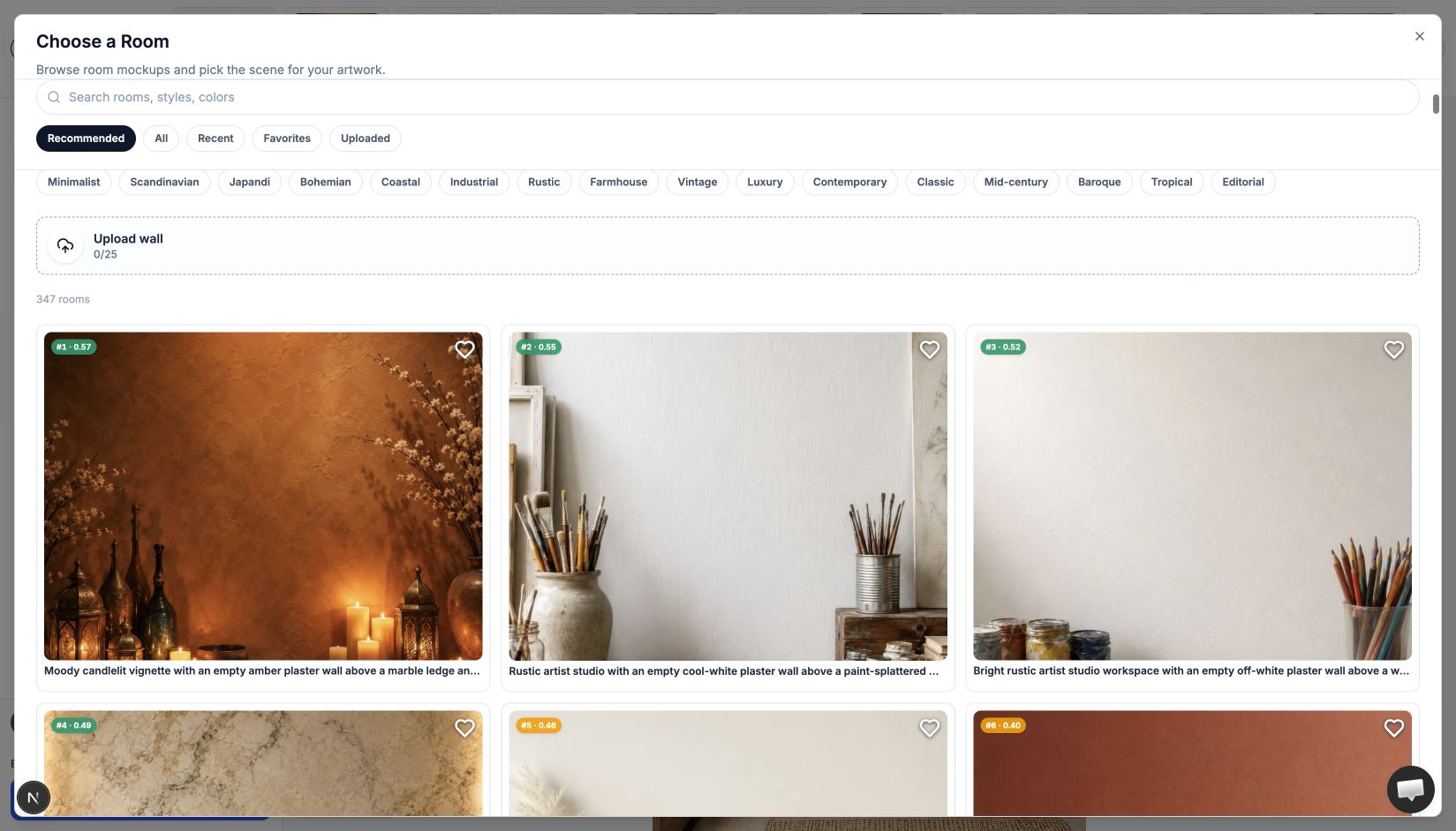
What it looks at
Four inputs, all from the artwork and the room, nothing about you:
- Real artwork size. A 12 × 18-inch print is not treated like a 40 × 60-inch original.
- Shape. Tall work rises in tall display areas, wide work in wide ones.
- Artwork colors. Up to five dominant colors, read in your browser after upload. Transparent PNG pixels are ignored.
- Wall colors. Mostly the main wall surface, with a lighter weight on the colors around it.
It doesn't use your purchase history, other artists' exports, or any idea of what the artwork means. Give it the same dimensions and colors twice and you get the same order.
Size first, then color
Every preset room has a measured wall and a safe display area that avoids furniture, windows, and doors. The first check is whether the piece fits there with some breathing room. The second is proportion: for most rooms, art spanning about 25% to 46% of the wall width scores well, with roughly a third as the starting ideal. A 10-inch print can technically fit a 15-foot wall and still look lost, so it drops.
Color only reorders the rooms that already make sense on size:
Rank = size-and-shape fit × a color multiplier
Because the two multiply, a perfect color echo can't rescue a room where the print looks like a postage stamp. Color is compared in a perceptual color space, and a complementary wall can outrank a same-color wall when it separates the art more clearly. On white, ivory, or gray walls, light-dark contrast does most of the work; on saturated walls, the hue relationship matters more.
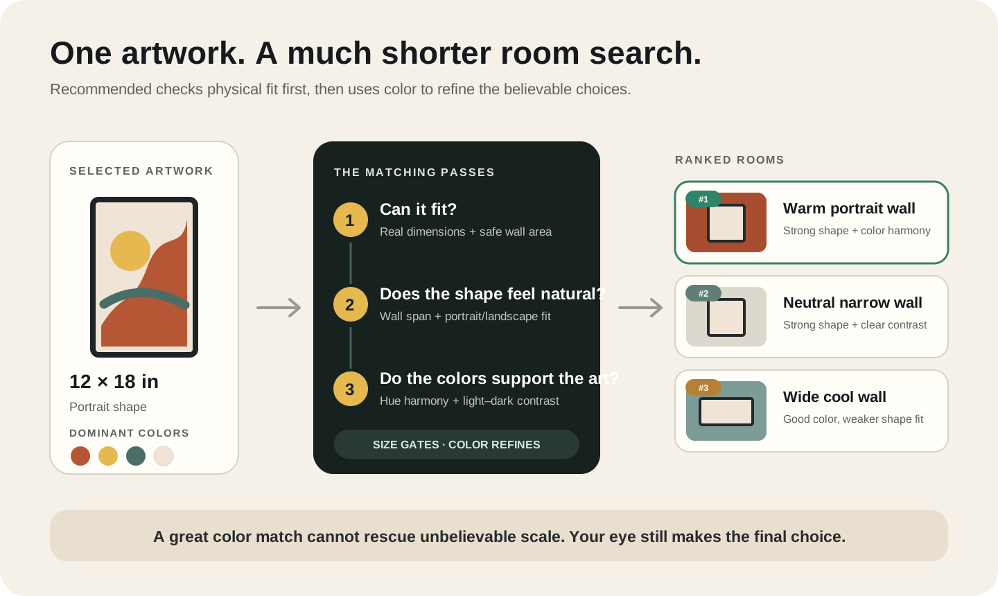
Reading the badge
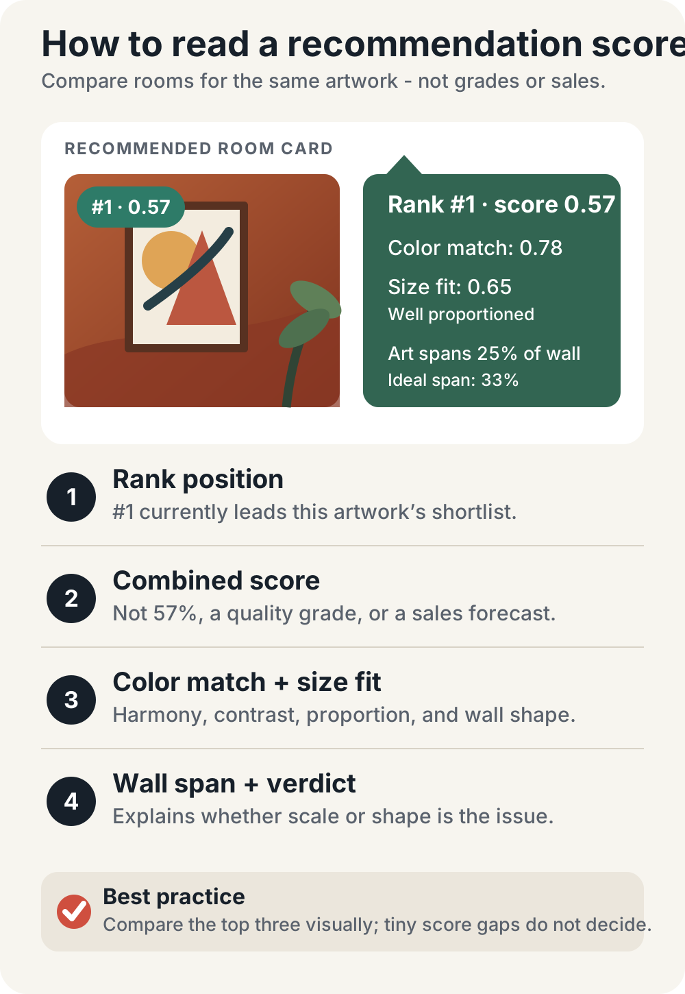
Each room shows a badge such as #1 · 0.57: its position, then the combined score. The score is a relative ranking signal. It is not a 57% chance of a sale and not a grade for your art, and scores from different artworks shouldn't be compared. A room at 0.57 isn't meaningfully better than one at 0.55; the number is useful for spotting a big drop caused by scale, shape, or contrast. Hover the badge to see color match, size fit, a size verdict, and how much of the wall the art spans.
Using it well
- Upload the final crop. A white border or a different crop changes the palette and shape it reads.
- Enter the real size. Type 24 × 36 for a 12 × 18 print and it will find rooms for a product you don't sell.
- Select the artwork you are matching if several are in the editor. The ranking follows the selected piece.
- Open Find Room → Recommended. Narrow by room type (bedroom, office, nursery) when the buyer needs that context; Recommended handles size, orientation, wall color, and style itself.
- Run the three-room test above on the top few results, not only on number one. The best listing image is sometimes number two or five because it suits the collection better.
When nothing fits well, for example a very wide panorama or an unusually small piece, it relaxes the breathing-room margin, then falls back to the closest options and tells you it is "Showing the best available matches." Treat that as a cue to double-check the size or upload your own wall. Custom walls can join the ranking once their colors are read, but they don't carry an authored safe area, so check doors and furniture yourself.
It also doesn't know your buyer, whether the frame is included, or what the rest of your storefront looks like. Those calls stay with you. For what other sellers actually pick, see the most-exported wall art mockup rooms.
Mistakes that make the wrong room look right
Enlarging the artwork until any room works
This is the most damaging shortcut. The mockup becomes attractive by promising a product the buyer does not receive.
Choosing by subject alone
Plants are optional in a botanical mockup, just as a beach house is optional for coastal photography. Repeating the subject in the decor can make the scene feel too literal.
Choosing the most fashionable interior
Japandi, coastal, luxury, or dark editorial rooms may look current, but a trend is useful only when it supports the artwork and buyer.
Using a room that is brighter than the artwork
If a dramatic window, marble counter, lamp, or patterned sofa attracts the eye first, the room is too competitive for a hero image.
Ignoring the shop grid
Ten excellent rooms can create one chaotic storefront. Reuse two or three primary room families across a collection, then add special scenes only when they answer a specific buyer question.
Fixing poor contrast with a heavy shadow
The wall, mat, frame, and artwork should separate naturally. A large black glow usually looks artificial.
Showing a frame the buyer thinks is included
If the product is an unframed print or digital file, state that clearly in the image set and description.
Final checklist
Before exporting, confirm:
- Are the artwork dimensions and finished frame footprint truthful?
- Do the display area and nearby furniture make the scale believable?
- Can you see the artwork before the decor at marketplace-thumbnail size?
- Do the frame, mat, lighting, and shadow represent the product honestly?
- Does the room fit the likely buyer and the rest of the collection?
If all five answers are yes, you probably have a strong wall mockup.
FAQ
What is the best wall color for an art mockup?
There is no universal best color. Start with a neutral wall, then test one contrasting or analogous color. Choose the wall where the artwork’s edge, values, and important details remain clearest.
Should the mockup room match the artwork’s colors?
It can, but it does not have to. Similar colors create cohesion; complementary colors create contrast. Avoid matching so closely that the artwork disappears into the wall or decor.
What room should I use for small art prints?
Use a close-cropped scene above a chair, desk, nightstand, shelf, or small console. Small work looks more intentional when nearby objects provide an appropriate scale reference.
Should portrait art always use a portrait wall?
Usually start there, but judge the usable display area rather than the room photo’s outer crop. A portrait can work on a wider wall when furniture or architecture creates a clear vertical zone.
How many room mockups should I use in one listing?
One or two strong room views are normally enough when the rest of the image set includes artwork detail, size information, frame status, and what the buyer receives. Every image should answer a different question.
Should I show my art larger to make the listing more attractive?
No. Show the real size represented by the listing. If several sizes are offered, label the size shown and add a separate comparison image.
Is WallMockup's Recommended view an AI algorithm?
No. It is a deterministic score that compares the selected artwork's size, shape, and dominant colors with measured room walls. It doesn't generate rooms or learn your taste.
Why did a neutral room rank above a room that matches my colors?
The neutral room probably gives the artwork stronger light-dark separation, a better shape match, or more believable scale. Matching hue is only one kind of harmony.
Does a higher recommendation score mean the mockup will sell better?
No. The score measures visual fit inside the editor. It doesn't predict clicks, purchases, or marketplace performance.
How can I choose quickly when there are hundreds of rooms?
Use the three-room test: neutral baseline, contrast alternative, and buyer-specific room. Or use WallMockup’s Recommended view to create the first shortlist, then apply the practical checklist in this guide.
Choose one room and test it now
Open the WallMockup editor, upload a finished artwork, enter the real dimensions, and compare three rooms: one neutral, one contrasting, and one chosen for the buyer.
Once the room is right, continue with How to Create Wall Art Mockups Without Photoshop for framing, shadow, and export steps.