
Published: October 10, 2026 · 11 min read
Most gallery wall ideas online are photos of someone else's living room. They look great and tell you nothing you can hang: which frames, how far apart, how wide the whole thing ends up. Every layout below comes with the frame sizes, the gap between frames, and the overall footprint, drawn to scale above real furniture widths. Seven of them open directly in the free gallery wall layout planner with those numbers already filled in, so you can change the wall width to yours and get hanging heights back.
Three numbers do most of the work in every layout here. The whole arrangement spans roughly two thirds of the furniture below it. Frames sit 2 to 3 inches apart. The bottom edge is 6 to 10 inches above the furniture; all the diagrams use 8.
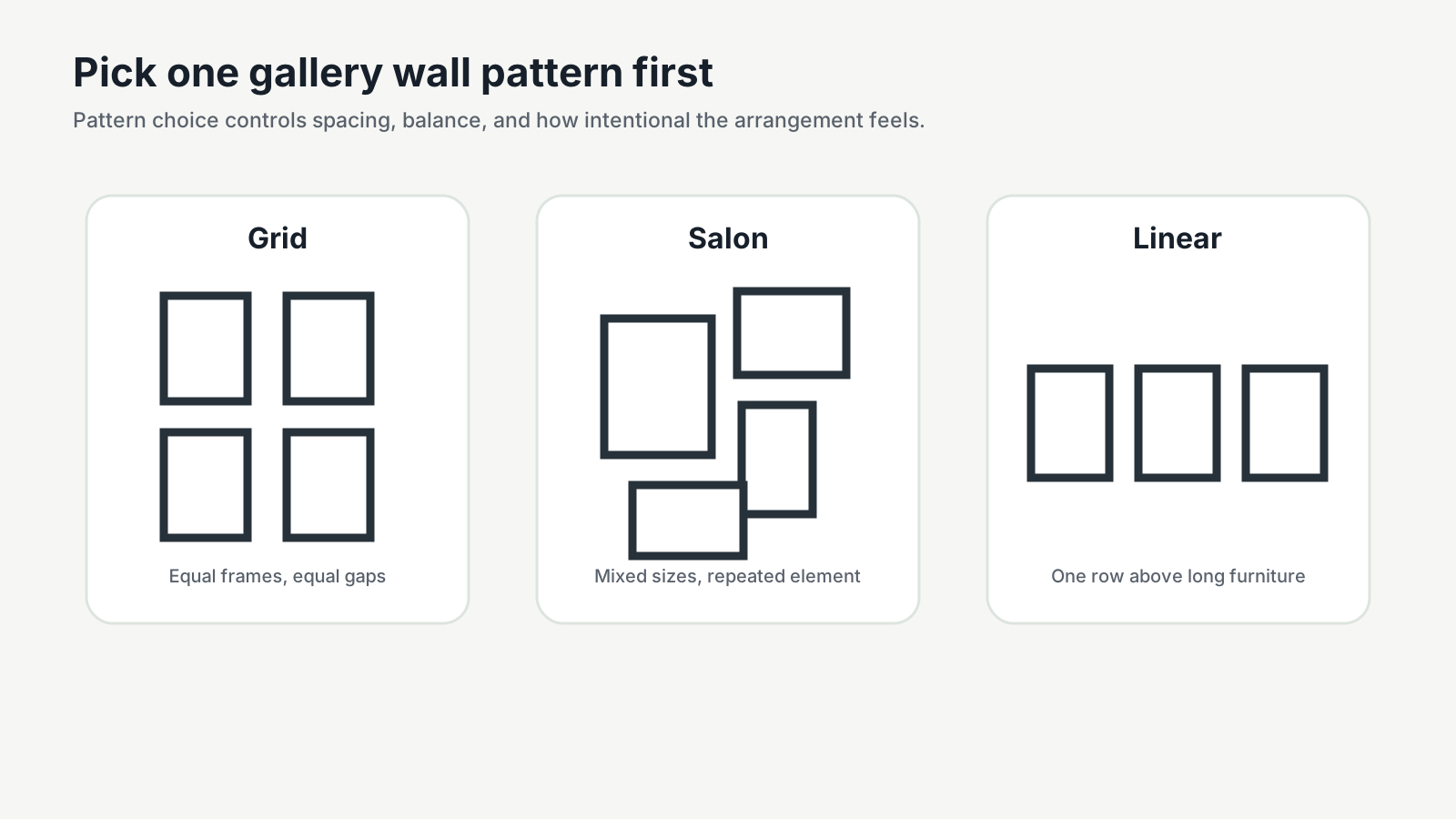
Table of Contents
- 1. Six-frame grid over a sofa
- 2. Two large prints over a sofa
- 3. Symmetric centerpiece with four small frames
- 4. Row of three over a bed
- 5. Nine-frame grid in an entryway
- 6. Eight small frames over a desk
- 7. Square frames in a nursery
- 8. Landscape grid in a dining room
- 9. Single column on a narrow wall
- 10. Salon wall with mixed sizes
- 11. Staircase gallery wall
- 12. Picture ledge you can rearrange
- How to choose between them
- FAQ
1. Six-frame grid over a sofa
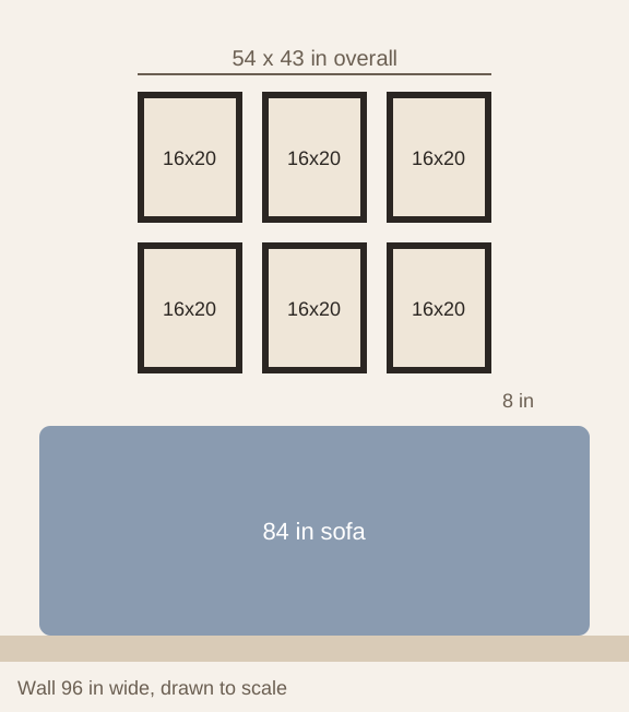
Frames: six 16x20 · Gap: 3 in · Overall: 54 x 43 in
The safest gallery wall there is. At 54 inches wide it covers almost exactly two thirds of an 84-inch sofa, and identical frames make it look tidy even if the art inside is mixed. Use the same frame color and the same mat width throughout. Open this layout in the planner.
2. Two large prints over a sofa
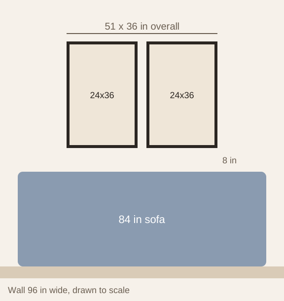
Frames: two 24x36 · Gap: 3 in · Overall: 51 x 36 in
Not a gallery wall in the busy sense, but it solves the same problem with two holes instead of twelve. A matched pair, such as two halves of a landscape or two related abstracts, reads as one deliberate piece. It is also the easiest layout to get level. Open this layout in the planner.
3. Symmetric centerpiece with four small frames
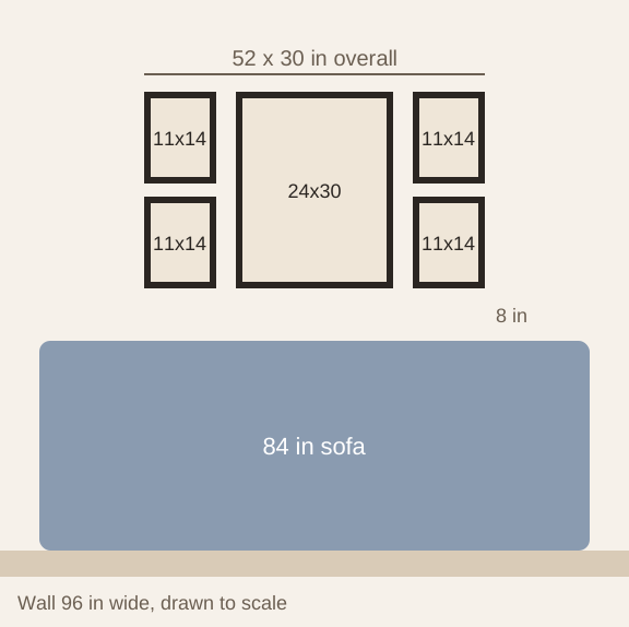
Frames: one 24x30, four 11x14 · Gaps: 3 in sideways, 2 in between the stacked pairs · Overall: 52 x 30 in
One strong piece in the middle, smaller ones balancing it. The stacked 11x14s add up to exactly 30 inches with a 2-inch gap, so their tops and bottoms line up with the centerpiece. That alignment is what makes it look planned. Hang the centerpiece first, then the four around it.
4. Row of three over a bed
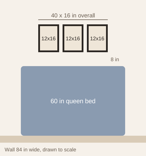
Frames: three 12x16 · Gap: 2 in · Overall: 40 x 16 in
A queen bed is about 60 inches wide, so 40 inches of art is the two-thirds mark. A single row keeps the wall calm above a headboard, which matters in a bedroom. If your headboard is tall, leave the 8 inches above the headboard, not above the mattress. Open this layout in the planner.
5. Nine-frame grid in an entryway
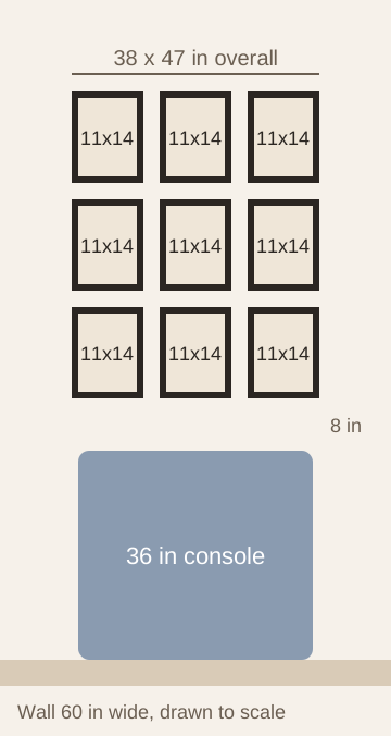
Frames: nine 11x14 · Gap: 2.5 in · Overall: 38 x 47 in
A tall grid suits an entryway or hall, where people walk past rather than sit in front of the wall. It is a little wider than a 36-inch console on purpose; a grid that runs past the furniture by an inch on each side still looks anchored. Good for a series: nine botanicals, nine city maps, nine photos from one trip. Open this layout in the planner.
6. Eight small frames over a desk
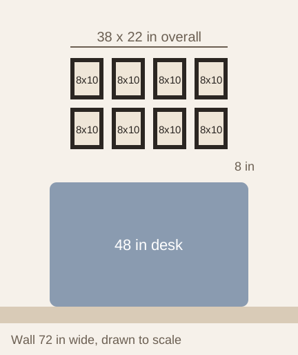
Frames: eight 8x10 · Gap: 2 in · Overall: 38 x 22 in
Small frames work above a desk because you sit close to them. Keep the bottom row high enough to clear a monitor; 8 inches above the desktop is usually too low here, so measure your screen first. Open this layout in the planner.
7. Square frames in a nursery
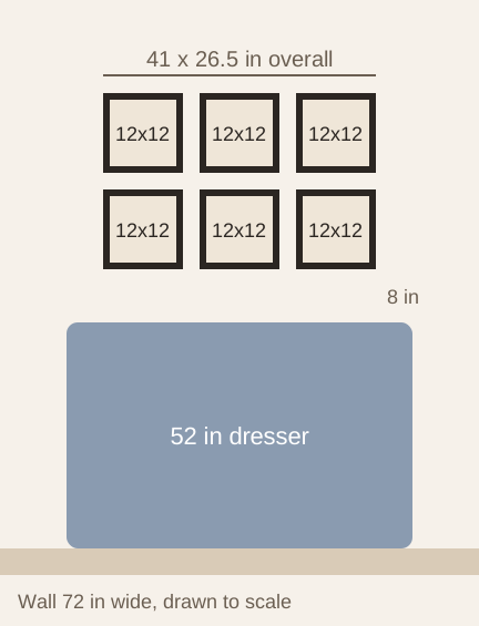
Frames: six 12x12 · Gap: 2.5 in · Overall: 41 x 26.5 in
Square frames are forgiving: there is no portrait or landscape decision, and alphabet prints, animal illustrations, and baby photos all fit. In a nursery, hang above a dresser or changing table rather than over the crib, and use frames with acrylic instead of glass. Open this layout in the planner.
8. Landscape grid in a dining room
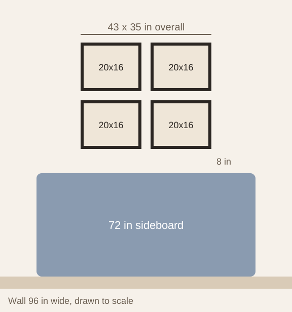
Frames: four 20x16, landscape · Gap: 3 in · Overall: 43 x 35 in
Landscape frames widen a wall and suit a sideboard or a long dining table. Four is enough here; a dining room is often lit from above, and more glass means more glare. Open this layout in the planner.
9. Single column on a narrow wall
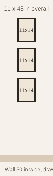
Frames: three 11x14 · Gap: 3 in · Overall: 11 x 48 in
The strip of wall between a door and a corner, or beside a window, is usually left empty. A vertical column of three fills it without crowding. Center the middle frame at about 57 inches from the floor and work up and down from there. This one is quicker by hand than in the planner, which prefers a wider grid for three frames.
10. Salon wall with mixed sizes
Salon walls, with frames of every size packed close together, are the gallery wall people picture first and the hardest to pull off. The trick is a hidden structure: keep one consistent gap (2 inches works well), keep the outer edge of the whole group roughly rectangular, and put the largest piece slightly off center rather than dead center. Mixing frame finishes is fine if one finish clearly dominates.
Lay the frames out on the floor first, photograph the arrangement from above, then trace each frame onto paper and tape the templates to the wall. The planner's Plan & Hang mode handles up to 24 mixed frames with measured positions if you would rather do this on screen.
11. Staircase gallery wall
A staircase wall is the one place the usual rules bend. Instead of centering at 57 inches from the floor, keep the center of each frame about 57 inches above the stair tread directly below it, so the group climbs at the same angle as the stairs. Start with the frame at the middle of the run, then work up and down. Equal frames in a diagonal line are easier to get right than a salon cluster on a slope. The planner's Plan & Hang mode includes a stair setting that keeps the rise consistent.
12. Picture ledge you can rearrange
If you change art often, or rent and want fewer holes, mount one or two picture ledges and lean frames on them. Overlap frames slightly, put taller pieces at the back and ends, and keep the total width at the usual two thirds of the furniture below. It is the only layout here you can redo in five minutes.
How to choose between them
| If you want | Choose |
|---|---|
| Hard to get wrong | Grid (1, 5, 6, 7, 8) |
| Fewest holes | Pair (2) or ledge (12) |
| A focal point | Symmetric centerpiece (3) |
| A calm bedroom | Row of three (4) |
| A collected, personal look | Salon (10) |
Whatever you pick, try it on the actual wall before drilling. Paper templates catch spacing mistakes. A room mockup catches the bigger ones: whether the art you have in mind works at this size in this room. For the step-by-step process, see how to plan a gallery wall layout; for hanging heights and hardware, how to hang wall art.
FAQ
How far apart should frames be in a gallery wall?
2 to 3 inches between frames works for most gallery walls. Go tighter, around 2 inches, for small frames and salon walls, and up to 3 inches for large frames. Keeping the gap consistent matters more than the exact number.
How big should a gallery wall be over a sofa?
Aim for about two thirds of the sofa's width. For an 84-inch sofa that is roughly 54 to 56 inches, which six 16x20 frames in a three by two grid with 3-inch gaps hit almost exactly.
How high should a gallery wall hang?
Leave 6 to 10 inches between the top of the furniture and the bottom of the arrangement. On an open wall with no furniture, center the whole group at about 57 inches from the floor.
What is the easiest gallery wall layout?
A grid of identical frames with equal gaps. The math is simple, the result looks intentional even with mixed artwork, and the free gallery wall layout planner can calculate it for any wall width.
How many frames should a gallery wall have?
Most living room gallery walls use 6 to 9 frames. Fewer, larger frames read calmer and need fewer holes; more, smaller frames suit an entryway, a hallway, or a salon look.