Updated: July 8, 2026 · 10 min read
Art mockups for online selling work when they remove buyer uncertainty: size, room fit, frame expectations, print quality, and what is included. Use this page as a hub for your listing-image system: choose the right mockup type, show honest scale, connect supporting images, and link every mockup back to a clear product promise.
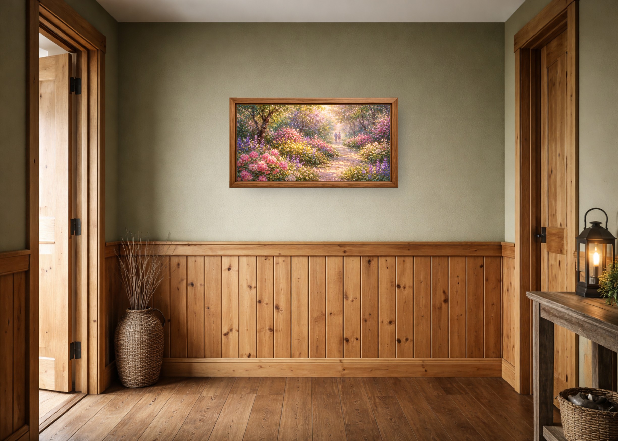
Table of Contents
- What is an art mockup for online selling?
- Which mockup types do online art sellers need?
- What should a good art mockup show?
- How do mockups fit into a complete listing image set?
- How do you keep mockups honest and buyer-safe?
- What tools and guides should artists use next?
- When are mockups not enough to improve sales?
- Key Takeaways
- FAQ
What is an art mockup for online selling?
An art mockup is a staged product image that places artwork in context: on a wall, in a frame, above furniture, inside a gallery wall, or beside size information. For online selling, the mockup's job is not decoration. It is product communication.
Buyers cannot hold the print, stand back from the wall, or test the frame in their room. They judge from images. A strong mockup makes the product easier to understand before the buyer reads the full description.
Simple definition: an online-selling mockup turns a flat artwork file into a buyer-facing product preview.
Use a dedicated wall art mockup generator when accurate wall scale matters. General design tools can be useful, but they often treat wall art like a decorative template instead of a size-sensitive product.
Which mockup types do online art sellers need?
Most sellers do not need every possible mockup type. They need the types that answer the buyer's main objections. For wall art, those objections are usually scale, room fit, product finish, and clarity about what ships.
| Mockup type | Best use | Buyer question answered |
|---|---|---|
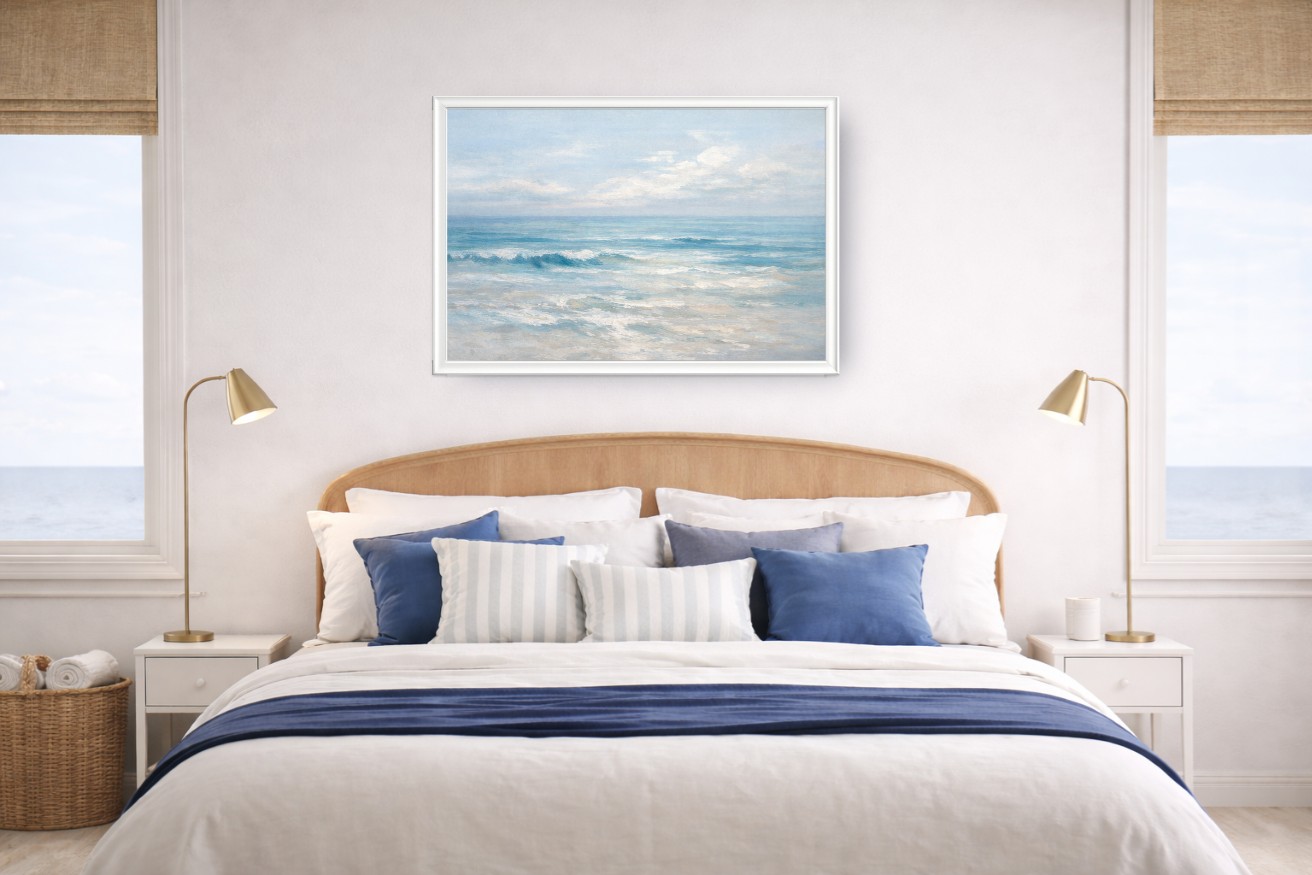
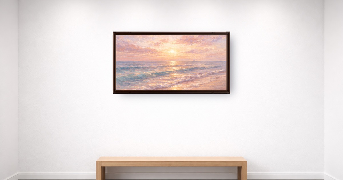
| Hero room mockup | First listing image and ads | Will this look good in a real room? |
| True-scale size mockup | Large prints and furniture placement | How big will this feel on my wall? |
| Frame mockup | Framed or display-only print listings | What finish should I expect? |
| Gallery wall mockup | Sets, bundles, and collections | How do these pieces work together? |
| Detail or crop image | Fine art, photography, texture, linework | What does the artwork look like up close? |
If you sell on Etsy, pair this with the How to Sell Art Prints on Etsy guide. If you sell from your own site, keep the same principle: every image needs a job.

What should a good art mockup show?
A good art mockup shows real scale, a believable room, a frame that matches the offer, clean artwork detail, and enough simplicity for the art to remain the focus. It should help buyers make a decision without creating a promise the product cannot keep.
| Quality signal | What it looks like | Why it matters |
|---|---|---|
| True scale | Print size matches the listed dimensions | Reduces disappointment and returns |
| Buyer-fit room | Room matches the niche, style, and likely use case | Helps shoppers imagine ownership |
| Honest frame | Frame shown only if included or clearly display-only | Prevents expectation mismatch |
| Sharp export | Artwork stays clean when the listing image is opened | Builds trust in print quality |
| Consistent style | Rooms, frames, and crops repeat across a collection | Makes the shop feel intentional |
For the sales psychology behind those signals, read Why Realistic Mockups Increase Art Sales.
How do mockups fit into a complete listing image set?
One mockup rarely carries the full sale. A complete listing image set should move from emotion to clarity: first show the art in a room, then show detail, size, included product, and optional variations.
| Image order | Image role | Use this when... |
|---|---|---|
| 1 | Hero mockup | You need the product to earn the click |
| 2 | Close-up or flat artwork | Buyers need to inspect design detail |
| 3 | Size comparison | You offer multiple dimensions or large prints |
| 4 | What is included | The product is digital, unframed, or configurable |
| 5 | Alternate room, frame, or set view | You want to show styling range without confusion |
Etsy's Seller Handbook overview of product photography is a useful baseline: sellers need multiple photo types because buyers need multiple kinds of information. For wall art, the product-specific version is scale, frame, detail, and room fit.
How do you keep mockups honest and buyer-safe?
Honesty is not only ethical; it is conversion work. Buyers are more likely to purchase when they understand what they will receive. Misleading frames, wrong scale, vague digital-download notes, and oversaturated room scenes create friction.
Keep mockups honest by matching the image to the offer:
- If the frame is not included, label the frame as display-only.
- If the product is digital, show that the buyer receives files.
- If colors may vary by monitor or printer, say that in the listing copy.
- If you show multiple sizes, make the size relationship visible.
- If the room is decorative, keep the art prominent and readable.
For print-size decisions, use the common frame sizes guide and the poster size guide before creating listing images. For hanging-height context, use How to Hang Wall Art.
What tools and guides should artists use next?
This hub connects the core online-selling tasks: make mockups, choose sizes, verify resolution, understand Etsy images, and compare tools. Start with the task that blocks the next listing.

| Need | Use this | Why |
|---|---|---|
| Create listing mockups | WallMockup editor | Make true-scale room previews quickly |
| Choose print sizes | Frame size chart | Pick buyer-friendly, frame-ready dimensions |
| Check printable quality | Print resolution checker | Avoid promising sizes your file cannot support |
| Compare mockup tools | ArtPlacer vs WallMockup vs Placeit | Choose based on workflow, not brand familiarity |
| Build Etsy image sets | Etsy art print mockups | Turn mockups into a complete listing carousel |
| Understand buyer psychology | How mockups build buyer trust | Learn why room fit and honesty affect whether buyers say yes |
If you are still choosing software, the new best art mockup tools guide compares dedicated wall art editors, broad template tools, and Photoshop workflows.
When are mockups not enough to improve sales?
Mockups improve presentation. They do not create demand by themselves. If your listing gets no impressions, work on niche, keywords, title, category, and attributes. If it gets impressions but no clicks, improve the first image and title. If it gets favorites but no sales, check price, shipping, product clarity, reviews, and trust signals.
Mockups are strongest when the product already has a clear buyer. They make a good product easier to understand. They cannot rescue an unclear niche, a weak offer, or a file that is not ready to print.
Use Etsy's Keywords 101 as a search-side companion to this visual system.
Key Takeaways
- Art mockups for online selling should reduce uncertainty, not decorate the listing.
- The core buyer questions are scale, room fit, frame status, detail, and what is included.
- A complete image set is stronger than one beautiful hero mockup.
- Honest scale and product clarity protect buyer trust.
- Use this hub to connect mockup creation, sizing, resolution checks, Etsy images, and tool comparisons.
FAQ
What is an art mockup?
An art mockup is a product image that places artwork in a room, frame, wall, or listing context so buyers can understand scale and style before purchasing.
Do mockups help sell art online?
Yes, when they make the product clearer. Mockups help buyers understand size, room fit, frame expectations, and whether the print matches their space.
What kind of mockup is best for wall art?
A realistic room mockup with true-scale sizing, a simple frame, and a quiet background is usually best for wall art listings.
Are mockups misleading?
They can be if they show a frame, size, or finish the buyer does not receive. Use honest scale and clear labels for digital files, unframed prints, and display-only frames.
How many mockup images should one listing use?
Use three to five focused images: a hero room mockup, close-up, size reference, what-is-included image, and one alternate room or frame view.
Build the next listing image
Open the WallMockup editor, upload one finished artwork file, set the real print size, and export one honest hero mockup. Then add the supporting images that answer size, detail, and product-inclusion questions.
See also: The Complete Guide to Wall Art Mockups for how this selling hub fits into the full mockup workflow.