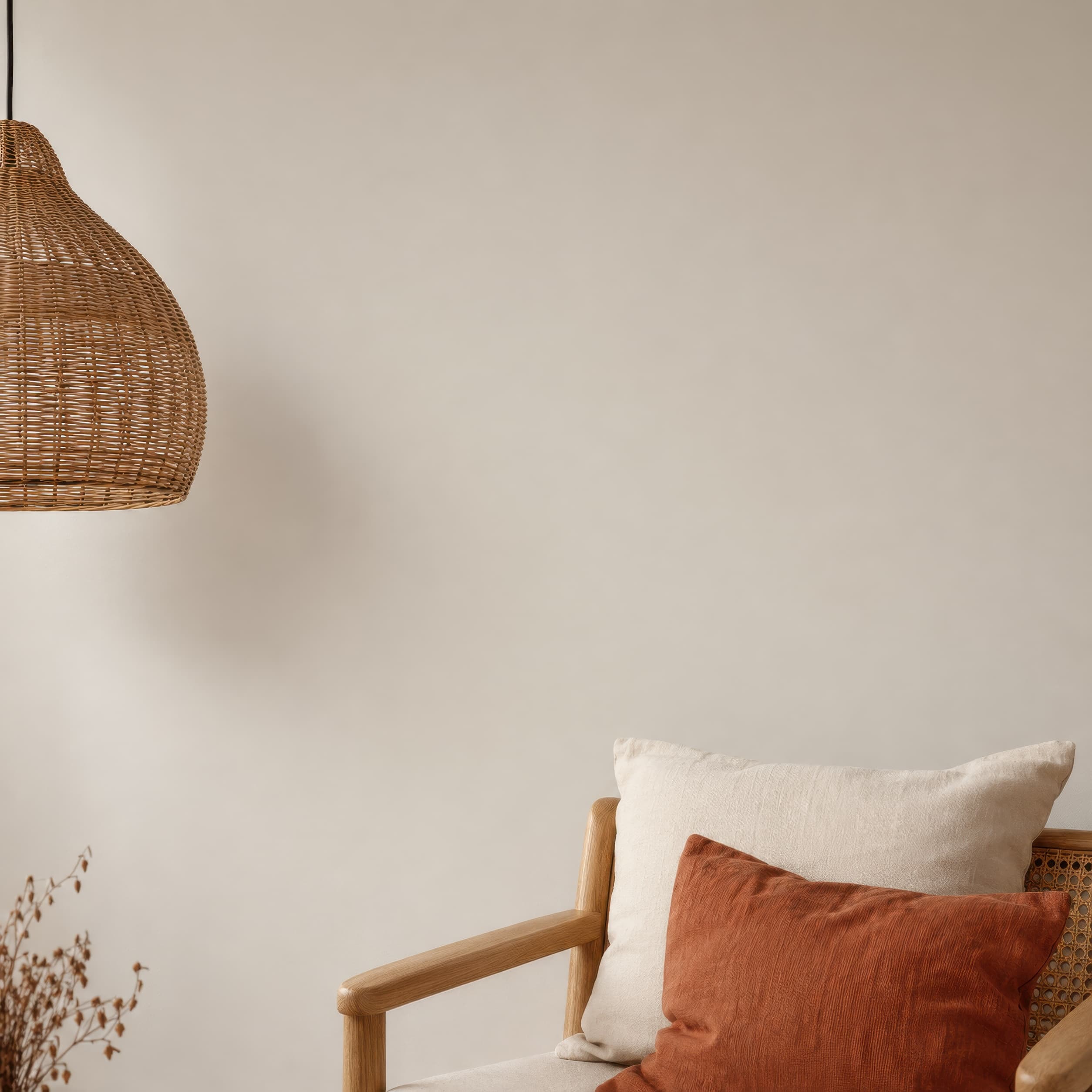
Room pick 1
Small chair against Scandinavian wall
Calibrated wall reference: 48 × 48 in (122 × 122 cm)
Try this room in the editor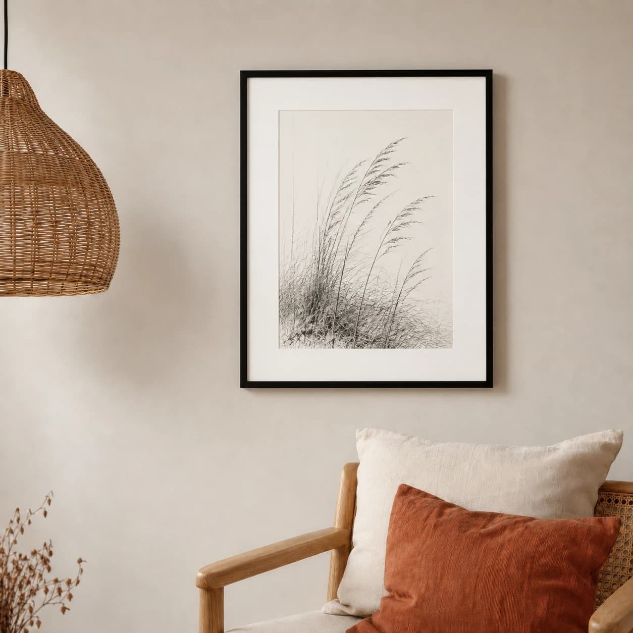
Blank-wall mockups
A blank-wall mockup is useful when a styled room says too much. Choose a wall with just enough furniture, floor, or architectural detail to prove scale, then let wall color, texture, and a restrained frame shadow separate the product from the background.
Exact room opens in the editor · 70 compatible presets · PNG, JPG, and WEBP export
Best for
Inspiration of use
These generated inspiration examples use the same top-ranked WallMockup rooms available below. Compare the scale, frame, and layout choices, then open the matching blank room to replace the example art with your own.
16 × 20 in / 41 × 51 cm print · black frame · 2 in mat
The mat protects the delicate drawing from the wall tone and the chair keeps the 16 × 20 scale easy to judge.
Try this exact room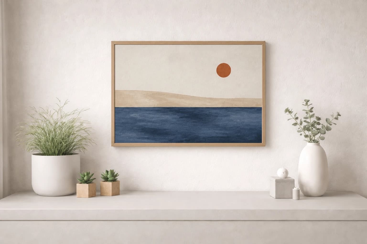
18 × 12 in / 46 × 30 cm landscape · oak frame
The low horizon follows the furniture width while the oak frame relates to the small wood accessories.
Try this exact room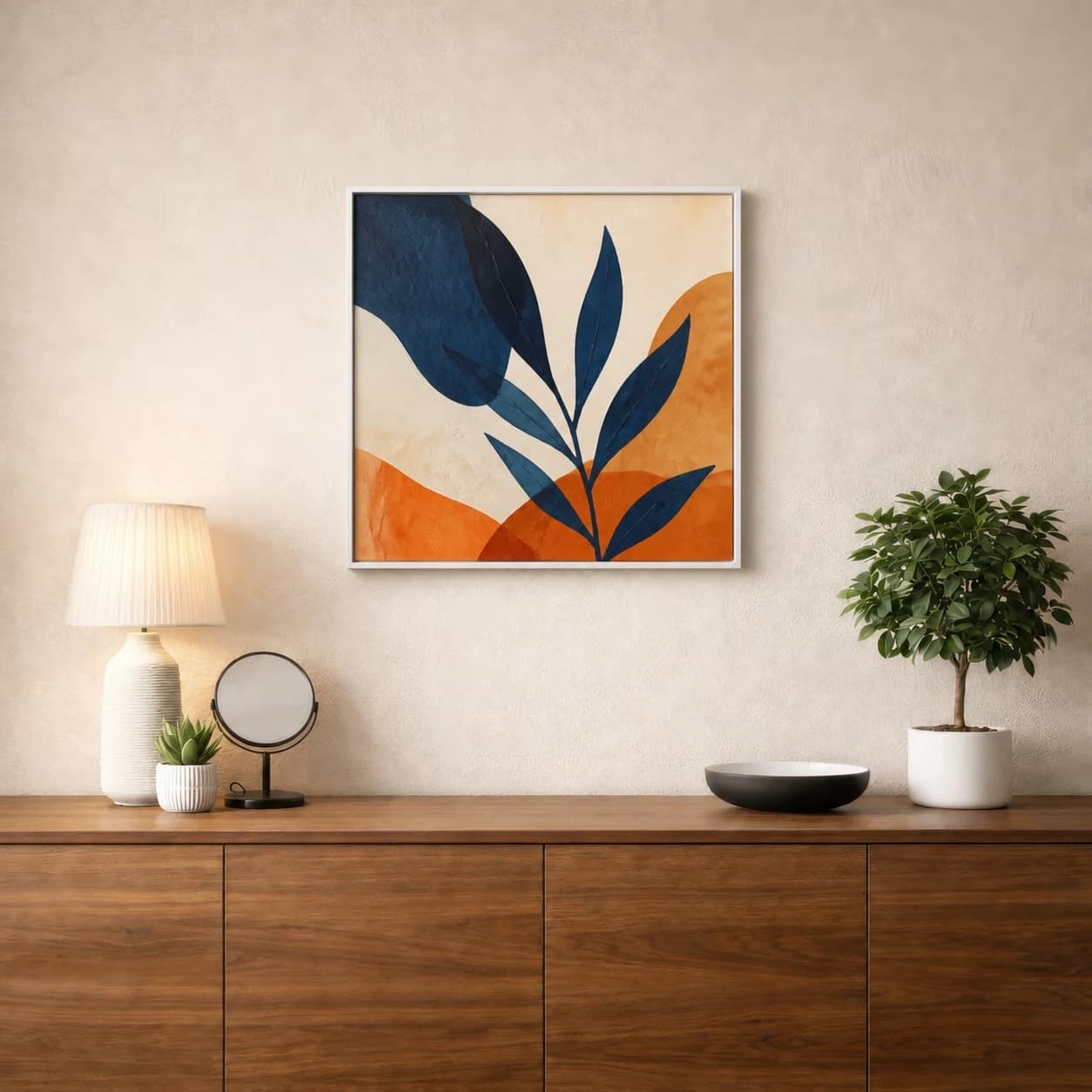
20 × 20 in / 51 × 51 cm print · white frame
Strong indigo leaves keep the square visible inside a white frame, while the tree makes its size immediately believable.
Try this exact roomChosen from real usage
These are the three highest small-wall presets in completed-download order. They keep a chair, table, or plant as a scale cue while leaving most of the frame visually quiet.
Room pick 1
Calibrated wall reference: 48 × 48 in (122 × 122 cm)
Try this room in the editor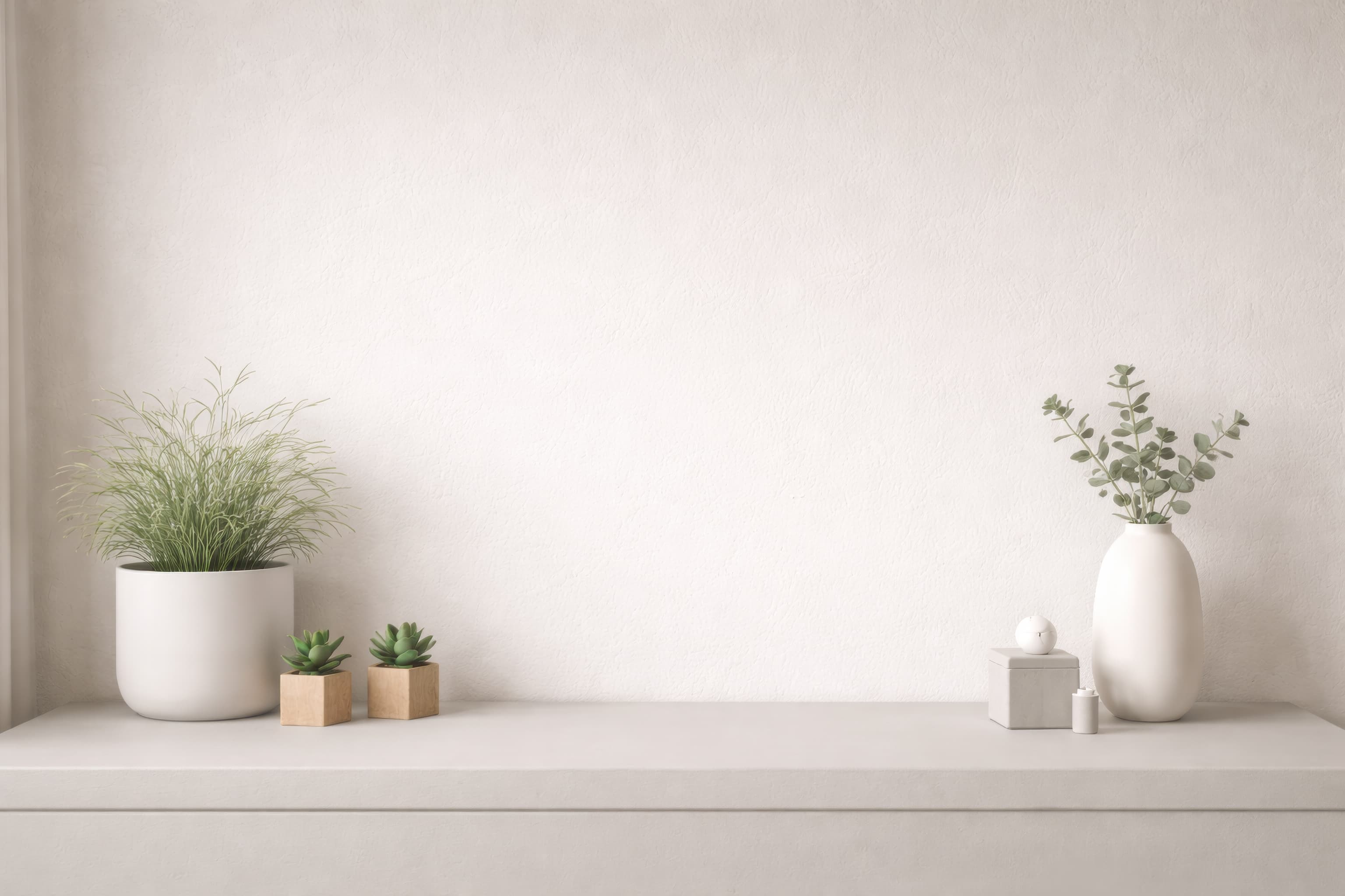
Room pick 2
Calibrated wall reference: 51.3 × 36.7 in (130 × 93 cm)
Try this room in the editor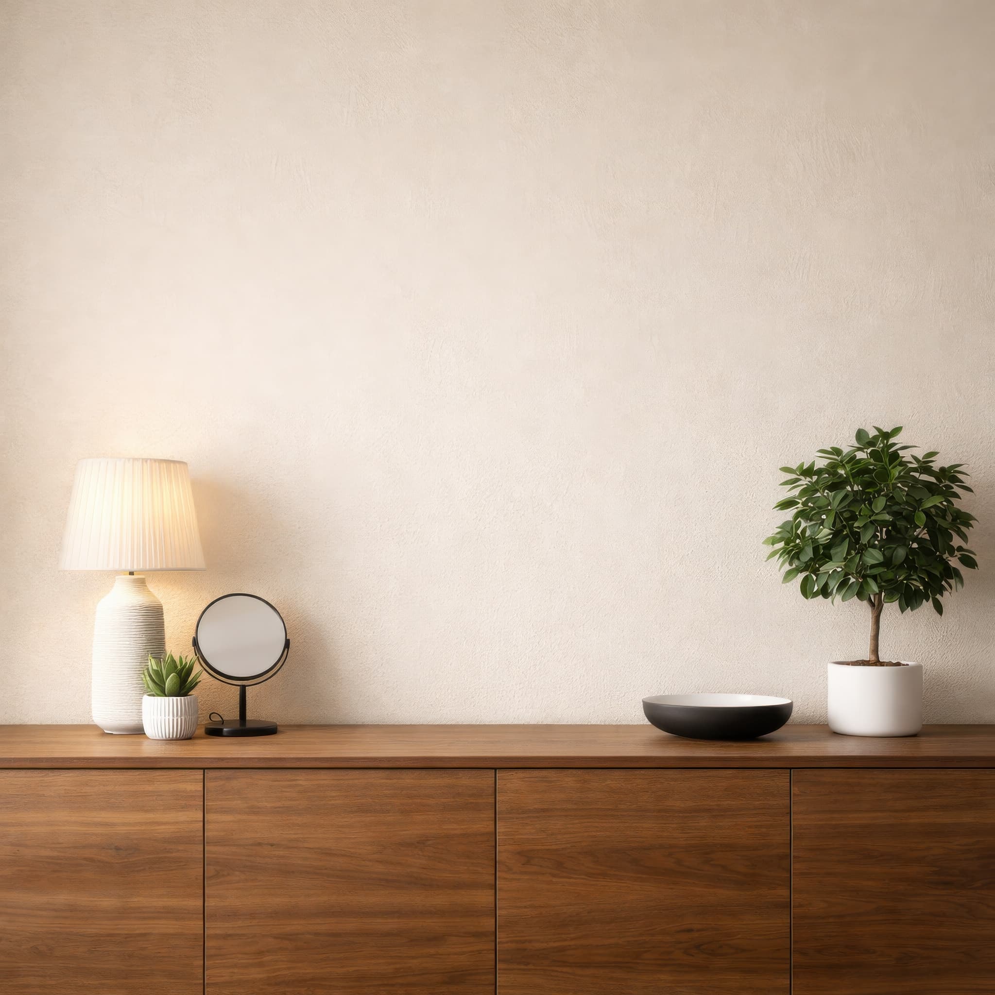
Room pick 3
Calibrated wall reference: 58.8 × 58.8 in (149 × 149 cm)
Try this room in the editor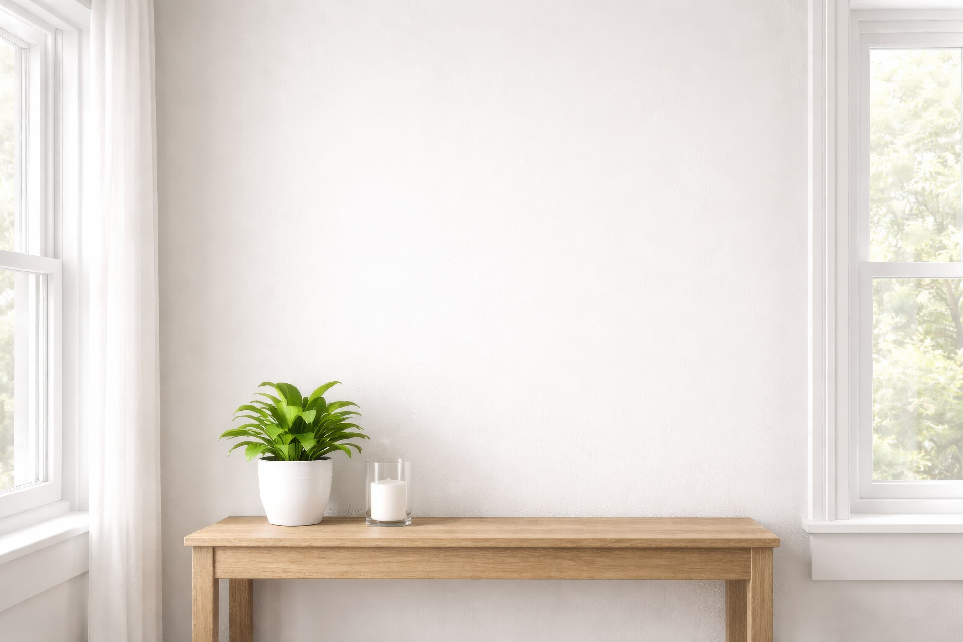
Room pick 4
Calibrated wall reference: 78.2 × 55.9 in (199 × 142 cm)
Try this room in the editor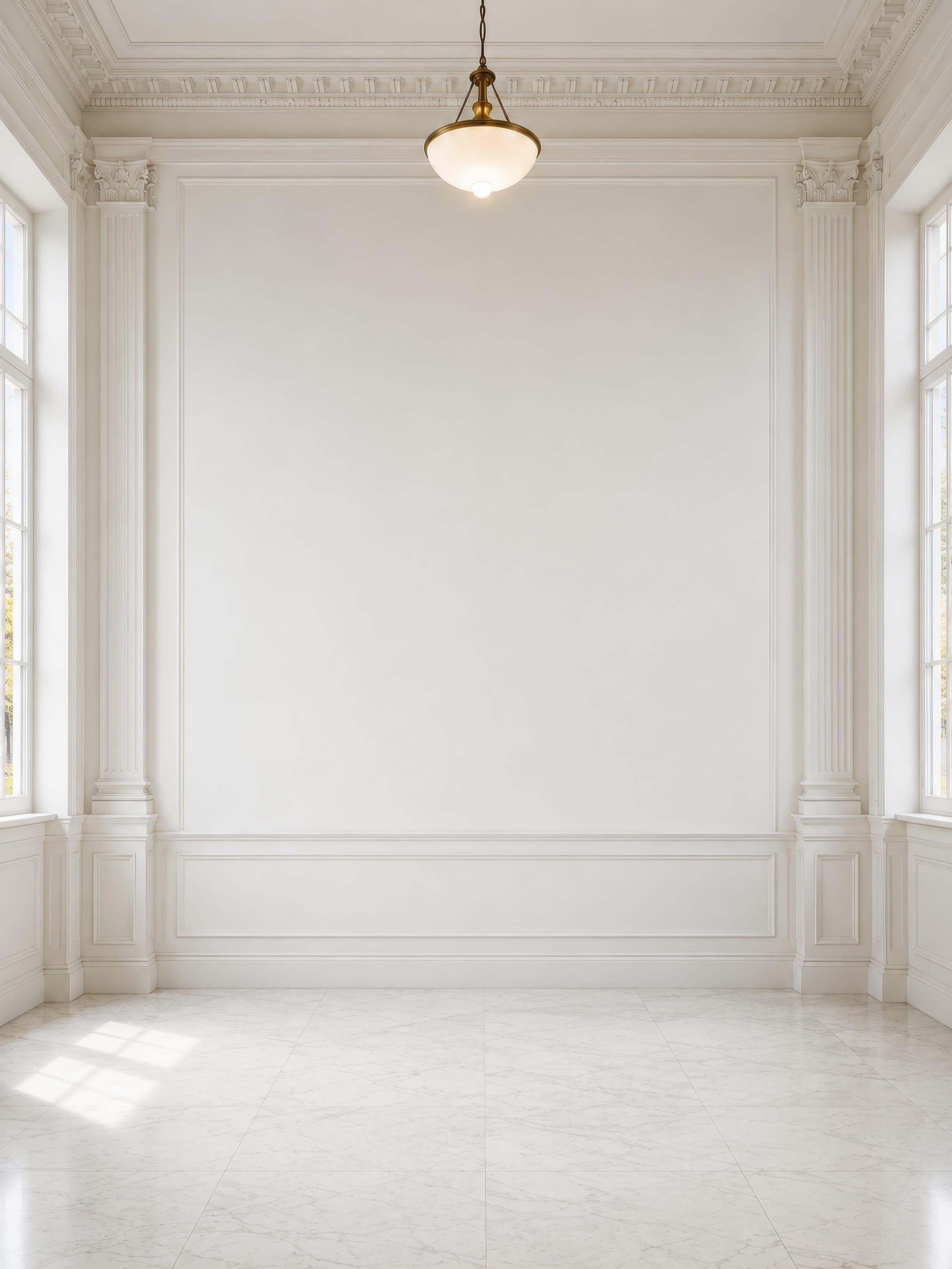
Room pick 5
Calibrated wall reference: 120.1 × 160.1 in (305 × 407 cm)
Try this room in the editor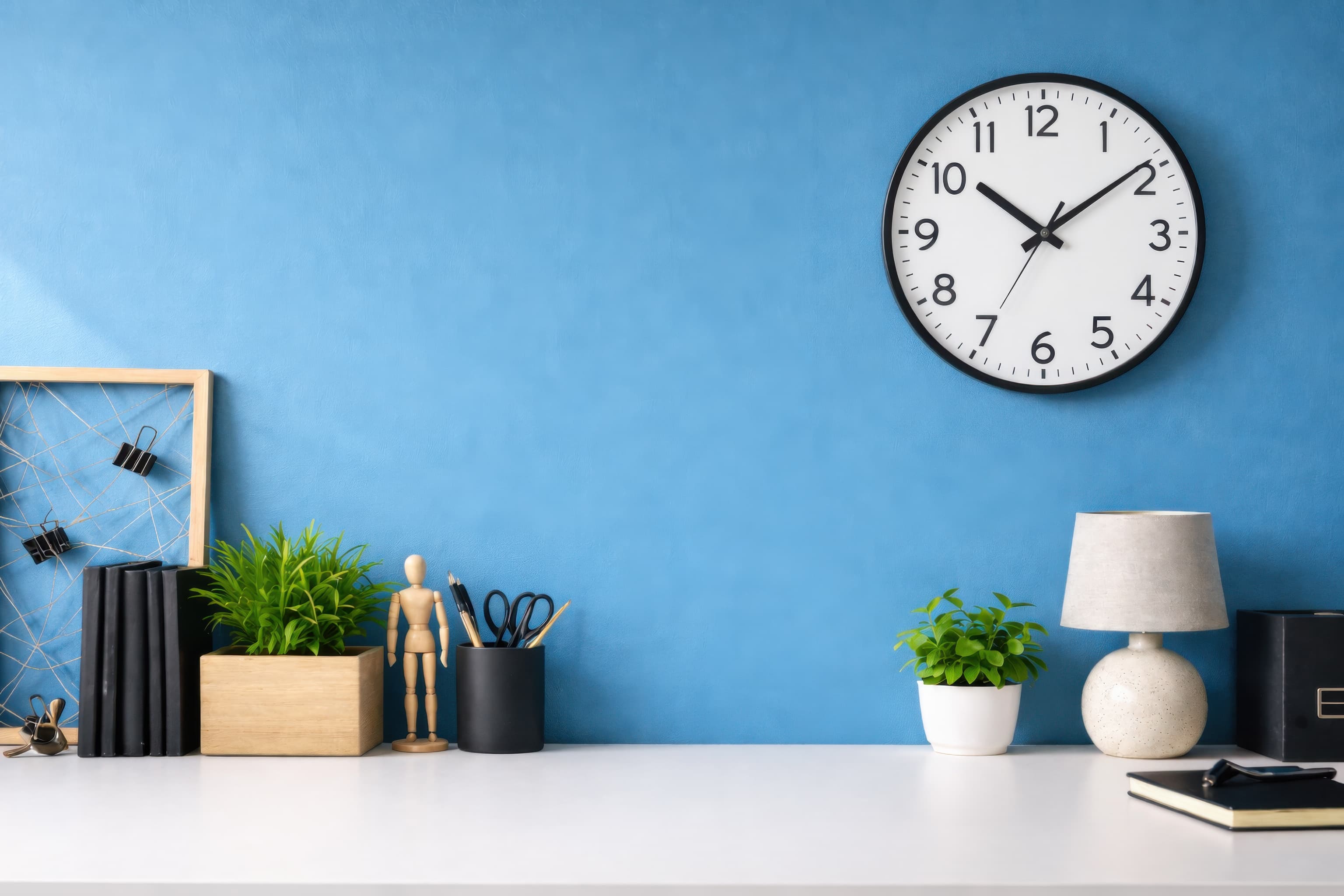
Room pick 6
Calibrated wall reference: 64 × 42 in (163 × 107 cm)
Try this room in the editor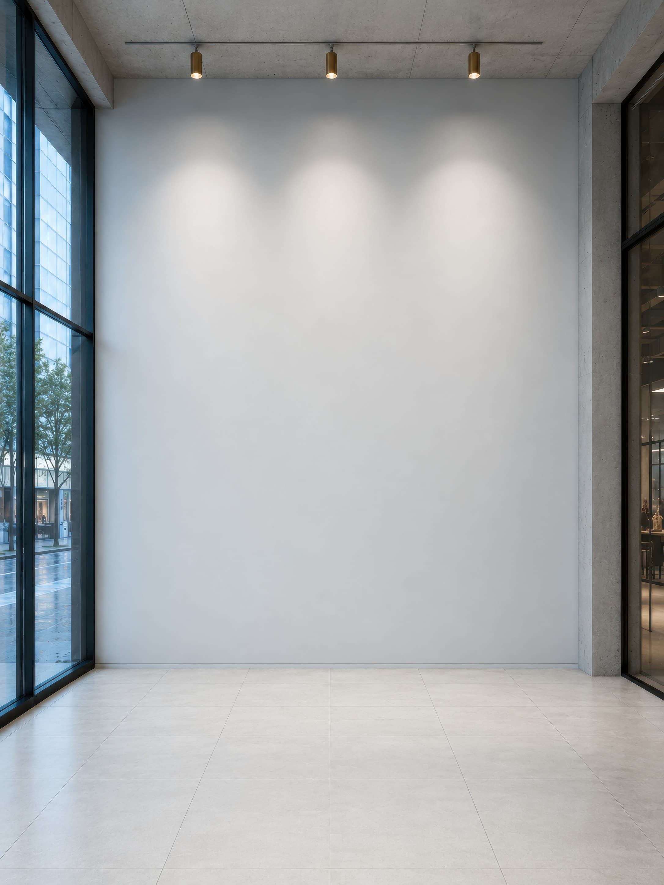
Room pick 7
Calibrated wall reference: 116.6 × 155.5 in (296 × 395 cm)
Try this room in the editor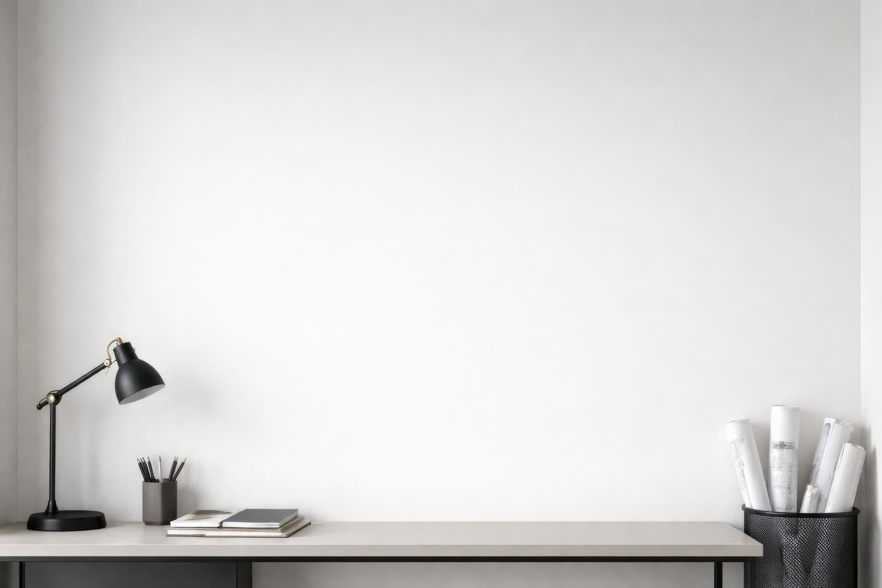
Room pick 8
Calibrated wall reference: 84 × 60 in (213 × 152 cm)
Try this room in the editor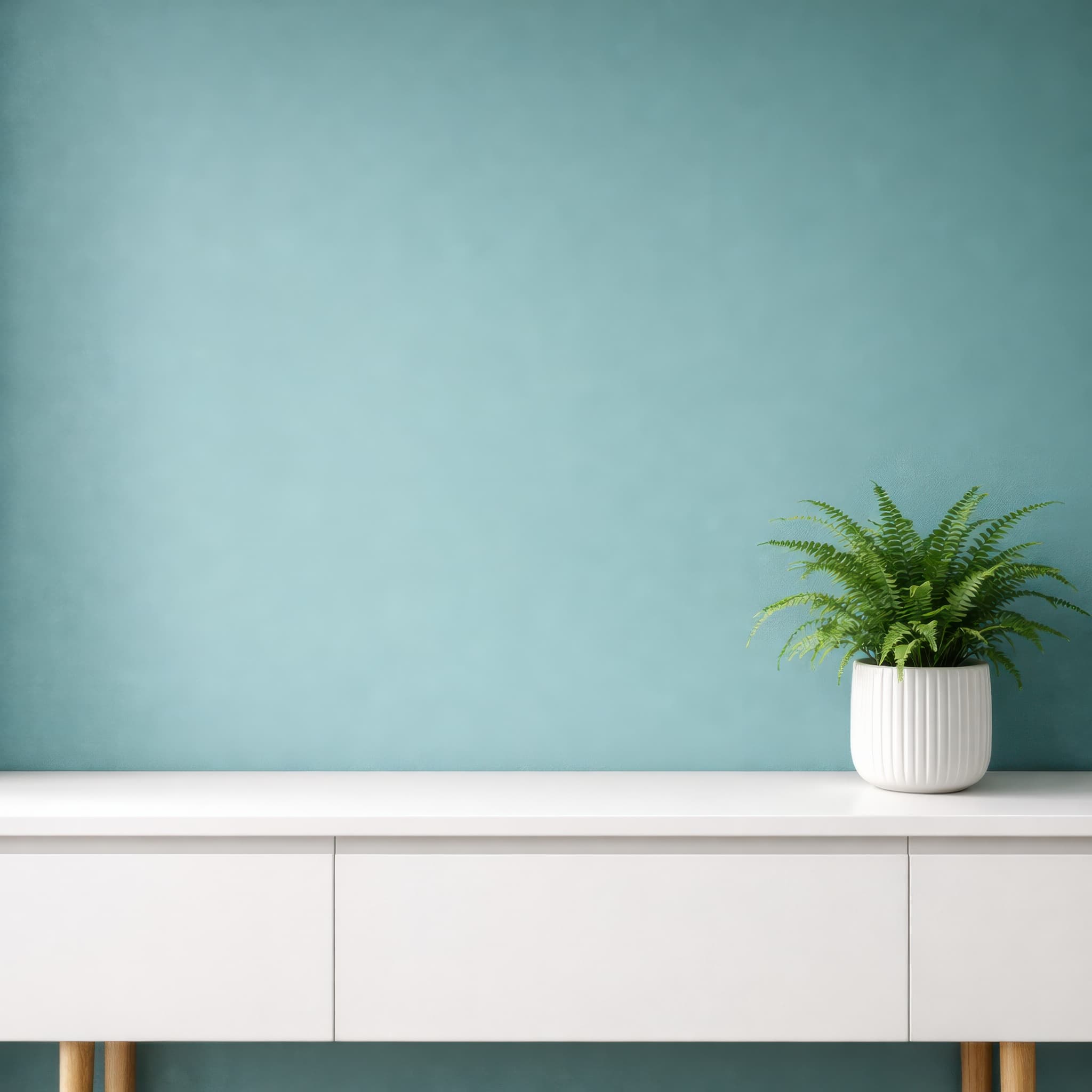
Room pick 9
Calibrated wall reference: 44.4 × 44.4 in (113 × 113 cm)
Try this room in the editor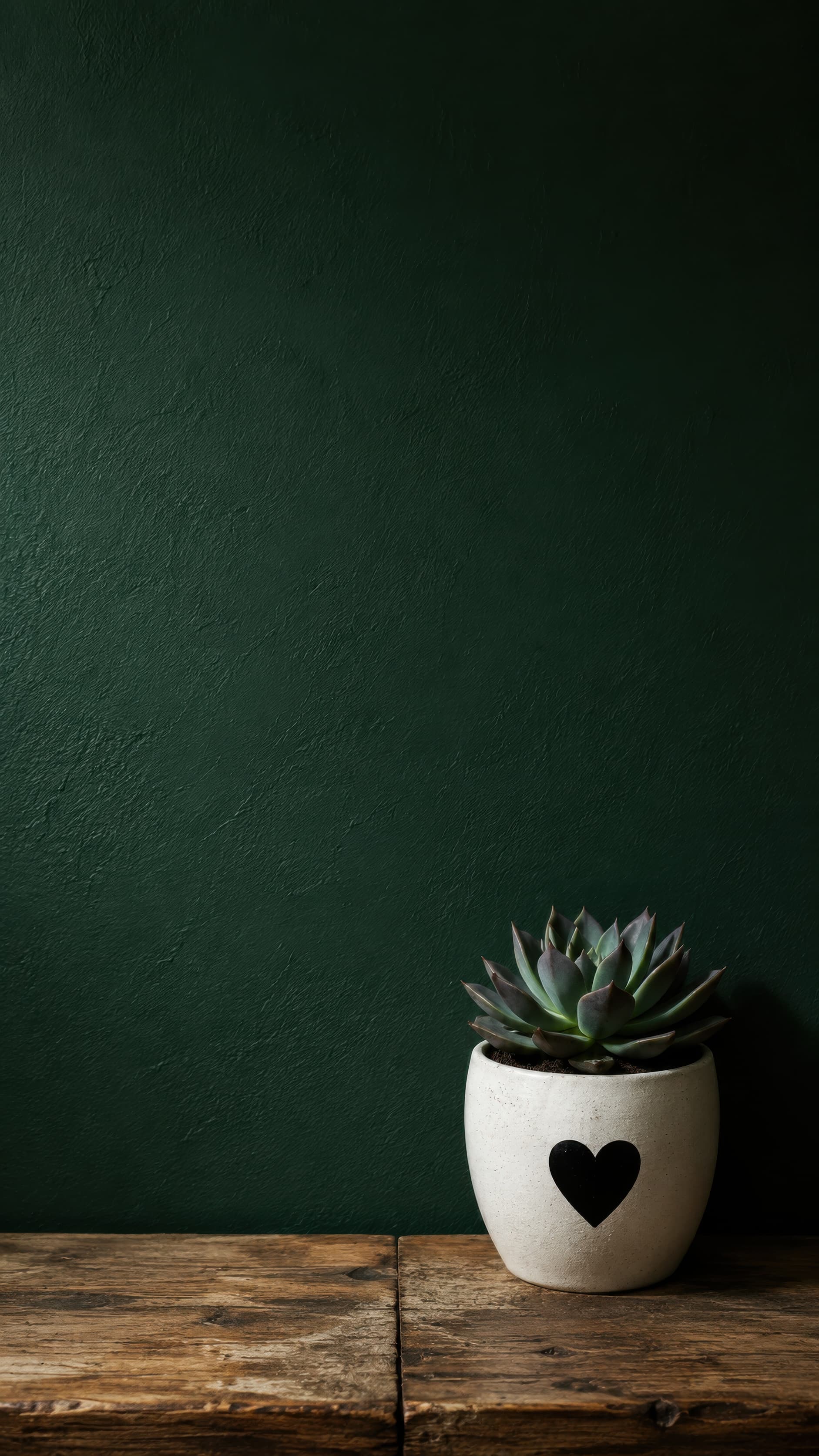
Room pick 10
Calibrated wall reference: 15.7 × 27.9 in (40 × 71 cm)
Try this room in the editor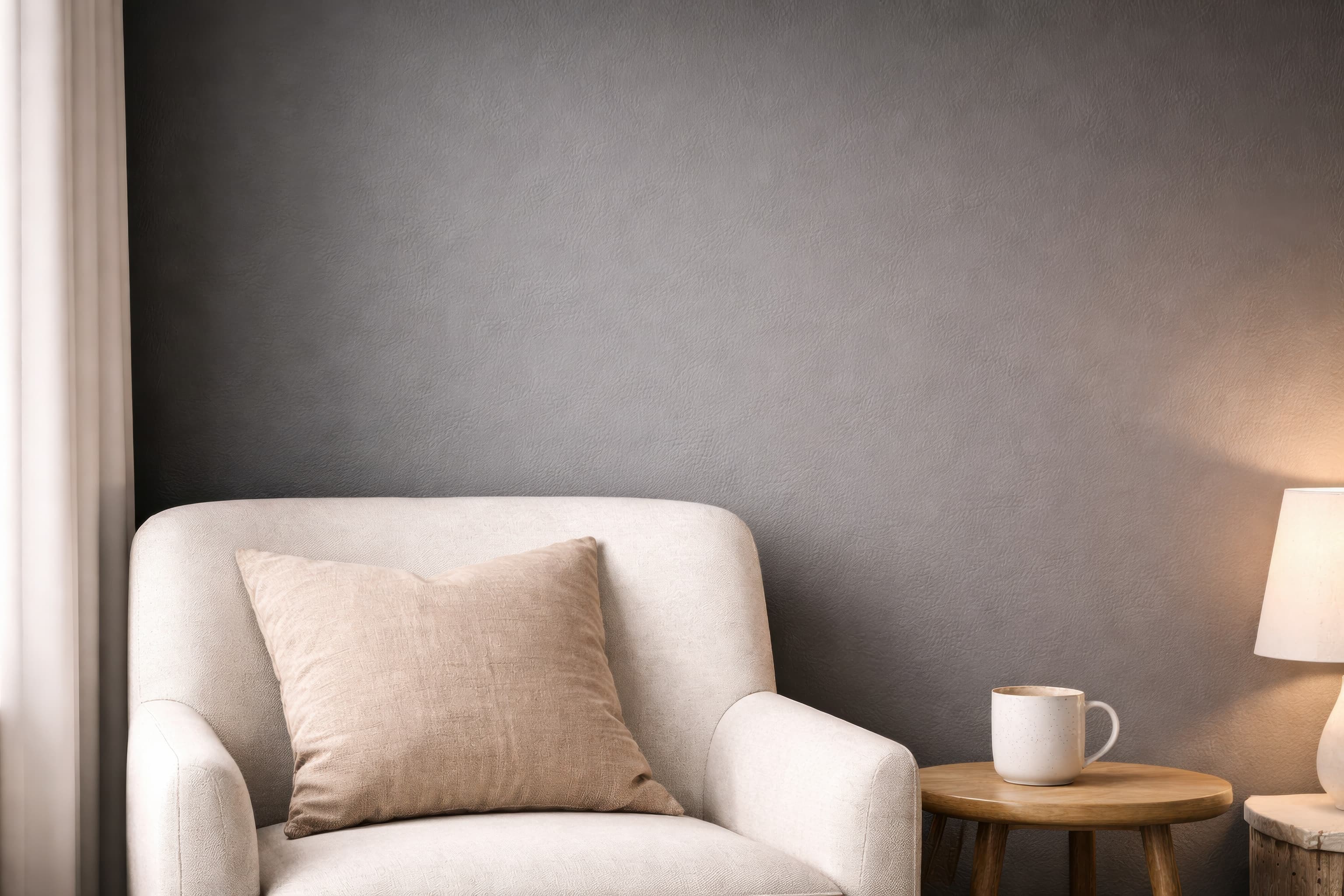
Room pick 11
Calibrated wall reference: 58.8 × 42 in (149 × 107 cm)
Try this room in the editor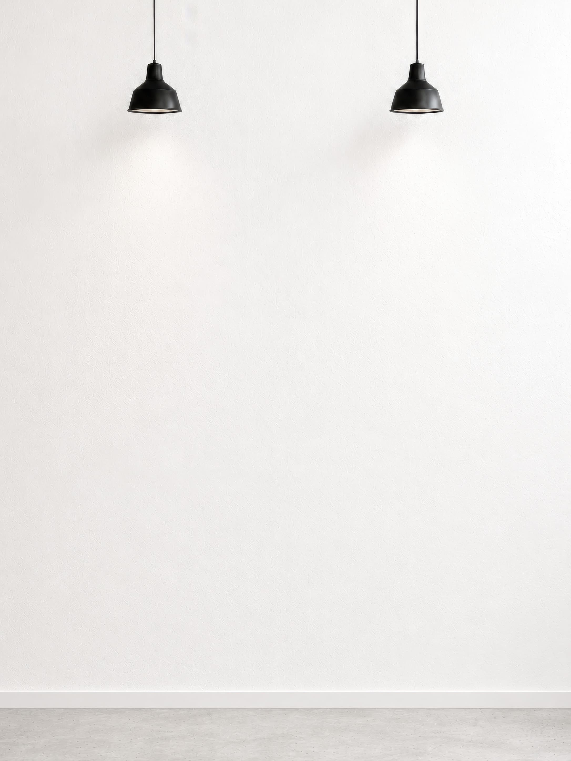
Room pick 12
Calibrated wall reference: 72 × 96 in (183 × 244 cm)
Try this room in the editor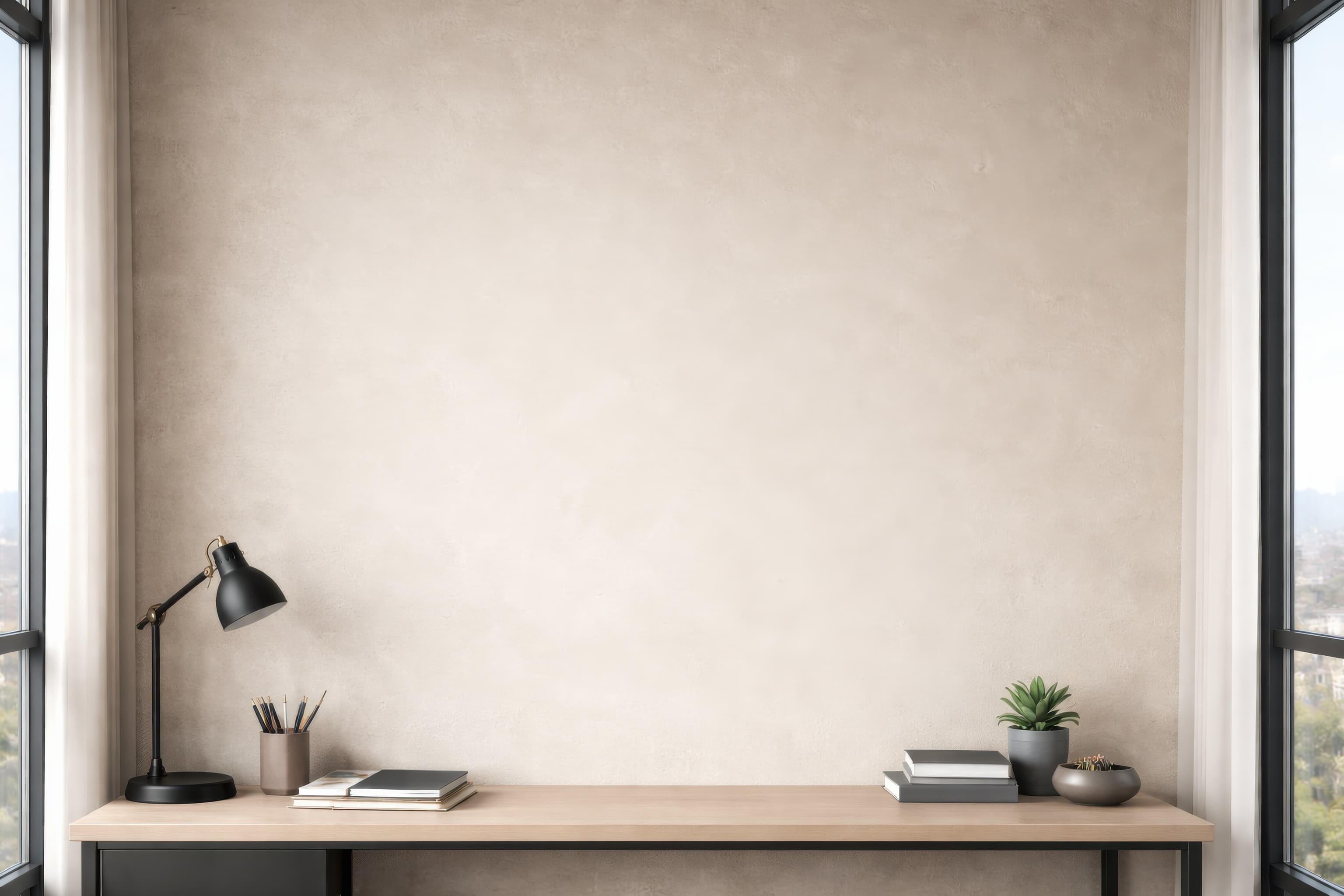
Room pick 13
Calibrated wall reference: 88.2 × 63 in (224 × 160 cm)
Try this room in the editor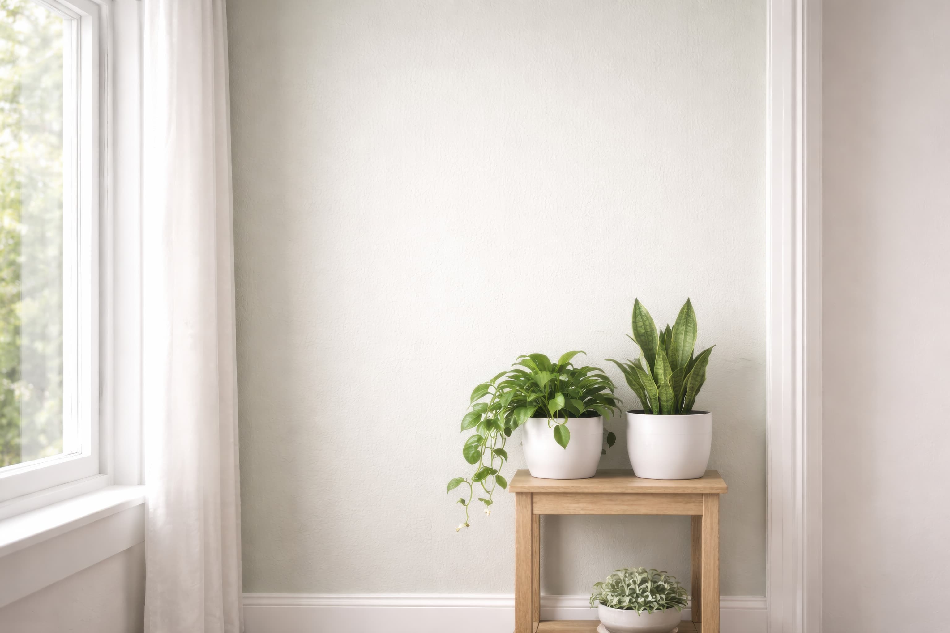
Room pick 14
Calibrated wall reference: 76.4 × 54.6 in (194 × 139 cm)
Try this room in the editor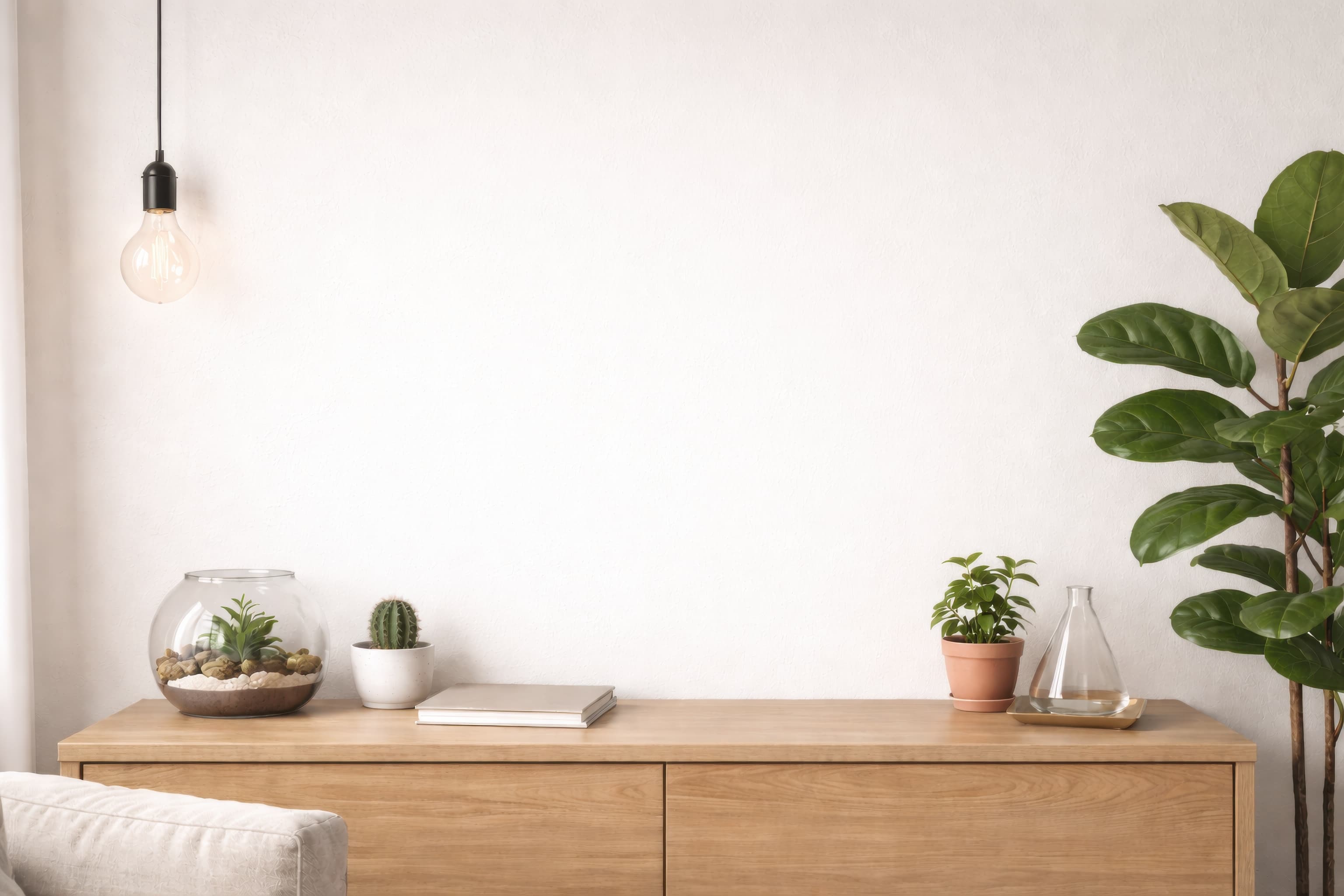
Room pick 15
Calibrated wall reference: 84 × 60 in (213 × 152 cm)
Try this room in the editor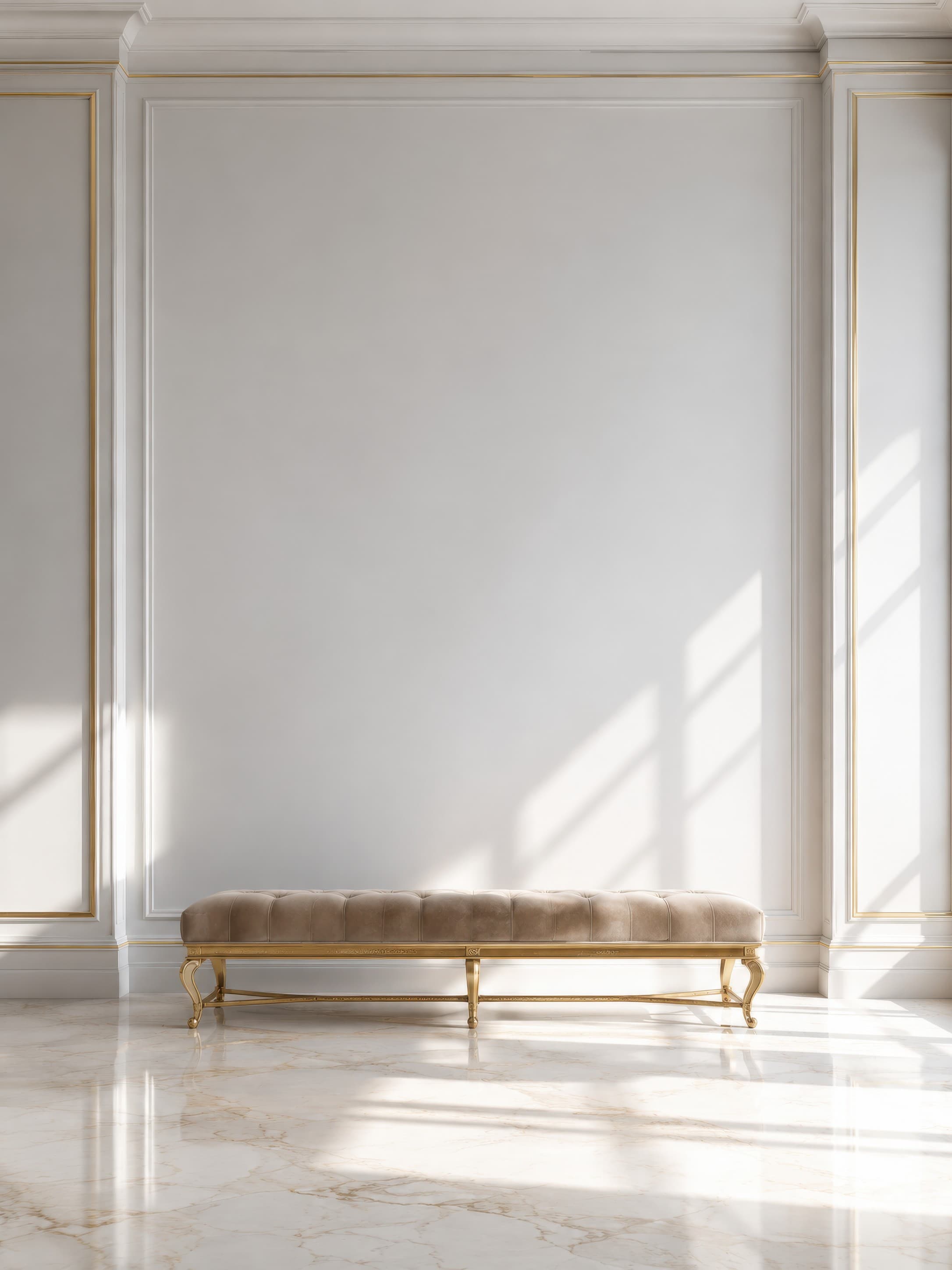
Room pick 16
Calibrated wall reference: 99 × 132 in (251 × 335 cm)
Try this room in the editor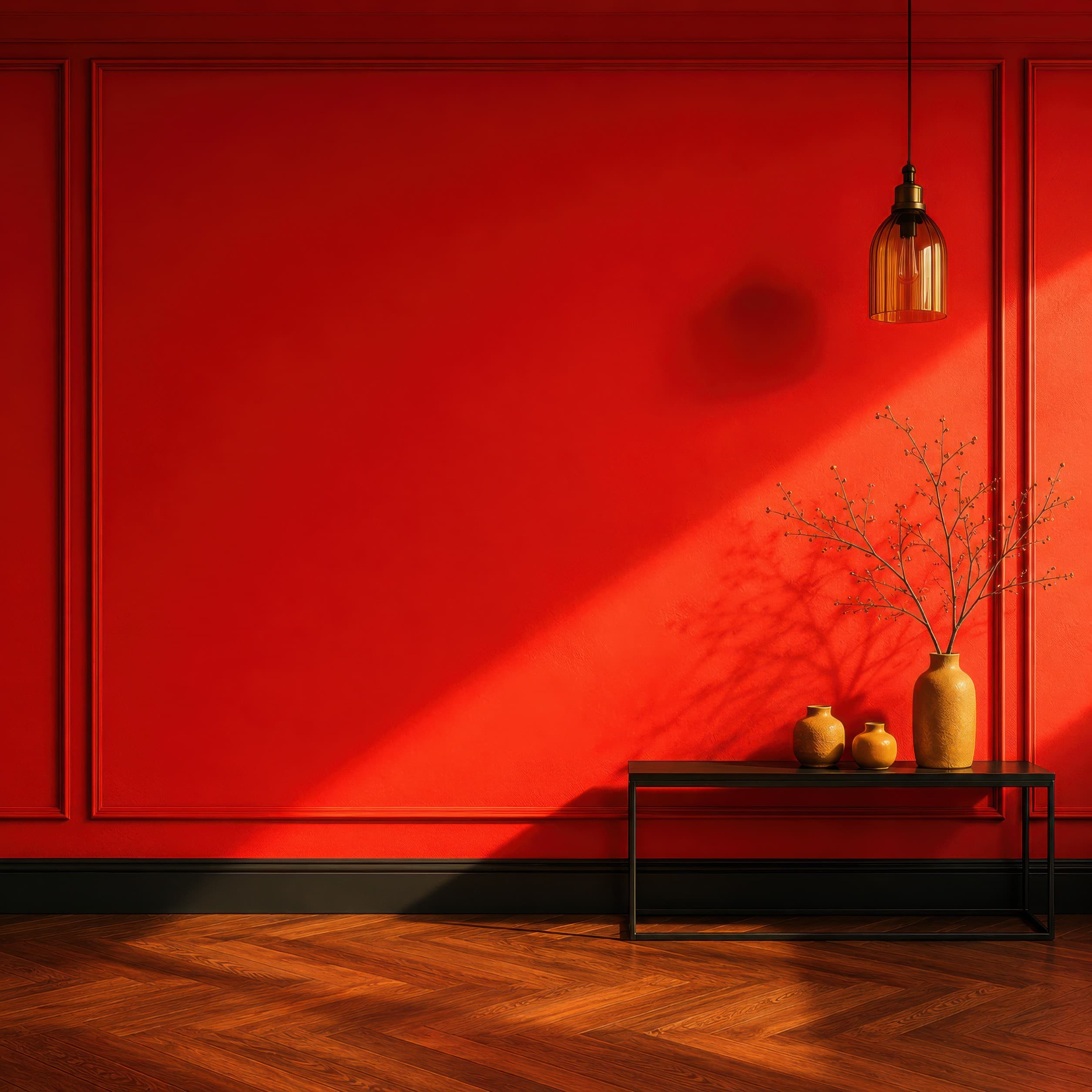
Room pick 17
Calibrated wall reference: 112.8 × 112.8 in (287 × 287 cm)
Try this room in the editor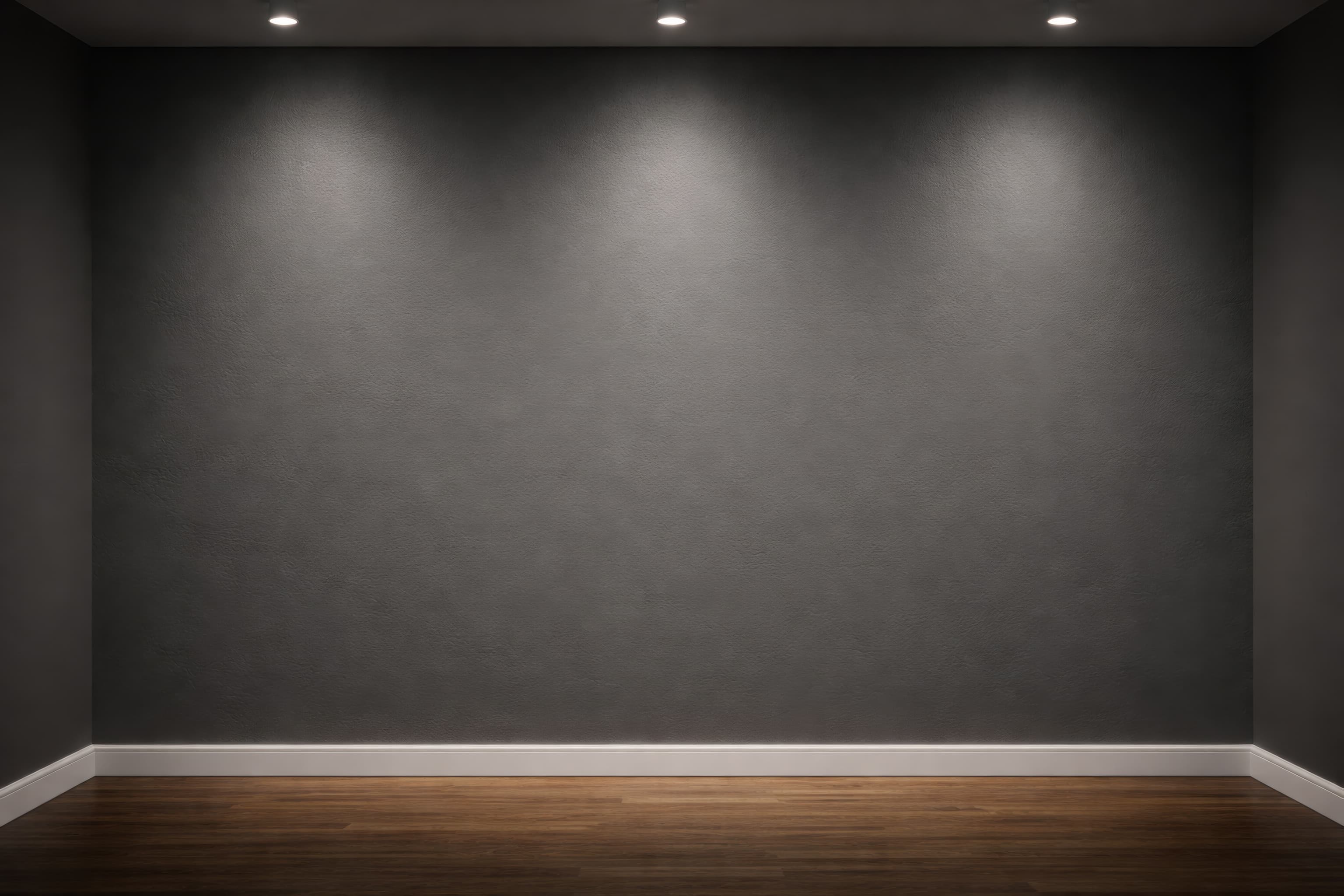
Room pick 18
Calibrated wall reference: 139.4 × 99.6 in (354 × 253 cm)
Try this room in the editor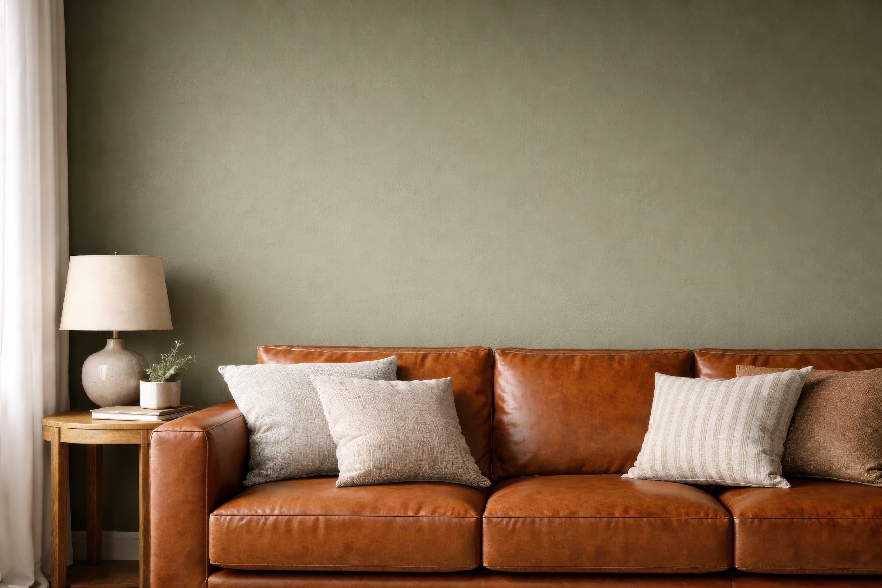
Room pick 19
Calibrated wall reference: 89.3 × 67 in (227 × 170 cm)
Try this room in the editor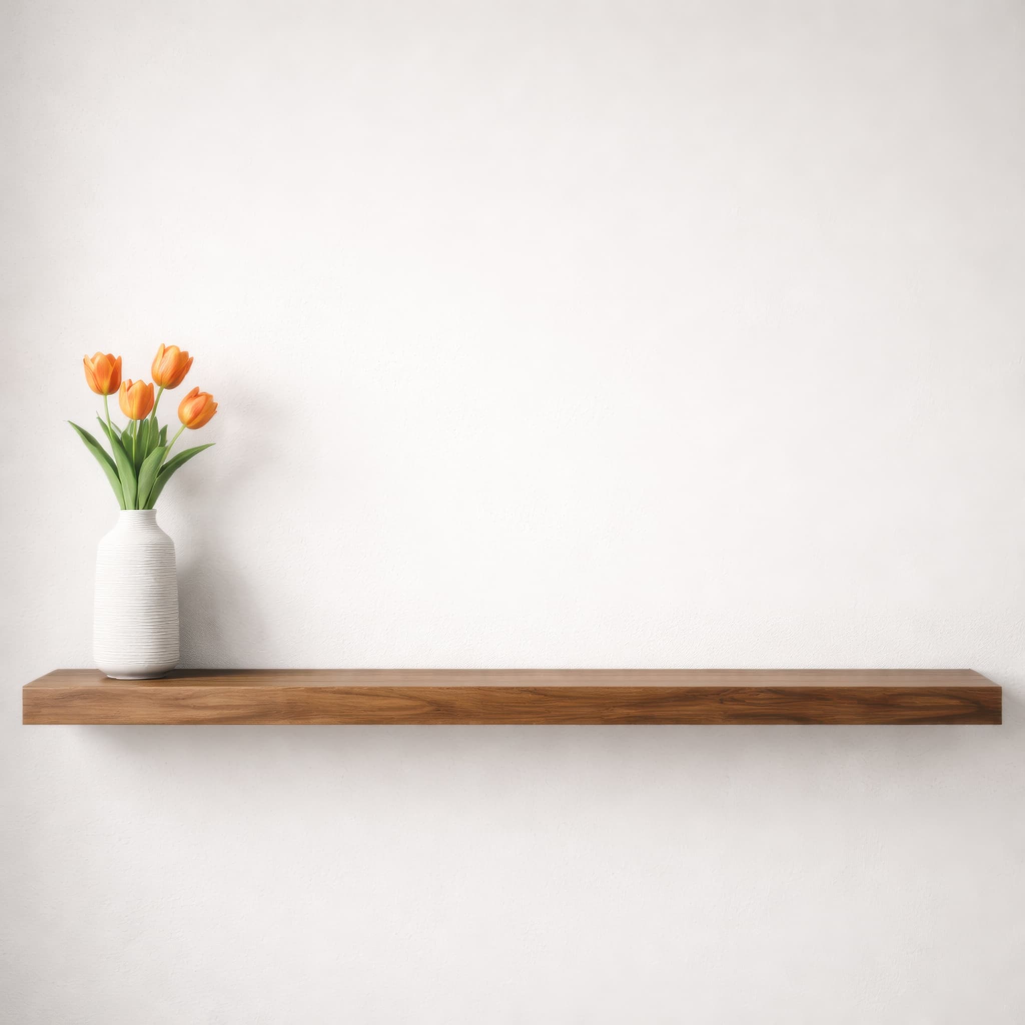
Room pick 20
Calibrated wall reference: 33 × 33 in (84 × 84 cm)
Try this room in the editorGuide 1
Minimal walls work for almost every art style because they reduce assumptions about the buyer's home. They are especially useful for detailed illustration, typography, and small prints that would disappear in a broad sofa scene. The strongest blank-wall images are not completely context-free: a chair, table, floor line, or molding gives the eye enough information to understand scale.
Choose wall undertone deliberately. Bright white creates crisp contrast but can make cream paper or white frames vanish. Ivory and greige feel warmer and often suit wood frames. Colored walls can make pale art vivid, but they also influence perceived color. Use a neutral hero image when faithful comparison matters and a colored wall as a secondary styling example.
Guide 2
A completely flat wall and shadowless frame can look like a pasted rectangle. Subtle plaster texture, a soft contact shadow, and a visible frame edge are usually enough to create depth. Strong diagonal sunlight can be attractive, but it becomes the subject quickly; reserve it for artwork that stays readable beneath the pattern.
Straight-on walls are best for judging proportion and frame thickness. Angled views feel more photographic but require consistent perspective. Use one straight comparison image and, when helpful, one angled lifestyle view rather than distorting the art to make both look identical.
Guide 3
A blank-wall scene is an effective catalog standard. Keep the room, camera, size, and frame fixed while swapping designs. Buyers can compare work quickly, and the same export recipe makes new listings faster. Add a more styled room later in the carousel to show personality without weakening the hero image.
Size reference
These are visual starting points, not universal room rules. Use the complete framed object or multi-panel group, then verify the result with the exact furniture and wall dimensions available to you.
| Placement | Starting point | Check before export |
|---|---|---|
| Small furniture wall | Use the furniture as a scale cue and keep the art within the calibrated safe area. | Do not crop away the object that makes the size believable. |
| Nearly empty gallery wall | Leave intentional negative space around the exact framed dimensions. | Keep floor or wall edges visible when scale is otherwise ambiguous. |
| Color comparison | Keep size, crop, and frame constant while changing only the wall. | Use the same artwork color profile across every export. |
Use real dimensions even when the wall itself is visually minimal.
1
Use the real product file and preserve its natural aspect ratio.
2
Select one of the popular rooms, enter the physical dimensions, and use only presentation controls that match the real product.
3
Check scale, wall contrast, lighting, and the listing crop before downloading.
It is better when the artwork needs a clean, comparable hero image or when a small print would look implausible above large furniture. A living room is better when the buyer needs a familiar sofa or console scale cue.
Show only what helps explain scale or mood. A chair edge, low table, floor line, or plant can be enough. Remove decor that competes with the artwork or implies a different product.
White, ivory, and light neutral walls are the easiest comparison backgrounds. Make sure pale paper and frames still have a visible boundary, and add a colored-wall image only when it helps the buyer imagine the style.
Usually yes, but keep it restrained and consistent with the room light. The shadow should anchor the frame rather than create a dramatic effect that changes how the artwork reads.
Upload the artwork, choose one of the selected rooms, enter the real dimensions, and export a listing-ready image without a template file.
Open the editorRoom selection and guidance reviewed by WallMockup product team. Last materially reviewed 2026-08-12. Popularity follows the editor preset order, which is maintained by completed production downloads.