Updated: September 17, 2026 · 30 min read
The paint is out, the surface is blank, and another ten minutes of browsing will not make the first mark easier. Give the painting one rule instead: a fixed color proportion, one tool, a repeated shape, or a sequence of layers. The 50 abstract painting ideas below are organized by those decisions, and 12 are developed into complete projects with exact pigments, paint consistency, drying cues, canvas sizes, and recovery paths.
Table of Contents
- What makes a painting idea abstract?
- 50 abstract painting ideas by starting constraint
- How to choose one idea
- 12 abstract painting ideas with materials and steps
- Color and layer projects
- Tool and texture projects
- Shape and system projects
- A 45-minute abstract choice, worked through
- Finished the piece? Here's what to do with it
- FAQ
What makes a painting idea abstract?
An abstract painting starts from a visual relationship rather than a recognizable subject. The first decision might be that one color gets 60 percent of the surface, that every mark must come from a two-inch brayer, or that a single line has to organize the whole canvas. Those limits do not remove expression. They give each later choice something to respond to.
That distinction matters when you follow a tutorial. A useful abstract project cannot stop at "paint what you feel." It should tell you which paint to mix, how fluid or stiff it needs to be, where the main division belongs, how long one layer must dry, and what visual evidence says the painting is ready for the next move.
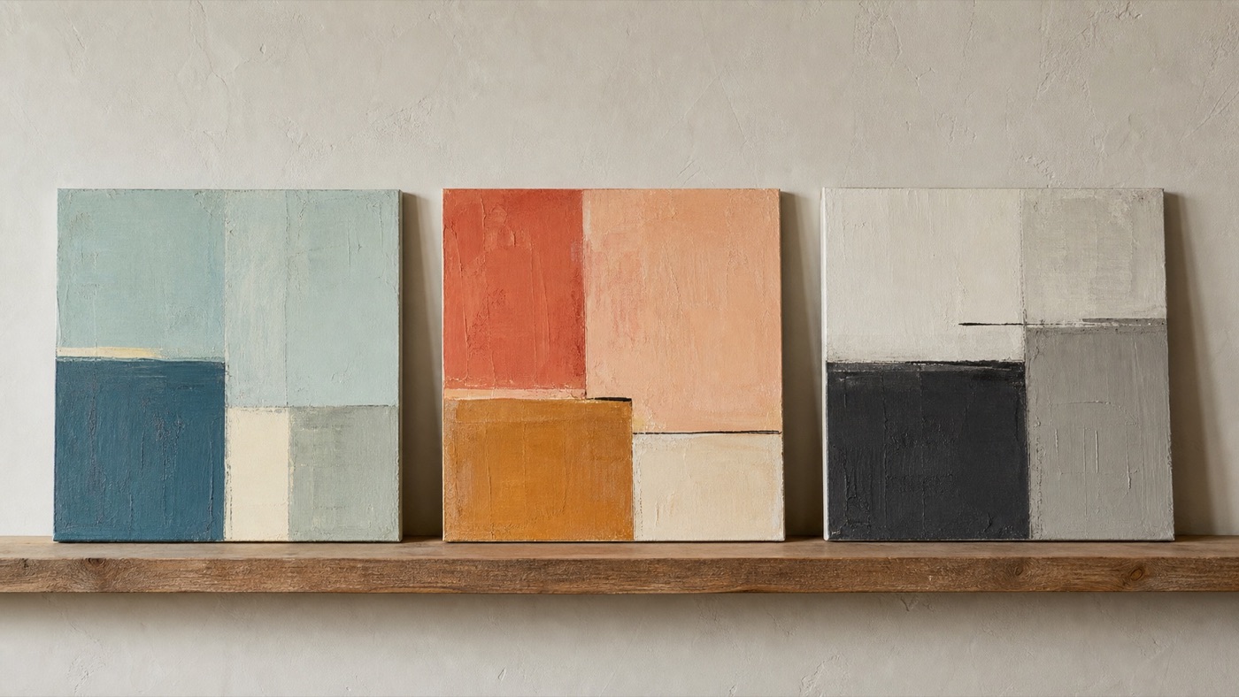
50 abstract painting ideas by starting constraint
Use this list when you need a direction, then use one of the developed projects below when you want full instructions.
Start with color
-
Divide a canvas into a 60/30/10 analogous palette. Give one related color most of the surface, a second about a third, and the brightest only a small accent. Keep the shapes unequal too, so the idea reads as hierarchy rather than a pie chart.
-
Build chromatic-black veils over a pale ground. Mix a dark from complementary pigments instead of tube black and thin it until the ground still glows through. Dry each veil before crossing it with the next, preserving at least two untouched pale areas.
-
Interrupt muted blue-gray with one orange accent. Cover most of the surface with two or three related blue-grays, then test several orange sizes on scrap paper. Place the smallest accent that still changes the balance from arm's length.
-
Shift one pigment's apparent temperature through its neighbors. Repeat the same middle color beside a warm field, a cool field, and a neutral field. Do not alter the repeated mixture; the exercise is to notice how context changes what the eye sees.
-
Reveal violet underpainting through narrow ochre seams. Paint and dry a saturated violet ground, then cover it with several unequal ochre shapes. Leave thin violet paths between selected shapes and one wider opening near the focal area.
-
Interrupt one dominant neutral with two saturated marks. Mix a varied gray-brown field and let its brush direction stay visible. Add one large and one very small saturated mark, placing them far enough apart that the eye has to travel between them.
-
Assign one color to each opacity level. Use one transparent color as a stain, a second as a translucent veil, and a third as an opaque shape. Overlap the three so the material difference becomes the composition.
-
Use five blue tints in unequal areas. Mix five steps from near-white to full blue before painting and arrange them from largest pale area to smallest dark area. Avoid placing them in value order, which can make the result feel like a scale exercise.
-
Repeat one composition in warm and cool neutrals. Transfer the same three large shapes to two small panels. Mix the first from ochre, red, and white, and the second from blue, green, and white, then compare how the identical structure changes mood.
-
Extract a 60/30/10 palette from a photograph. Sample the photo's largest color family, a supporting family, and one small accent without painting its subject. Use the proportion rather than the objects as your abstract starting point.
Start with a tool or surface
-
Knife heavy paint over a complementary ground. Let the ground dry, load only the knife edge, and drag at a low angle so the undercolor skips through. Change direction once rather than smoothing every broken ridge.
-
Roll broken bands with a nearly dry brayer. Load the roller at its center and test it on scrap until the pass begins to break. Make five unequal bands, then interrupt their shared direction with one narrower crossing.
-
Comb wet acrylic, then interrupt the channels once. Spread an even workable layer and pull a wide comb through it in one direction. Before the skin forms, cross only one area at another angle and leave the rest of the channels intact.
-
Scratch a loose grid through skin-set paint. Paint a contrasting ground, let it dry, then cover it with a second layer. Wait until the surface is dull but still yields to a tool, scratch an irregular grid, and leave several lines unfinished.
-
Press and lift paper for incomplete transfers. Roll thin paint onto a donor sheet, press it lightly to the surface, and peel before the paint dries. Rotate the surface for a second transfer and preserve the broken gaps rather than printing over them.
-
Sand shallow paste relief, then stain it. Build broad low ridges with modeling paste and let them cure fully. Sand the tops, brush away dust, and wipe a transparent stain across the relief so pigment settles more deeply in the recesses.
-
Use one silicone wedge three different ways. Pull its broad face through paint, draw with the narrow edge, and stamp with one corner. Assign each action to a different scale so the surface shows variety without introducing another tool.
-
Alternate matte paint and gloss medium. Build several shapes in flat matte acrylic, dry them, then cross only part of the composition with clear gloss medium. Judge the piece in raking light, where sheen changes appear without adding color.
-
Stamp one irregular shape at three scales. Cut or find one non-geometric stamp and make small, medium, and large versions of its mark. Cluster one scale, scatter another, and let the third appear only once.
-
Pull a notched spreader through adjacent colors. Place two thick paint bands side by side and drag the spreader through both in a single pass. Allow the teeth to mix some channels and preserve separate color in others.
Start with a shape rule
-
Give one form 70 percent of the surface. Draw a large shape that nearly presses against two edges, then balance it with two much smaller shapes. Keep some breathing room around the dominant form so size, not outline, creates its authority.
-
Mask three arcs from off-canvas centers. Imagine each circle's center beyond the edge and tape only the entering curve. Vary arc width and crop, then add one small counterweight after the tape comes away.
-
Fill three spaces made by one continuous line. Draw from one edge to another without lifting the tool, allowing several loops and crossings. Choose only three enclosed spaces for opaque color and leave the remaining line work exposed.
-
Stack five unequal horizontal bands. Change every band width and avoid placing the narrowest one in the center. Let one band carry texture, one carry the darkest value, and the others stay comparatively quiet.
-
Break repeated rectangles with one rotation. Establish a family of aligned rectangles, then rotate a single shape far enough to interrupt their rhythm. Echo its color elsewhere without repeating its angle.
-
Build a diagonal composition that avoids every corner. Move a chain of shapes from one side toward the opposite side but stop before it connects corner to corner. The interruption keeps the diagonal from becoming a predictable slash.
-
Divide the canvas at two-fifths, not halfway. Place the main vertical or horizontal split at about 40 percent and treat the two fields differently in color or texture. Add only one small bridge across the division.
-
Crowd one quadrant and quiet its opposite. Pack repeated marks, close values, or layered shapes into one quarter of the surface. Leave the diagonal opposite mostly open, using one faint echo to keep it connected.
-
Crop one circle into two separated arcs. Place a large imaginary circle partly outside the canvas and show only two non-touching segments. Change the arc thickness or color once so the eye reconstructs the circle without seeing all of it.
-
Erase a grid until it is only implied. Draw or paint a regular grid, then bury, wipe, or scrape away more than half of it. Preserve a few intersections in separate areas so the missing system remains legible.
Start with a layer sequence
-
Paint opaque, scrape, glaze, then return opaque. Let each stage leave evidence instead of covering the previous one completely. Use the final opaque marks sparingly so the glaze and scrape still explain how the surface was built.
-
Bury torn paper under two transparent veils. Adhere three pieces with varied deckled edges, dry them flat, then glaze across both paper and ground. Change the second glaze direction and leave at least one seam more visible than the others.
-
Cross three dry fluid paths with controlled marks. Tilt fluid paint into three separate paths and let them dry fully. Add one firm opaque shape or line that crosses the paths, giving the accidental movement something deliberate to push against.
-
Alternate soft and hard edges for three layers. Make the first layer mostly soft, the second mostly hard, and the third a selective mix. Preserve examples of every stage so the finished surface has depth rather than one uniform edge treatment.
-
Reveal a saturated first layer through scratches. Cover a dry bright ground with a quieter second color. Scratch while the upper paint is skin-set, varying pressure so some marks reach the color and others only score the surface.
-
Rotate the surface between two ghost prints. Press one imperfect transfer, turn the panel 90 degrees, and add a second in another color. Keep areas where neither print lands, allowing the ground to separate the layers.
-
Scumble an old painting, preserving five fragments. Choose five passages worth keeping, then drag a dry opaque mixture over the rest. Let the old image return in broken glimpses rather than carefully painting around each fragment.
-
Repeat shapes while changing each layer's dominant color. Use the same small shape family through three dry layers, changing which color occupies the most area each time. Shift scale or spacing slightly so repetition feels responsive rather than stamped.
-
Move from transparent to opaque without burial. Begin with broad stains, add translucent middle layers, and reserve opaque paint for the final structural shapes. Limit those final shapes so the early light still survives across most of the surface.
-
Change layer order across three related panels. Use the same colors, proportions, and tools on all three panels but change which color arrives first, second, and last. Display them together to see how order changes weight and visibility.
Start with pace, sound, or attention
-
Follow quiet and percussive passages with different marks. Listen to one short instrumental piece and assign broad veils to quiet sections and firm repeated marks to sharper sounds. Keep the translation consistent rather than trying to illustrate the music literally.
-
Paint ten minutes, wait ten, and revise three times. Use the waiting periods to look from another room, turn the surface, and write the one issue that matters most. Each new painting interval should answer that note instead of adding general activity.
-
Switch hands between first and last layers. Use your non-dominant hand for the loose first layer and your dominant hand for the final structure. Preserve some awkward early marks rather than correcting all the energy out of them.
-
Alternate one minute of action and observation. Set a timer for six to ten cycles and put the tool down completely during every observation minute. Name what changed in balance or direction before beginning the next action.
-
Make ten marks, rotate, then make ten more. Count the marks so the first pass cannot sprawl indefinitely. Rotate the surface a quarter turn and let the second set respond to the first rather than filling every gap.
-
Repeat one rule in 5, 15, and 30 minutes. Use three equal small surfaces and the same palette, tool, and shape constraint. Compare what urgency, moderate attention, and slower revision do to the same idea.
-
Turn one verb into shape and direction. Choose a verb such as gather, lean, scatter, or press and list three visual actions it suggests. Build the composition from those actions without lettering the word or illustrating an object.
-
Translate a remembered room into color proportions. Recall the largest surface, supporting colors, and one vivid object from a room you know. Convert their approximate proportions into abstract fields and allow memory, not a photograph, to simplify them.
-
Write the next decision after every layer. When a layer dries, write one sentence naming what the painting needs, such as more quiet at the top or a bridge between two shapes. Make only that change before pausing again.
-
Place one final mark from six feet away. Step back, decide its size, direction, and color before approaching, then make it once. If no single mark would clarify the structure, the correct final mark may be none.
For salt blooms, transparent watercolor circles, dry-brush feathers, and other water-led exercises, use the dedicated watercolor painting ideas guide. For a two-color first painting with material substitutions, see painting ideas for beginners. Keeping those medium-specific exercises in their own guides lets the projects below stay focused on acrylic and mixed-media abstraction.
How to choose one idea
Choose by the condition you already have, not by the most impressive finished image.
- Basic acrylics and brushes: use analogous blocks or the continuous line.
- Less than one hour: use brayer bands or the continuous line.
- Space to dry flat overnight: use impasto, transfers, pours, collage, or paste.
- Evenly busy compositions: choose a measured two-fifths, 60/30/10, or 70/30 division.
- Muddy color: choose a project that dries fully between layers.
The visual targets are comparisons, not templates. Match the stated structure first: area ratios, layer count, edge types, and opacity. Your shapes can differ while the exercise still succeeds.
12 abstract painting ideas with materials and steps
Color and layer projects
1. Build an analogous 60/30/10 block composition
Things you'll learn: How unequal color proportions create hierarchy even when every shape has a similar hard edge.
Time: 55 minutes to paint, plus 30 to 45 minutes for the ground to become touch-dry.
Materials: 12 x 16 inch primed canvas panel; 1-inch flat synthetic brush; no. 6 bright brush; Quinacridone Magenta, Pyrrole Red, Hansa Yellow Medium, Titanium White; low-tack painter's tape; matte acrylic medium.
- Mix three related colors before painting. Combine Quinacridone Magenta with a little Pyrrole Red, use Pyrrole Red as the middle mixture, and mix Pyrrole Red with Hansa Yellow Medium for the warmest color. Thin each with about one part matte medium to four parts paint so it levels but does not run; equal viscosity keeps one block from looking accidentally heavier.
- Map the 60/30/10 areas in pencil. Place the main vertical division at roughly three-fifths of the canvas width, reserve about 30 percent for two secondary blocks, and keep the brightest mixture near 10 percent. Measuring the areas prevents three attractive colors from becoming three equal competitors.
- Paint the 60 percent field first. Use the 1-inch flat in parallel strokes, keeping the layer opaque enough to hide the white ground. Let it lose all cool shine before taping across it, because tape on soft acrylic dents the surface and creates torn edges.
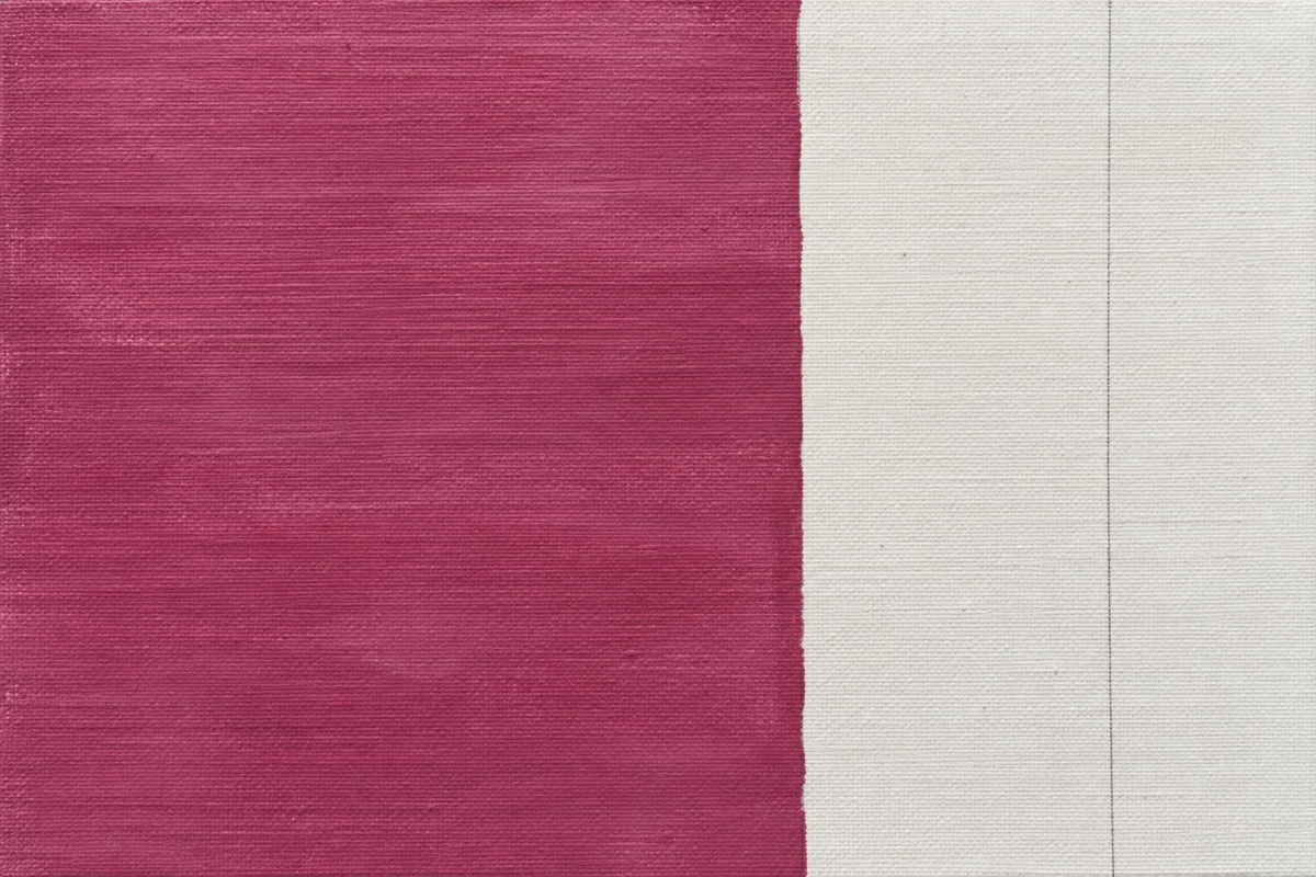
- Add the 30 percent shapes with one coat. Keep their outer edges aligned to the measured divisions, but offset one horizontal seam above the center. The offset prevents the composition from reading like four equal tiles.
- Place the 10 percent accent last. Use the no. 6 bright to add one small Hansa-rich block near a lower-third intersection, then repeat only a sliver elsewhere. The small echo connects the accent without spreading it so widely that it loses emphasis.
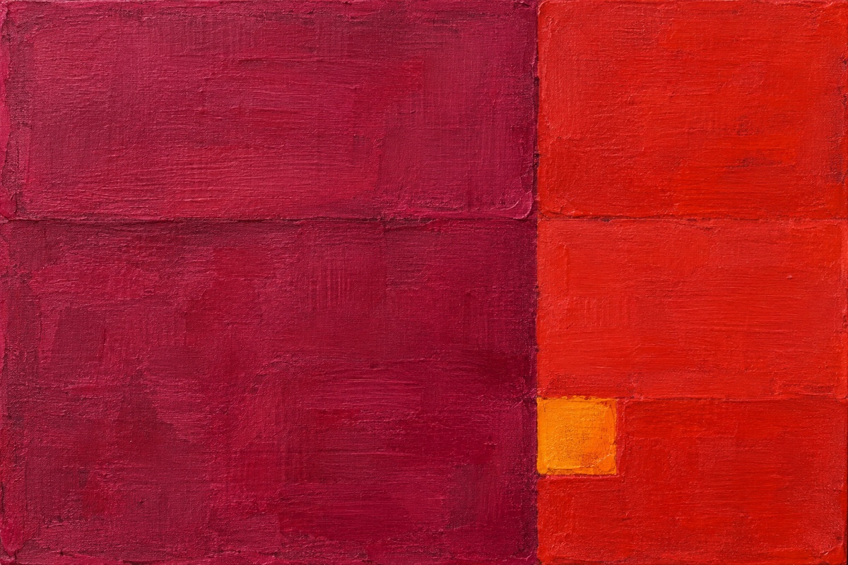
Failure mode and recovery: If every block asks for equal attention, one of the secondary colors probably occupies too much area. Let the surface dry, extend the 60 percent color over part of the weakest block, and leave the accent unchanged. Do not add a fourth color to manufacture a focal point.
2. Layer chromatic-black veils over a pale ground
Things you'll learn: How transparent layers made from complementary pigments can produce depth without using tube black.
Time: 35 minutes of painting across 2 to 3 hours, including three 30-minute drying intervals.
Materials: 11 x 14 inch, 300 gsm acrylic paper taped to a board; 2-inch hake or soft wash brush; no. 8 filbert; Ultramarine Blue, Burnt Umber, Yellow Oxide, Titanium White; glazing medium; two clean water jars.
- Make a warm pale ground. Mix one part Yellow Oxide, four parts Titanium White, and enough water for soft-cream consistency, then cover the sheet with the hake. A warm ground lets later blue-brown veils read as chromatic darks rather than flat gray.
- Mix the chromatic black at equal strength. Combine Ultramarine Blue and Burnt Umber 1:1, then add three parts glazing medium to one part mixed paint. Brush a test over scrap; it should darken the paper while still revealing its tooth.
- Place the first veil across two-fifths of the sheet. Keep the large division vertical and soften only its upper edge with a clean damp brush. That measured split creates structure before the later layers add complexity.
- Wait until the first veil is fully matte. Touch the tape margin rather than the painted area; if it feels cool or tacky, wait another ten minutes. A second glaze over damp acrylic lifts the first and makes cloudy crumbs instead of transparent depth.
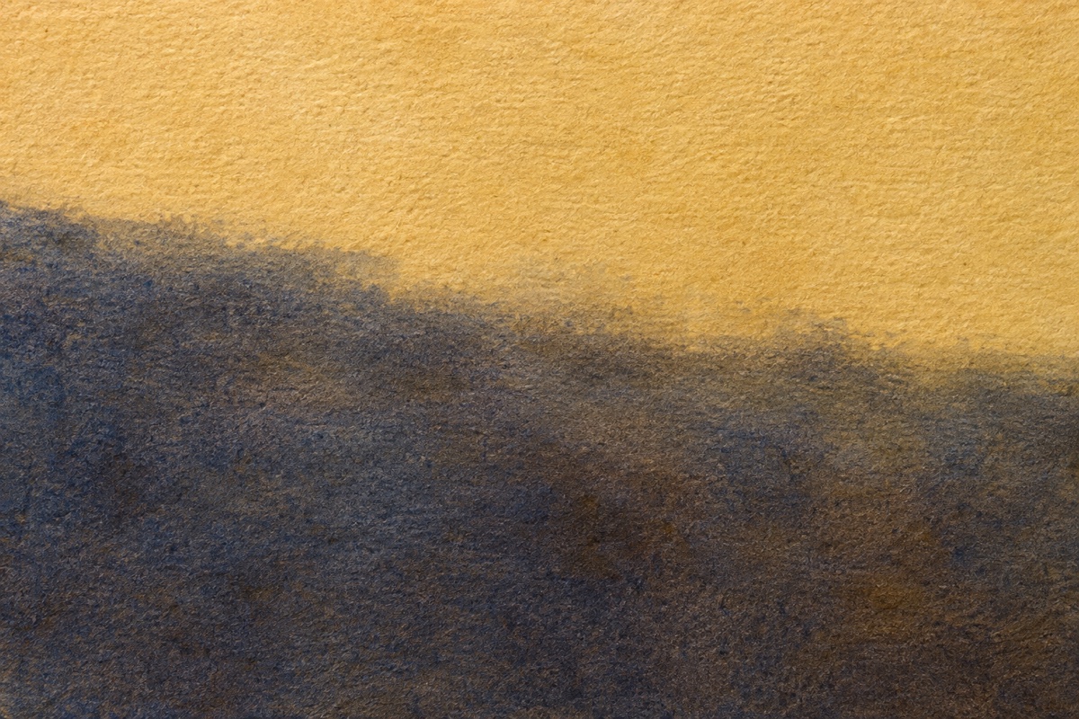
- Cross the first layer twice. Add a cooler veil with slightly more Ultramarine Blue, dry it, then add a warmer Burnt Umber veil with the no. 8 filbert. Keep the darkest overlap under 15 percent of the sheet so the black does not swallow the pale ground.
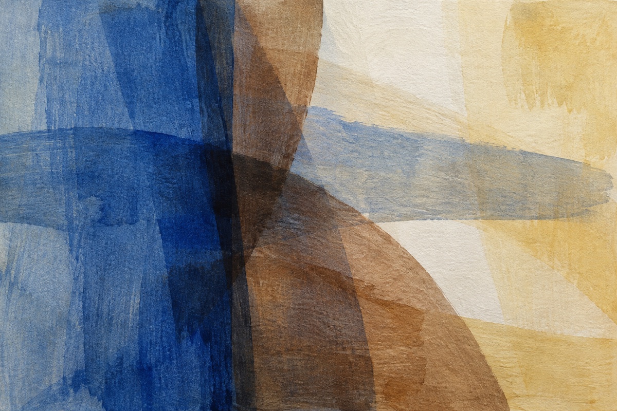
Failure mode and recovery: If the overlaps look chalky or opaque, the mixture contains too much paint or the prior layer was damp. Let everything dry, glaze a very thin Ultramarine-and-medium layer across the cloudy patch, and restore one pale opening with a Yellow Oxide and Titanium White scumble.
3. Bury torn-paper seams under transparent color veils
Things you'll learn: How to make collage edges function as structure instead of sitting on top as decoration.
Time: 70 minutes of work, plus 2 to 4 hours of adhesive and glaze drying.
Materials: 12 x 12 inch cradled wood panel; six pieces of uncoated mulberry or lightweight drawing paper; 2-inch brayer; 1-inch flat brush; matte medium; Raw Umber, Phthalo Blue Green Shade, Quinacridone Nickel Azo Gold, Titanium White.
- Tear six unequal paper shapes. Make one shape cover about 40 percent of the panel, three medium shapes share 35 percent, and two small pieces occupy the rest. Unequal scale gives the seams a hierarchy before paint is added.
- Arrange the largest seam off-center. Run it near two-fifths of the panel width and keep at least one paper edge from reaching the panel boundary. This creates an internal event rather than a set of stripes.
- Adhere from center to edge. Brush matte medium under each piece and roll with the brayer until no pale air pockets remain, leaving three short torn edges intentionally raised. Wait until the medium is clear and no longer cool to the touch, because wet adhesive can reactivate under the glaze.
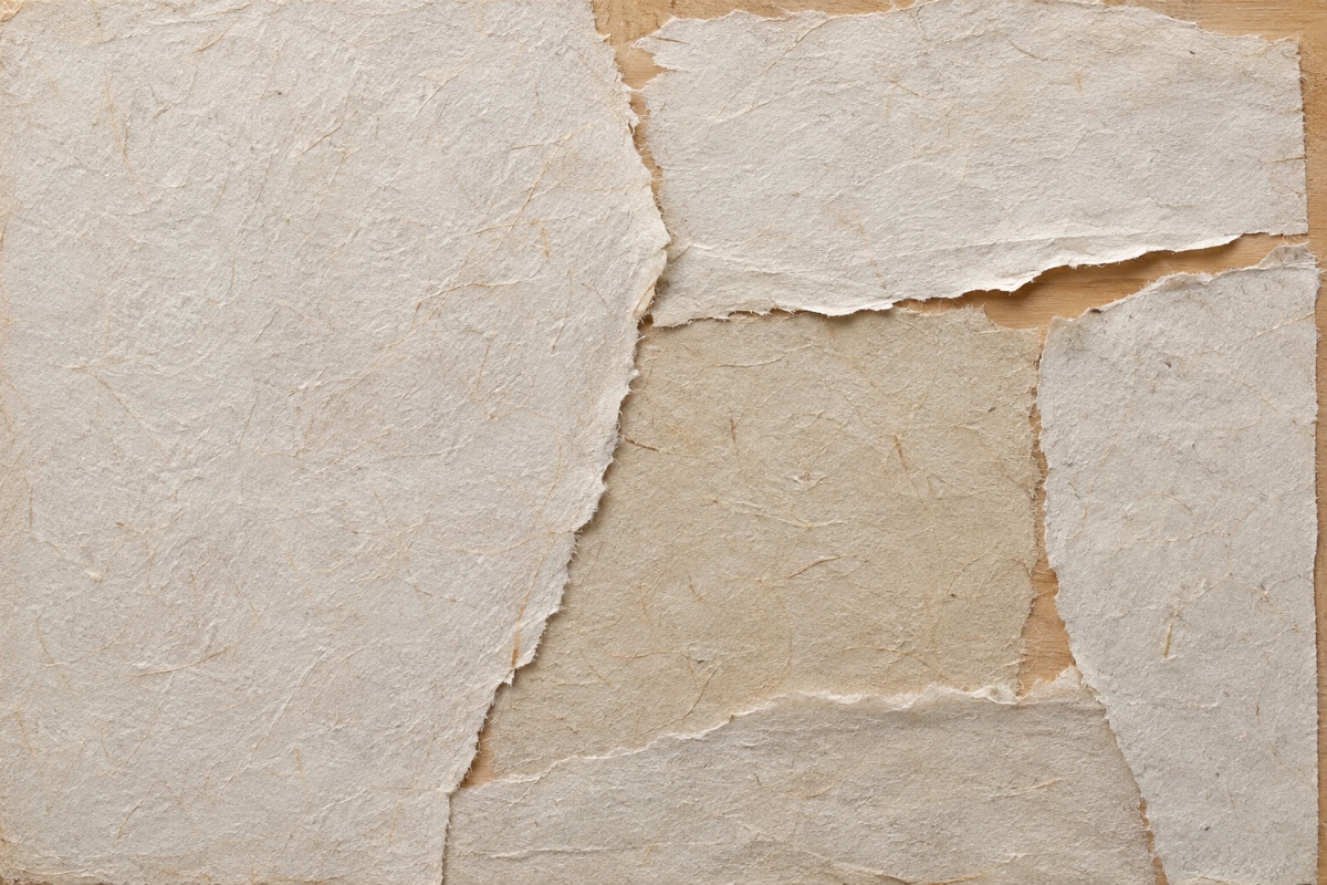
- Glaze the first color thinly. Mix one part Phthalo Blue Green Shade, six parts matte medium, and two parts water. Pull it across about 60 percent of the panel so some seams disappear and others remain visible.
- Add a warm crossing veil after drying. Use Nickel Azo Gold at the same dilution across roughly 30 percent, add a few Raw Umber marks, then wipe three edges clean before the glaze sets. Those exposed boundaries reveal the construction without making every seam equally important.
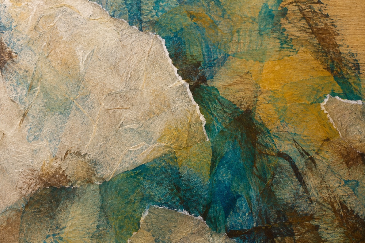
Failure mode and recovery: If every paper edge remains equally sharp, the collage will look pasted on. Dry the surface, extend one transparent glaze over the busiest cluster, and scumble a Raw Umber and Titanium White neutral across another seam. Preserve only the three edges that best direct the eye.
4. Transfer two rotated ghost-print layers
Things you'll learn: How incomplete transfers create irregular marks that still follow a planned layer sequence.
Time: 50 minutes to print, plus 45 to 60 minutes of drying between the two transfers.
Materials: 9 x 12 inch, 300 gsm mixed-media paper; two sheets of uncoated copy paper; 4-inch soft rubber brayer; no. 4 round brush; Carbon Black, Yellow Oxide, Cobalt Teal, Titanium White; fluid matte medium.
- Tint the receiving sheet. Roll a thin 4:1 mixture of Titanium White and Yellow Oxide over the paper, leaving some tooth visible. The warm off-white ground makes missing transfer areas intentional rather than unfinished.
- Paint the first donor sheet quickly. Roll Cobalt Teal mixed with 10 percent matte medium over about half the copy paper, then cut three channels through it with the brush handle. Work at heavy-cream consistency so the paint transfers without flooding the channels.
- Press while the surface is glossy but not pooled. Lay the donor paint-side down, rub with the clean brayer for one firm pass, and lift one corner after 20 seconds. A mottled edge means it is ready; a solid wet smear means the paint layer is too thick.
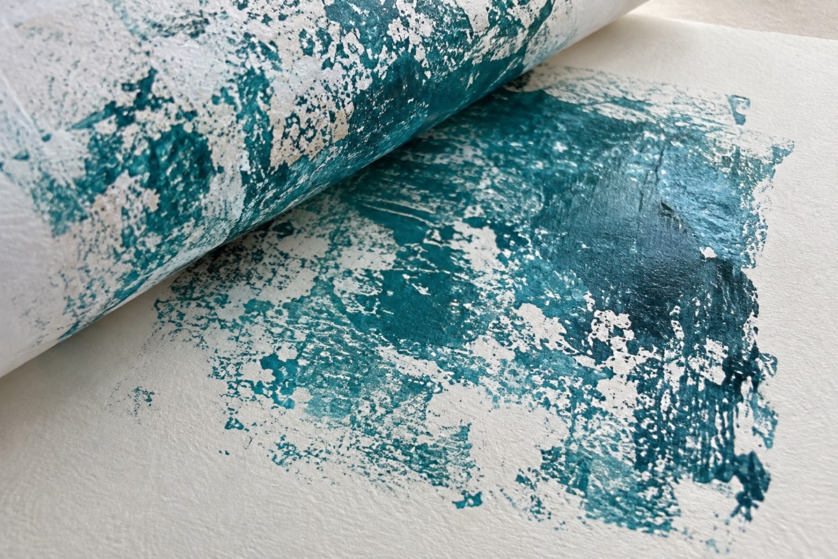
- Dry, rotate, and print again. Turn the receiving sheet 90 degrees only after the teal is matte, then transfer Carbon Black, a little Yellow Oxide, and two parts medium across one-third. Rotation makes the dark layer cross the first, while the 30 percent limit keeps teal dominant.
- Add one opaque return. Place two small Titanium White marks with the no. 4 round where the transfers overlap most densely. The opaque return restores a clear top layer after two irregular impressions.
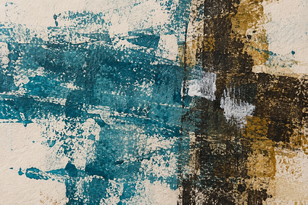
Failure mode and recovery: A completely solid transfer means excess paint or pressure erased the broken texture. While wet, press clean paper onto part of the solid area and lift it to remove paint. If dry, veil the area with the ground color and make a smaller dry-brayer transfer over it.
Tool and texture projects
5. Drag palette-knife impasto over a complementary ground
Things you'll learn: How paint viscosity, knife angle, and pressure change a stroke from a solid slab to a broken ridge.
Time: 65 minutes to paint, plus 24 to 72 hours for raised acrylic to dry through.
Materials: 12 x 16 inch primed hardboard; 2-inch flat brush; 3-inch offset painting knife; heavy-body Ultramarine Blue, Burnt Sienna, Unbleached Titanium, Payne's Gray; gloss gel medium.
- Brush a thin Burnt Sienna ground. Mix one part paint with one part water and cover the board, then wait 25 to 35 minutes until it is fully matte. The orange-brown ground supplies complementary warmth through later blue openings.
- Divide the composition at three-fifths. Mark a faint diagonal that crosses the long dimension near 60 percent, keeping the upper-left area quieter. A planned imbalance stops thick texture from becoming uniform wallpaper.
- Load the knife with stiff paint. Mix Ultramarine Blue with about 20 percent gel so a peak holds for several seconds. Hold the knife 15 to 20 degrees above the board and drag with light pressure; that low angle deposits ridges instead of scraping the ground clean.
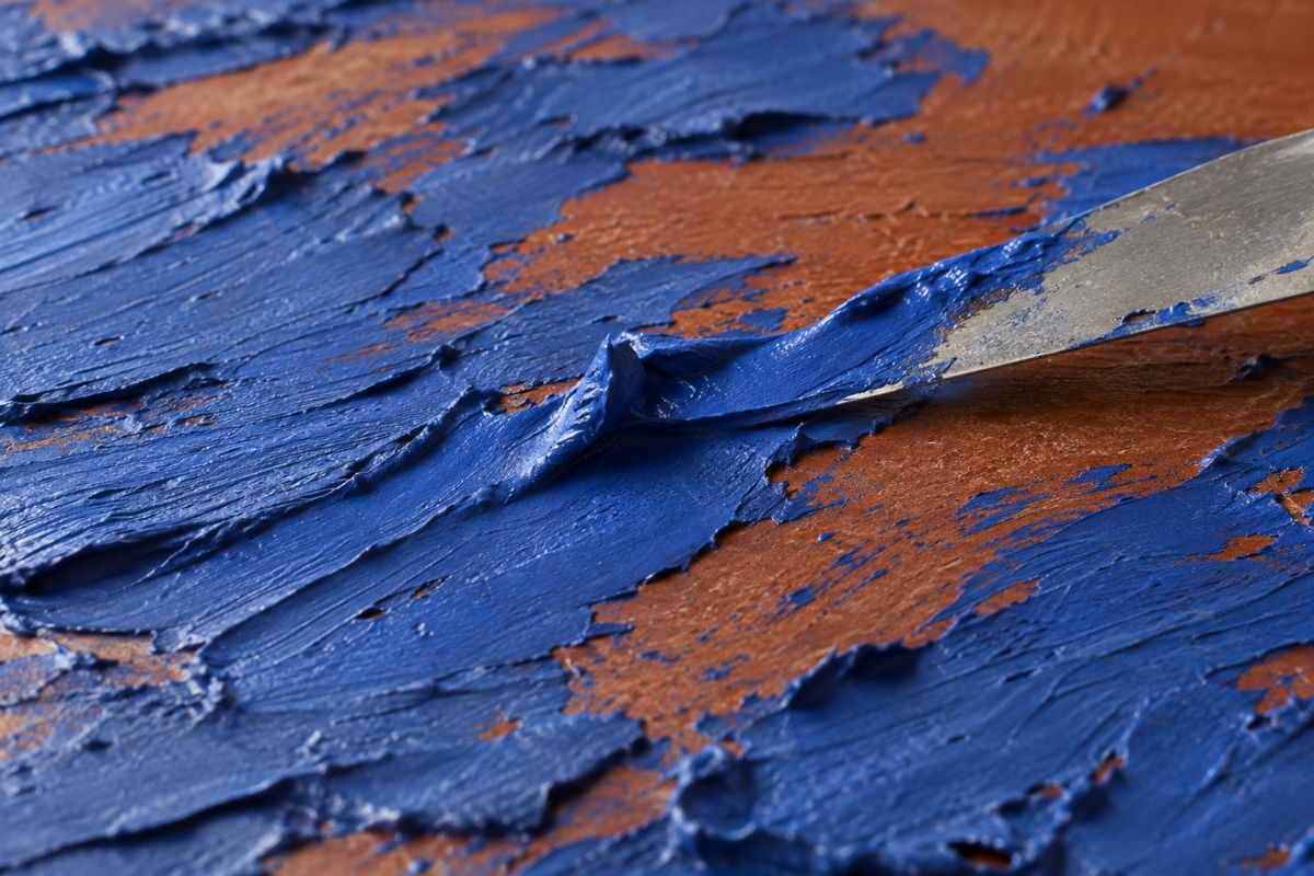
- Change pressure across the main diagonal. Use three broad blue pulls, two shorter Unbleached Titanium pulls, and one narrow Payne's Gray accent. Let about 35 percent of the ground remain flat so the raised paint has visual contrast.
- Scrape back one crowded passage. Clean the knife, hold it near 45 degrees, and remove a channel through the thickest cluster. The exposed complementary ground reconnects separate orange openings.
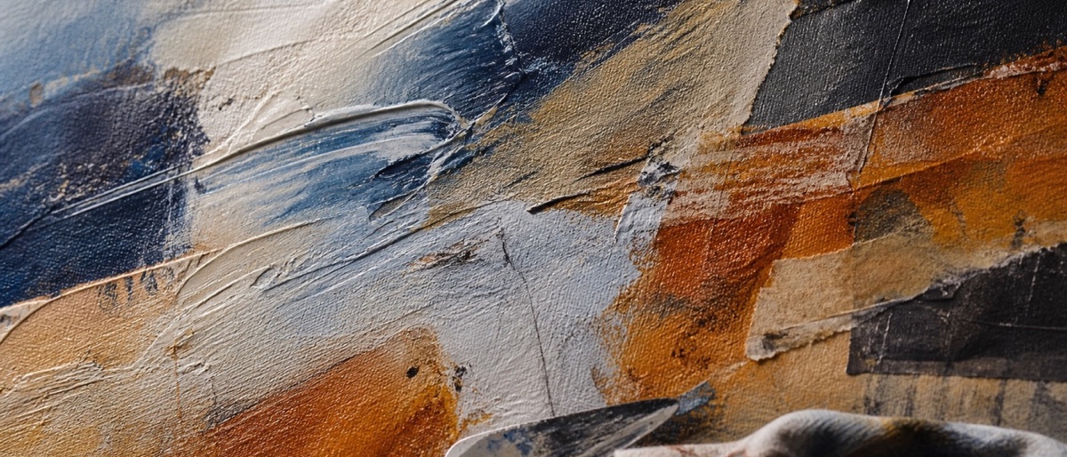
Failure mode and recovery: If every stroke forms a heavy rectangular slab, the knife was too upright or overfilled. While the paint is wet, scrape one-third of it back, wipe the knife, and redeposit smaller loads at a lower angle. If a skin has formed, let it dry and add a thin broken layer tomorrow.
6. Roll interrupted bands with a nearly dry brayer
Things you'll learn: How paint load and roller pressure create broken texture without random sponging or decorative noise.
Time: 45 minutes to paint, plus 20 minutes for the ground to dry.
Materials: 10 x 14 inch canvas paper; 4-inch hard rubber brayer; palette knife for loading; Mars Black, Titanium White, Yellow Oxide, Pyrrole Red; matte medium.
- Paint a warm-gray ground. Mix Titanium White, a small amount of Mars Black, and a touch of Yellow Oxide to a value around 3 on a 1-to-5 scale. Apply it thinly and dry it completely so the brayer skips across tooth instead of blending into wet paint.
- Plan five unequal bands. Place the narrowest band just below one-third of the sheet height and make the two largest bands together cover about 65 percent. Unequal widths keep the format from reading as a color chart.
- Load only the center of the brayer. Spread a teaspoon of Pyrrole Red with a palette knife, roll through it twice, then make one test pass on scrap. The roller should leave small gaps at both edges; full edge-to-edge coverage means it is overloaded.
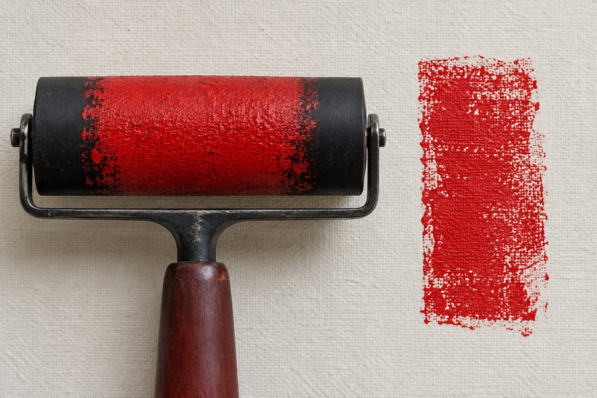
- Roll each band once or twice. Use moderate pressure for the first pass and light pressure for the second, stopping before the band becomes solid. The broken ground showing through is the evidence that pressure and paint load are balanced.
- Cross one band with black. Add a Mars Black interruption over about one-quarter of the sheet width, then echo it with one small mark near the opposite edge. A single cross-direction event gives the horizontal field a focal turn.
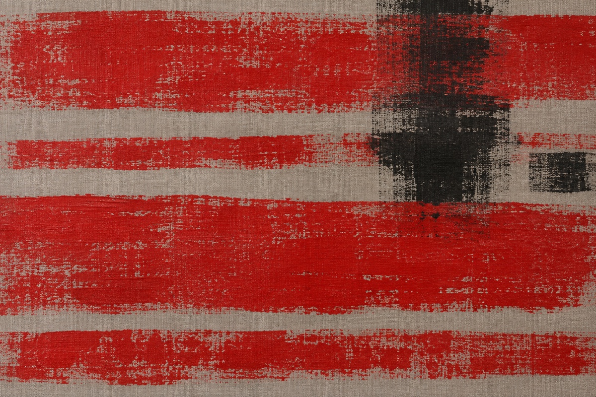
Failure mode and recovery: If the bands are slick and solid, blot the brayer on scrap until it sounds tacky and rolls with slight resistance, then pass the ground color lightly over selected areas. If the marks are too faint, add paint to the middle of the roller rather than pressing harder, which flattens the paper texture.
7. Scratch a broken grid through a skin-set layer
Things you'll learn: How to time sgraffito so a drawn structure cuts cleanly without exposing bare support everywhere.
Time: 50 minutes to paint, plus 25 to 40 minutes of staged drying.
Materials: 12 x 12 inch gessoed wood panel; 1-inch flat brush; wooden skewer; silicone color shaper; Phthalo Green Blue Shade, Quinacridone Magenta, Naples Yellow Hue, Titanium White; retarder medium.
- Cover the panel with a magenta ground. Brush Quinacridone Magenta and Titanium White in a 2:1 mix to full opacity, then dry it completely. This buried color becomes the grid line, so gaps later read as intentional drawing.
- Spread the top layer at soft-butter consistency. Mix Phthalo Green, Naples Yellow Hue, and 5 percent retarder, then spread a layer about the thickness of a credit card. Too much retarder prevents the surface skin needed for a clean scratch.
- Wait for the skin-set cue. Watch until the shine dulls but the paint still yields to a light touch on the edge, usually 8 to 12 minutes. Scratching earlier causes wet paint to flood the channel; waiting until fully dry makes the tool chatter and chip.
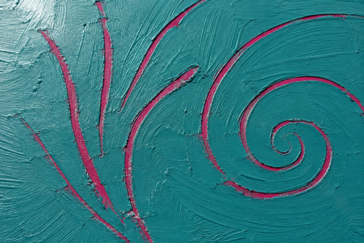
- Scratch an irregular grid. Place vertical lines at roughly one-fifth, one-half, and four-fifths of the width, then add four uneven horizontal lines. The unequal cells preserve rhythm without producing graph paper.
- Break the grid in three places. Use the color shaper to close one channel with teal, widen another, and drag one diagonal across two cells. These interruptions establish a dominant route through the structure.
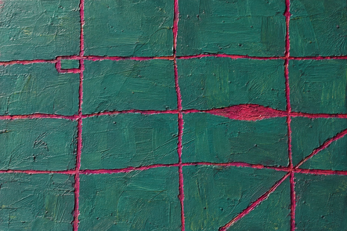
Failure mode and recovery: If the grooves close immediately, the top layer is still too wet. Stop, wait three minutes, and test at the outer edge. If the paint is already chipping, let it dry fully and redraw selected lines with a no. 2 round and the original magenta mixture.
8. Build sanded texture-paste relief under a stain
Things you'll learn: How shallow relief, sanding, and transparent stain work together without turning the surface into heavy decorative texture.
Time: 50 minutes of active work across two days, with 8 to 12 hours for the paste to dry.
Materials: 10 x 10 inch cradled panel; flexible 2-inch putty knife; fine 220-grit sanding sponge; acrylic modeling paste; Raw Sienna, Payne's Gray, Transparent Red Iron Oxide; glazing medium; soft 1-inch brush; dust mask.
- Plan relief over 40 percent of the panel. Keep the thickest activity in a broad L-shape whose inner corner falls near a lower-third intersection. Limiting the textured area gives the remaining smooth support equal compositional purpose.
- Spread paste no thicker than 2 millimeters. Pull the putty knife in two directions and leave three raised ridges, each shorter than the last. Shallow paste dries more reliably and keeps the piece from becoming a collection of peaks.
- Let the paste dry through overnight. It is ready when the deepest ridge is room temperature and uniformly white, not gray or cool. Stain over damp paste can trap moisture and create weak, chalky areas.
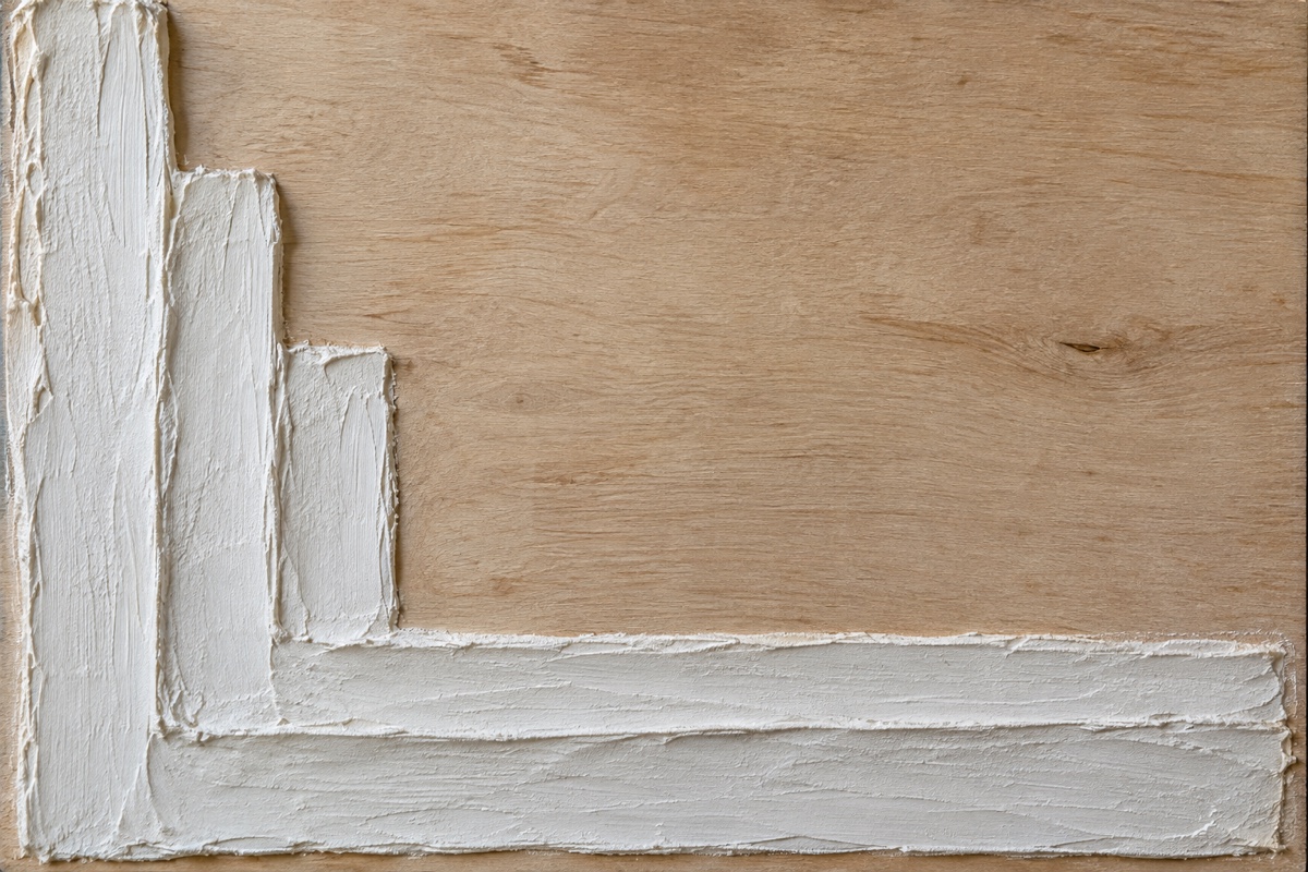
- Sand only the ridge tops. Wear the dust mask, use three or four light passes, and wipe away dust with a dry cloth. Flattening the high points creates bright ledges that will catch a thinner stain.
- Brush on two temperature-shifted stains. Mix Raw Sienna with four parts glazing medium over the smooth 60 percent, then use Transparent Red Iron Oxide over the relief. Keep Payne's Gray to one narrow edge so warm color remains dominant.
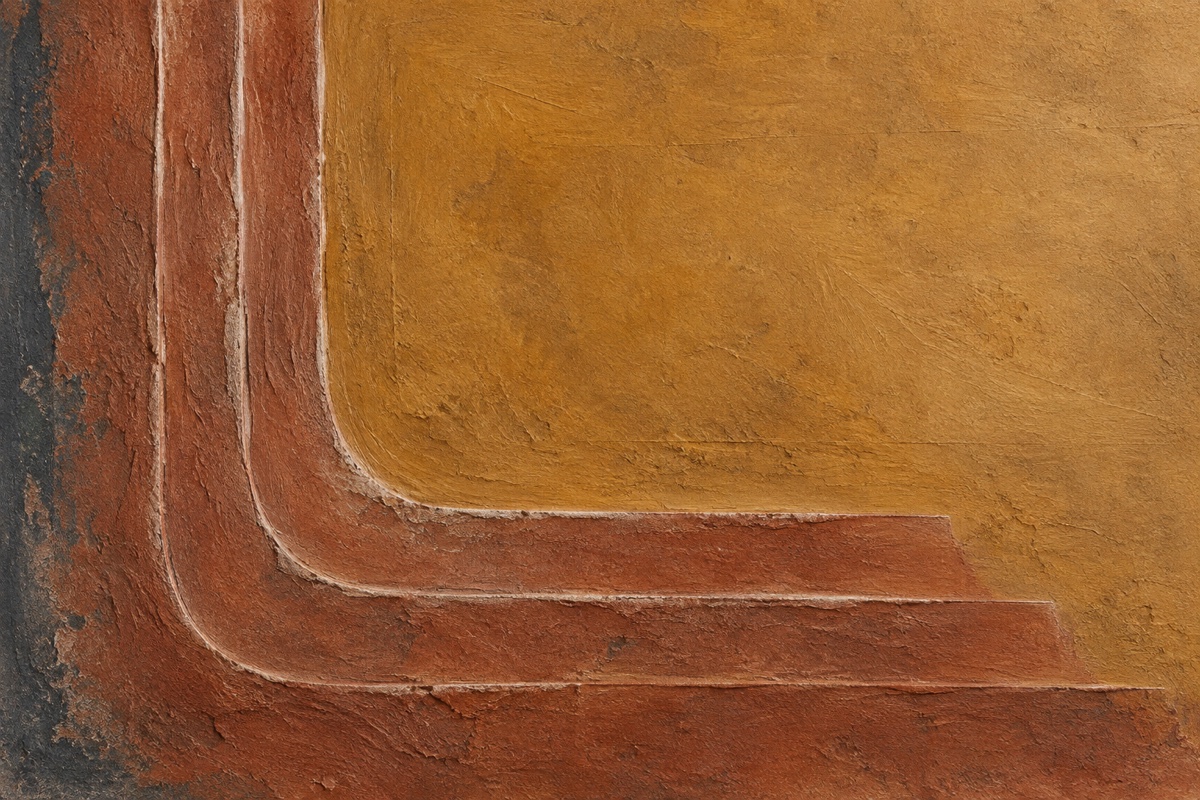
Failure mode and recovery: If the stain pools into opaque dark trenches, wick it out immediately with the corner of a dry cloth. After drying, glaze the surrounding smooth area slightly darker so the remaining trenches belong to the value range rather than looking like accidental outlines.
Shape and system projects
9. Mask three off-center arcs with a 70/30 balance
Things you'll learn: How cropped curves and unequal figure-to-ground proportions create movement without a centered target shape.
Time: 70 minutes to paint, including two 20-minute drying intervals.
Materials: 12 x 16 inch canvas panel; flexible curve or three round lids; low-tack 1/4-inch tape; 1-inch flat brush; Cobalt Blue, Yellow Oxide, Titanium White, Mars Black; matte medium.
- Create a warm 70 percent field. Mix Yellow Oxide and Titanium White 1:3 and cover the panel, keeping the layer smooth and opaque. This field will remain visually dominant, so allow it roughly 70 percent of the finished surface.
- Draw three arcs from off-canvas centers. Let one enter from the left edge, one from the top, and the smallest from the lower-right edge. Cropping every circle prevents the composition from becoming a row of complete symbols.
- Tape just outside the pencil curves. Burnish the tape lightly, then seal its edge with a thin coat of the ground color. The seal fills tiny gaps and gives the later blue layer a clean boundary.
- Paint the 30 percent curved forms. Use Cobalt Blue with 10 percent matte medium for two coats, drying until matte between them. Keep the total blue area near 30 percent even though the arcs are split into three places.
- Peel and counterweight at touch-dry. When the blue loses its shine, pull the tape back at a low angle, then add a narrow Mars Black bar near a lower-third intersection. Timely peeling avoids smears, and the small straight edge interrupts the curves.
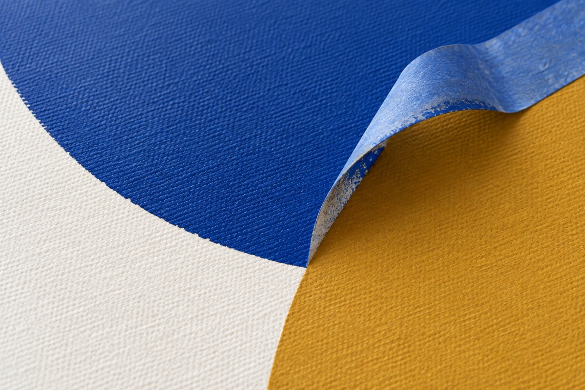
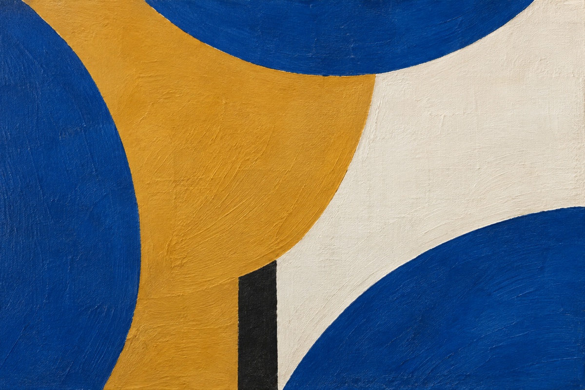
Failure mode and recovery: If paint bleeds under the tape, wait until the area is dry, redraw the intended curve, and correct the leak with the ground mixture using a no. 4 flat. If the composition resembles a centered target, enlarge one arc off the edge with another blue coat rather than adding more circles.
10. Organize three opaque fills with one continuous line
Things you'll learn: How a single drawn route can hold a composition together while selective color preserves negative space.
Time: 40 minutes, plus 20 minutes for the painted fills to dry.
Materials: 11 x 14 inch, 300 gsm hot-press paper; soft 4B graphite pencil; no. 6 round brush; Titanium White gouache, Ivory Black gouache, Red Ochre gouache, Prussian Blue gouache; kneaded eraser.
- Place three turning points first. Mark faint dots near the upper-left third, just right of center, and the lower-right third. These anchors keep the line from wandering evenly around the page.
- Draw one line without lifting. Begin off the left edge, pass through each turning region, cross the line two or three times, and exit at the bottom. Vary loops in size so no two enclosed spaces have the same footprint.
- Choose only three spaces to fill. Select one large shape of about 20 percent, one middle shape near 10 percent, and one small shape under 5 percent. The scale change gives the fills hierarchy while most of the paper remains active negative space.
- Mix gouache to heavy-cream consistency. Fill the large space with Red Ochre, the middle with Prussian Blue, and the smallest with Ivory Black. Opaque paint makes the three choices decisive against the soft graphite.
- Strengthen one line segment. After the fills dry, redraw only the route between the large and middle shapes with a 4B pencil. The darker segment creates an entry point without outlining every colored form.
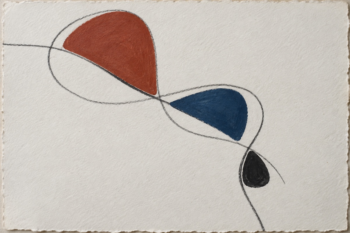
Failure mode and recovery: If the drawing is crowded everywhere, do not add white paint over the whole page. Use the kneaded eraser to fade two quiet sections, then enlarge the dominant filled shape slightly. A clearer hierarchy comes from subtraction and unequal scale, not from another color.
11. Control three gravity paths with one hard-edged crossing
Things you'll learn: How fluid acrylic dilution, surface angle, and a later opaque layer turn pours into directed movement.
Time: 45 minutes of work, plus 8 to 12 hours for the fluid paths to dry flat.
Materials: 12 x 16 inch sealed wood panel; four level supports; 1-ounce squeeze bottles; no. 8 bright brush; fluid Phthalo Blue Green Shade, Quinacridone Magenta, Transparent Yellow Iron Oxide, Titanium White; pouring medium; pipette.
- Mix three flowing colors separately. Use one part fluid acrylic, two parts pouring medium, and about one-quarter part water. A line from the pipette should settle flat in three seconds but retain its color; watery mixtures make pale halos and weak edges.
- Mark three starting points across the upper third. Space them unevenly, with two closer together on one side. The grouping creates a dominant path before gravity begins moving paint.
- Release each color on a level panel. Squeeze a pool about the size of a quarter at each mark and wait until it spreads to roughly twice that width. Moving the panel immediately sends a thick center ahead of the thinner edge.
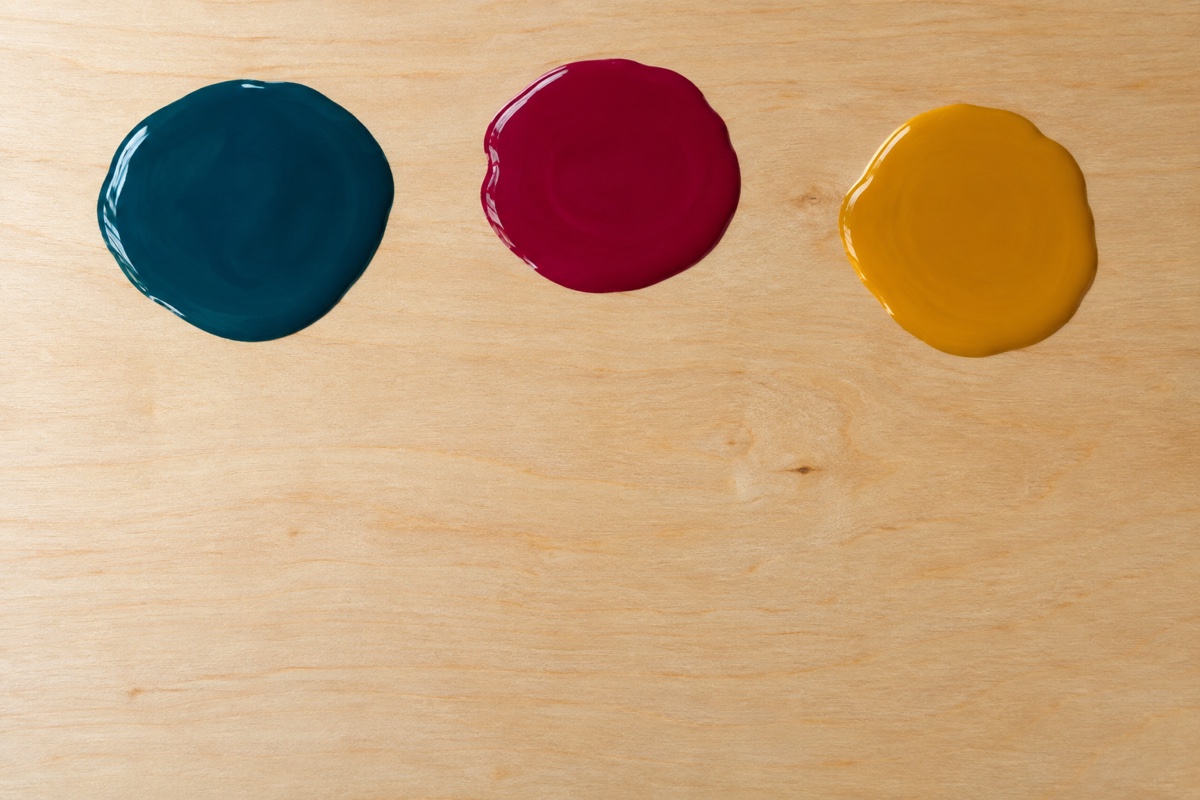
- Tilt to 15 degrees for short intervals. Raise the upper edge for three seconds, return to level, then tilt one side for two seconds. Short, measured tilts preserve three separate paths while allowing one overlap.
- Leave the panel flat overnight. Do not chase bubbles once the surface begins to tack. A fully dry path is matte, firm at the thickest pool, and no longer cool to the touch.
- Add one opaque crossing. Mix Titanium White to heavy-cream consistency and paint a 1-inch band across the lower two-fifths, stopping at both sides of the dominant path. The hard-edged interruption converts gravity marks into a layered composition.
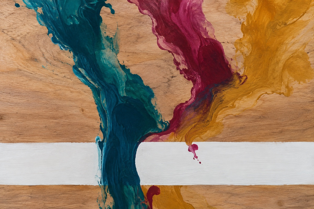
Failure mode and recovery: If all three colors merge into one wide river, return the panel to level and wick a channel through the mixture with folded paper towel. Let it dry, place the opaque crossing over the muddiest junction, and restore only one clean path fragment on top.
12. Repeat one system across a three-panel layer-order series
Things you'll learn: How changing layer order alters emphasis while fixed pigments, tools, and proportions keep three paintings related.
Time: 2 to 2.5 hours across one afternoon, including two 25-minute drying intervals.
Materials: three 8 x 10 inch canvas panels; 1-inch flat brush; 2-inch brayer; no. 4 round; Ultramarine Blue, Burnt Sienna, Unbleached Titanium, Carbon Black; matte medium; pencil and ruler.
- Write the shared system before painting. Each panel gets a 60 percent pale field, a 25 percent blue shape, a 10 percent sienna passage, and black marks under 5 percent. Fixed proportions create family resemblance even when the layer order changes.
- Map one composition on all three panels. Put the main division at two-fifths of the width, shift it left on panel two and right on panel three, and keep the black accent near a lower-third point. Small placement changes create variation without inventing a new design each time.
- Change only the layer order. On panel one paint pale, blue, sienna, black. On panel two paint blue, pale, black, sienna. On panel three paint sienna, black, pale, blue. Dry each layer until fully matte so the sequence remains visible instead of mixing wet colors.
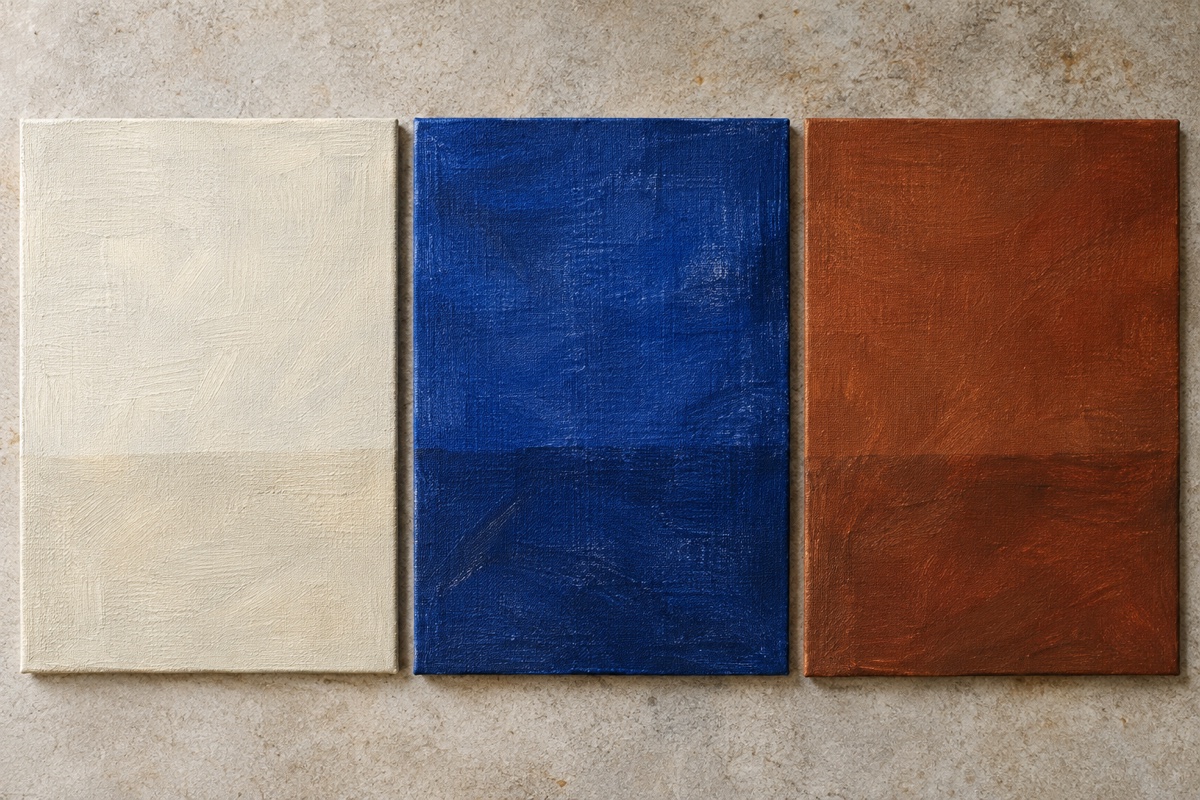
- Keep tool assignments fixed. Use the flat brush for the pale field, brayer for blue, round brush for sienna, and the flat brush edge for black. Repeated tool character makes the panels read as one hand and one session.
- Expose and balance the buried layers. Leave two seams or brayer gaps on each panel, then view the set with 2-inch gaps from six feet away. Quiet only the strongest panel with an Unbleached Titanium scumble over no more than 10 percent, preserving visible evidence of layer order.
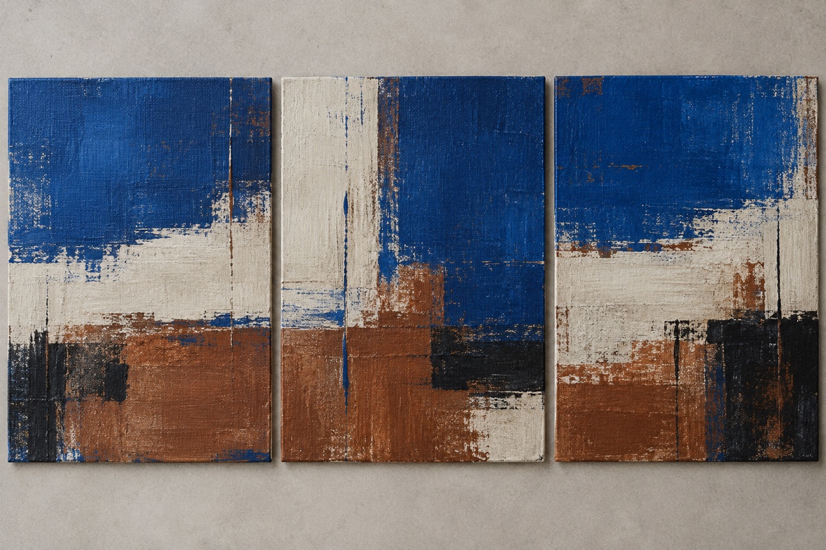
Failure mode and recovery: If the panels look unrelated, check proportions before changing colors. Extend the pale field or reduce an oversized blue shape until each panel returns to the 60/25/10/5 system. If they look identical, reveal a different buried seam on each rather than adding new marks.
A 45-minute abstract choice, worked through
Suppose you have canvas paper, basic acrylics, a brayer, and 45 minutes. Drying time rules out paste, collage, impasto, and pours, while the available tool points to interrupted bands. Raw Sienna can replace Yellow Oxide in the ground, and Naphthol Red can replace Pyrrole Red. Keep the rule: five unequal bands, the narrowest below one-third, and one black crossing.
Allow 10 minutes for the ground, 5 to map widths, 15 to roll, 5 to quiet one area, and 10 to assess and clean up. "Good enough" means ground skips through the red, widths are unequal, and black changes the eye's direction. Straight edges and gallery-level resolution are not required.
If none of the available materials points to an answer, use the broader What Should I Paint? decision framework. It works from medium, time, audience, and finish level instead of offering another list.
Finished the piece? Here's what to do with it
An abstract painting can change character once it leaves the easel. A quiet color interval may disappear on a similarly colored wall, while one hard edge can dominate when the work is enlarged as a print. Put the piece into the WallMockup editor and compare it against one warm wall and one cool wall at the print size you are considering. You are testing scale and color relationships, not looking for a room that flatters every decision.
If the painting will become a print, photograph it square to the surface in even light and check that raised texture has not turned into harsh black shadow. Buyers need to understand the size and surface without holding the original. See why realistic mockups increase art sales for the presentation details that make that judgment easier.
FAQ
What is a good abstract painting idea for beginners?
Start with a two-color painting or a monochrome study. Limiting your palette to one or two colors removes the hardest decision (what colors to use) so you can focus on mark-making and composition.
How do I come up with abstract painting ideas when I have no inspiration?
Use a constraint instead of waiting for inspiration: pick a color pair, a texture technique, or a single word and let the painting respond to that one decision. A "found palette" pulled from a photo on your phone also works well when you feel blank.
What materials do I need for abstract painting?
Acrylic paint, a few brushes, and a canvas or heavy paper are enough to start. Palette knives, texture paste, and collage materials like torn paper open up more ideas but aren't required for most of the ideas above.
How big should an abstract painting be?
Any size works, but starting small (under 12x12 inches) is useful for testing an idea quickly before committing to a larger canvas. Small-canvas series are also a common way to build a body of work fast.
Can abstract paintings sell as well as realistic art?
Yes, when the presentation makes the scale and color relationships clear. Abstract work often has no recognizable subject to anchor expectations, so an accurate, true-to-scale room mockup does more of the selling than it would for a realistic painting.
Do abstract paintings need titles?
No, but a title can help a viewer (or a buyer) enter the piece instead of standing in front of it unsure what to look for. A title doesn't need to explain the painting - something evocative or even a little odd usually works better than a literal description of the colors used.
See also: The Complete Guide to Wall Art Mockups for how presentation fits into the full process of finishing, photographing, and selling a piece.